The human mind demands categories. It’s science. But the heart doesn’t adhere to rules and can often be found in the driver’s seat when it comes to creativity. The head and the heart dance together for both the makers and audience alike. I believe it is in this dance that we ebb and flow through and by categories. Meaning can be derived by categorization, but can also create boundaries or barriers to expression.
Through our friends at Regular Practice, we are taken on a journey through the categorization of design. Kris and Tom walk us through seven case studies that touch on three key areas of investigation:
What is the purpose of categorization?
What are the different reasons to categorize?
How do you go about categorizing your own work (or not)?
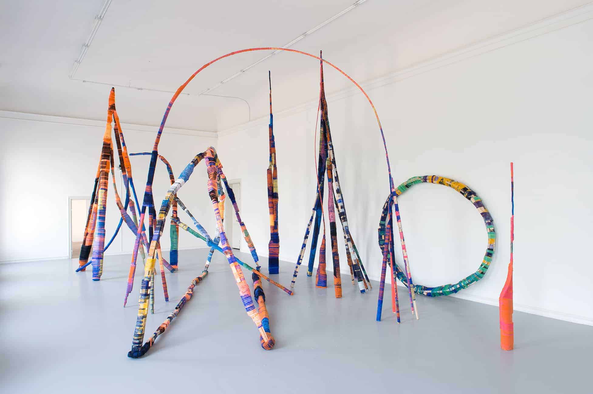
ANTON ALVAREZ
Alvarez is introduced as an artist then described as an industrial designer and engineer. His work is original and stand apart from his formal training.
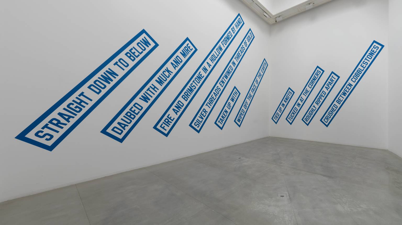
LAWRENCE WEINER
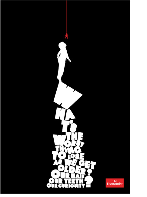
Weiner uses solely typography and graphic design to express his creativity, yet is considered an artist. This case study in begs the questions: do you categorize by what tools you use? -or- the place in which your work is reviewed or inhabits? -or- can your work exist across numerous contexts? I found this provocation to be very interesting and came back to it often in looking through the D&AD categories and relative works. More on that later…
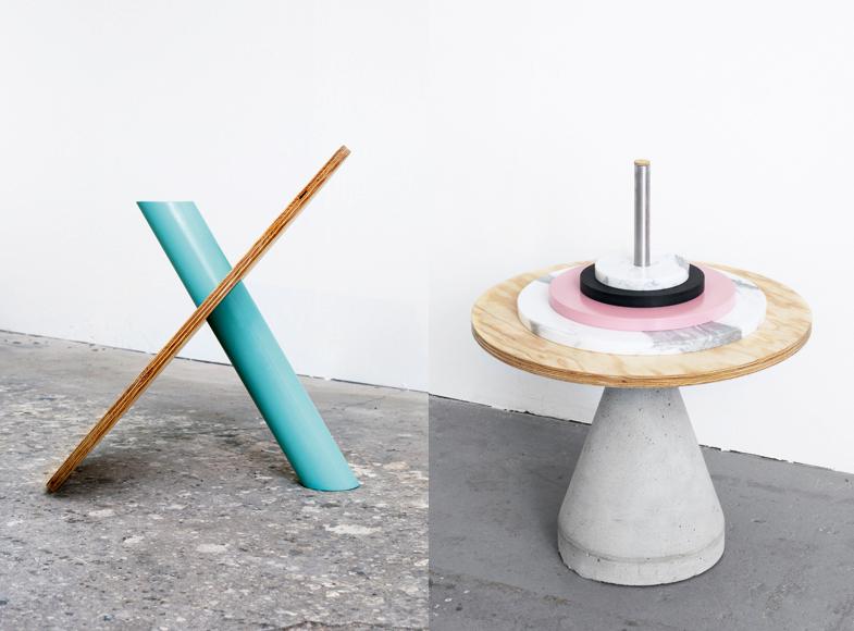
HELLO ME (and a some NON FORMAT)
This graphic design studio is making furniture. This is a perfect example of the aforementioned questions: form? function? hybrid? Categorization can be a tool but also a crutch or barrier. I believe that the folks at Non Format have it figured out, whether they’d agree or not. Their curiosities have landed them work that has defined channels or categories of design: typography, illustration, layout design, advertising design and so on, yet they are creative explorers not reliant on labels or categories to define what excites them about graphic design. It’s the passion, curiosity, and exploration that drives them, not the categories.
EIKE KÖNIG
König again leans heavily on typography to create posters that are deemed as art. Is it the message, the form, the way the design albeit simplistic that defines his work as art or is the combination of all of these categories?
MADE THOUGHT
We learn about MadeThought through their broad company statement. They will not be categorized, sliced and diced into pieces, they want to engage your heart. And it shows in their profound final sentence, “We Create Desire.” Wow, don’t you want to know more? Aren’t you enticed by the lack of category? But how would you know who they are outside of this statement. Is this enough? (I think so.)
OKRM
We go narrower a bit with how OKRM defines themselves: “ideas, art direction, and design for art, culture, and commerce.” This gives on a lot to consider, yet places a finer point on what it is they do.
POW-SMITH
Pow-Smith is quite explicit in categorizing their work: they do web. This specificity of categorization can be useful or even required if you are wanting to attract specific work like web design.
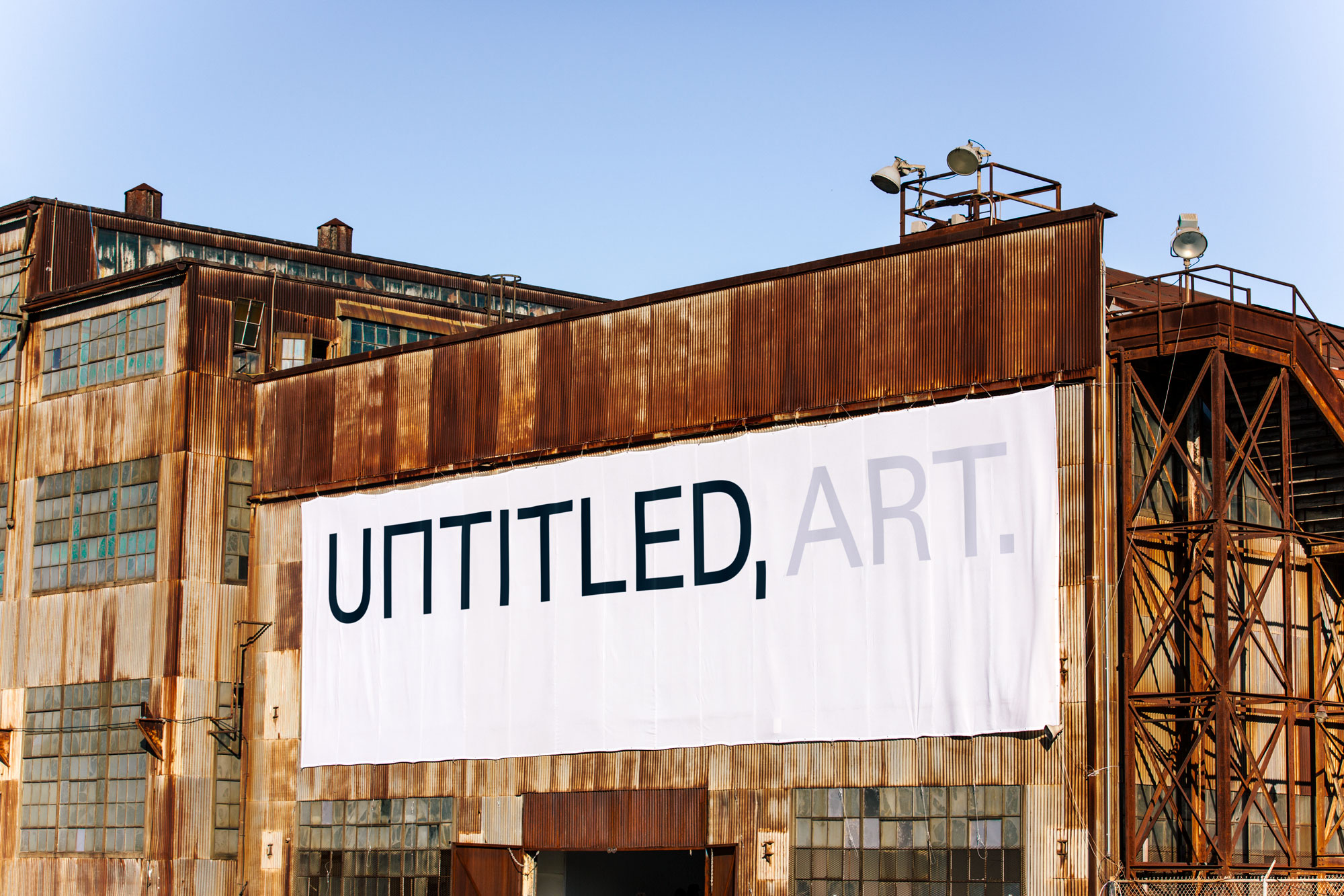
D&AD
Thirty-five categories, numerous subcategories, and even more categorization within the works themselves. This was quite an exploration. I wondered quite a lot about how the award categories were defined as much as how awardees were determined. The symbol that kept appearing to me throughout this categorical exploration was the onion. So many layers that overlap and also ordered, within each layer are defined areas of structure, can be seen as a whole or sum of parts, is both translucent and opaque. What a beautiful design, the onion. Thank you, Nature. To me, this is graphic design: an onion.
I chose to focus on five categories for deeper exploration and identification that supports of my onion theory: Side Hustle, Art Direction, Book Design, Music Video, and Creativity for Good.
SIDE HUSTLE: THE WAYBACK
This blew me away. I was so inspired by this work and was delighted to see it listed at the top of a seemingly alphabetical approach to listing yet clearly not beginning with the letter “a”. I wonder if D&AD felt blown away as well and decided “side hustle” needed to appear first as a result. This onion includes: cinematography, fashion, packaging design, typography, experiential design, art direction, and creativity for good.

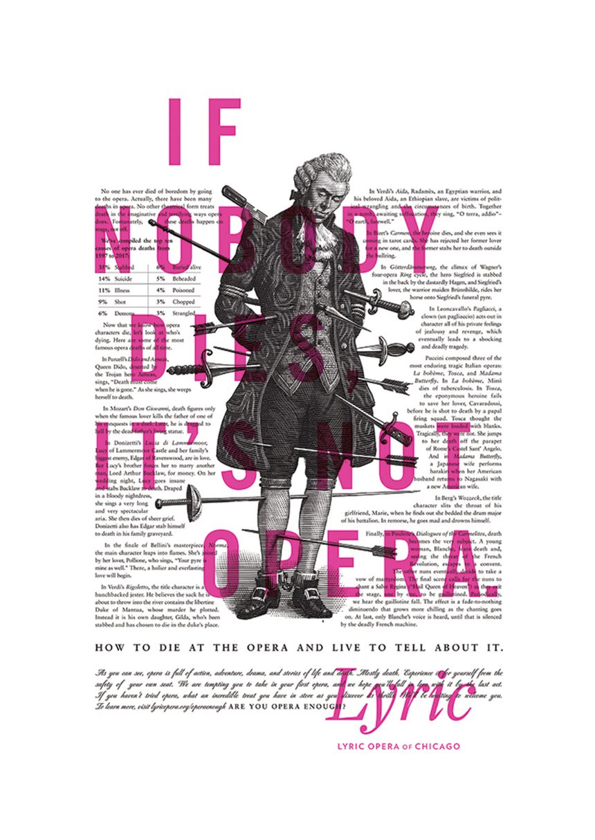
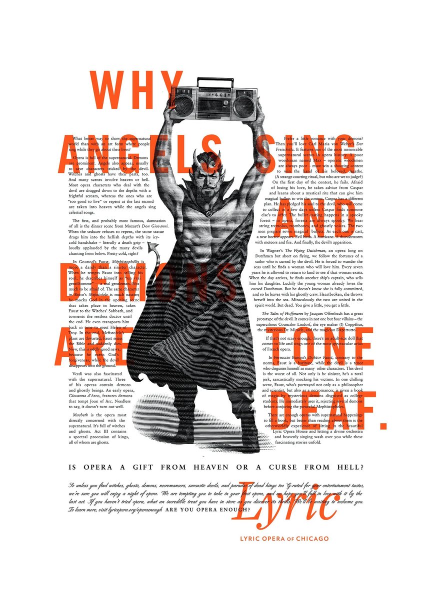
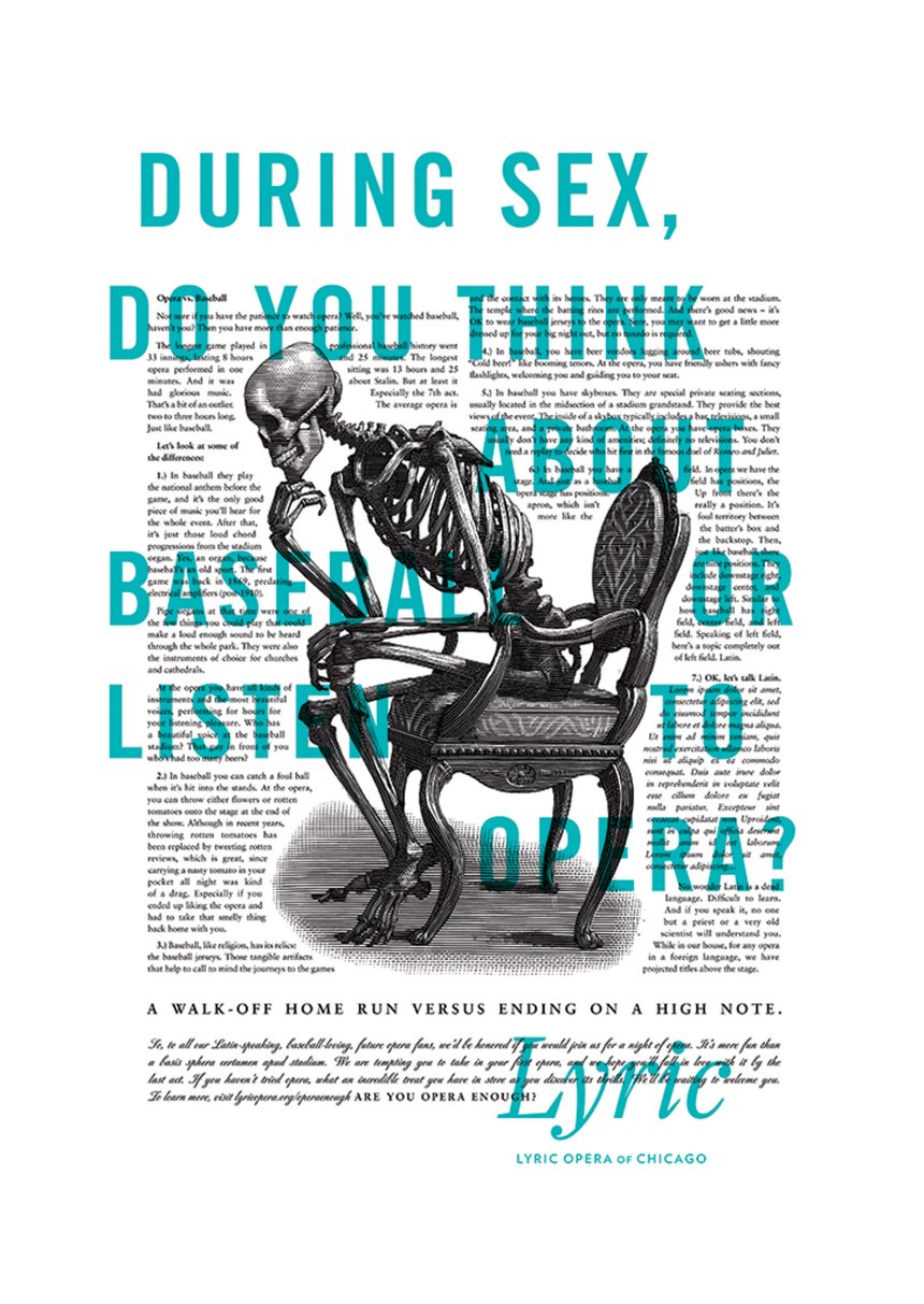
ART DIRECTION: LYRIC OPERA
I have been drawn to this type of design my entire life. The marriage of illustration, typography, storytelling, graphic design, layout design speaks to my sweet center of my design venn diagram. I love the bold use of type and how it’s modern approach is juxtaposed across historical-esque illustration. If this doesn’t make you even just a bit curious about the opera, then you may just be a robot. A brilliant case study in reaching new audiences.
BOOK DESIGN: With – A BOOKAZINE ON COLLABORATION
This awardee has it all: objet ‘d'art, typography, layout design, photography, lettering and more. It is exquisitely unexpected, a feast for the eyes.

MUSIC VIDEO: “NEVER CHANGE” BY OBONGJAYAR
I was drawn to this piece as it too, has many layers, not only in what design practices are utilized (typography, photography, cinematography, lettering, and more) to make it so successful, but the layers and layers of texture, color, and use of still and moving imagery all make a rich tapestry. And that’s just the visuals. Combine all of that with the music itself: stunning.
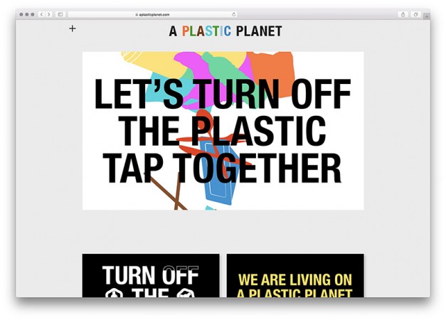
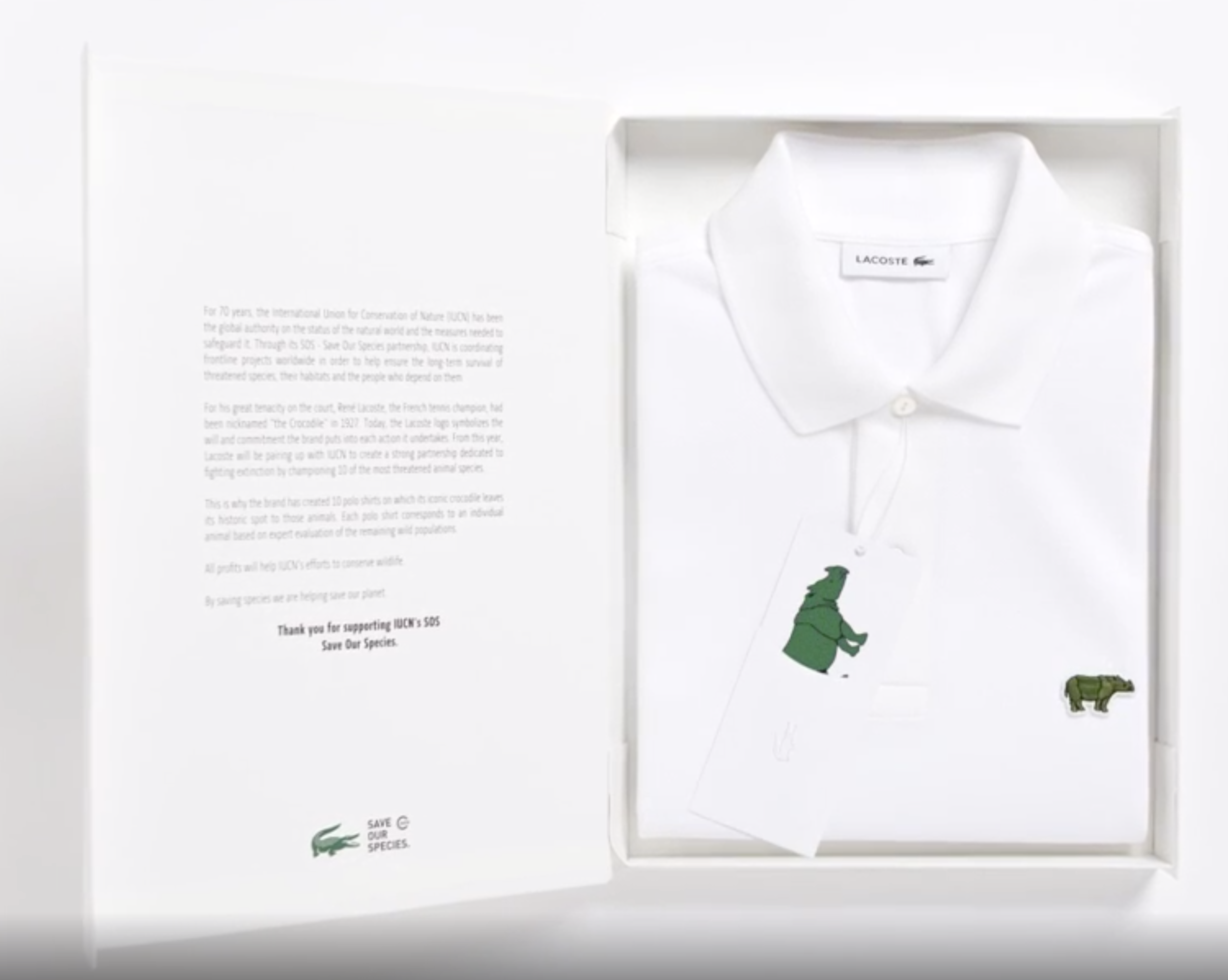
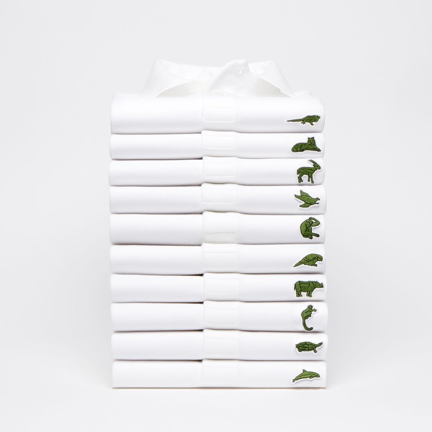
CREATIVITY FOR GOOD: LACOSTE AND “RANG-TAN”
Lacoste chose to alter its globally recognizable alligator in defense of endangered animals through its “Save Our Species” campaign. This creative embodies iconography, photography, fashion, product, packaging, multimedia, web design and more.
Iceland Foods in partnership with Greenpeace through Mother agency, produced a highly controversial documentary/holiday message called “Rang-tan” that tells the story of the deforestation of habitat for the orangutan via the palm oil industry. Illustration, videography, cinematography, typography, animation, art direction, sound, and photography come together to share this heartbreaking story with the world.