GDE710 W12 | Workshop Challenge

THE FUTURE IS PLANTS

Can design help change the face of snack packaging and save farming?

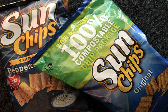
snacksofourlives.0.0.jpg

Walk down the snack aisle of any supermarket, convenient store, or worse, a mega store like Costco and what you will see is packaging that will end up in a landfill, polluting the earth. 

This week’s assignment called on design to rethink old into new ways and the first thing I thought of was waste. How can we continue to load our garbage bins full of waste that is killing our planet? 

What if we could create snack packaging that not only biodegrades, but to also sustain another American industry on the brink given present political trade crises: farming?

One word: PLANTS. 

Technology in product packaging design is moving forward. I propose that we could move it along a lot faster and further if we got American farmers involved. 

While exports of corn and soybeans are in jeopardy, we could be growing sustainable packaging that is compostable thus creating a cycle of sustainability that is not only green but would help put farmers in the black. In 2010, Frito-Lay won a packaging design award for creating a compostable bag of Sun Chips. That was nearly a decade ago. Why hasn’t this gone mainstream? I would put all of my chips on government lobbyists and big agriculture that is not interested in changing the way their bottom line is met. 

This technology exists. We have seen new waves of product design that are far more sustainable than they’ve ever been, but there just doesn’t seem to be a big enough incentive to expedite old ways of design, production, and distribution. 

Queue a global financial trade war with America’s largest importer of corn and soy, and perhaps push may actually come to shove. 

Companies like ReGrained sustainable packaging manufacturer aims to be in a fully certified compostable structure within one year. And once they achieve that milestone they intend to open-source their technology so it can be available to and widely adopted by  the industry. 

Designers can do their part. Specifying sustainable materials as a part of their projects, working with FSC-certified vendors, designing packaging with smaller carbon footprints (lighter, smaller, etc.).

But we can do so much more. We can be included in the conversation when a company like Frito-Lay wants to go beyond winning awards for show and tell and wants to make a real impact on sustainability and saving the planet. It’s no longer a matter of convenience, it’s a matter of conscious.

GettyImages-485081020+LOW.jpg

REFERENCES

Blue, M. (2019, March 02). Biodegradable Plastics Made From Soybean Products. Retrieved from https://sciencing.com/biodegradable-plastics-made-soybean-products-22587.html

Designers, stop designing for yesterday's planet. (2018, September 13). Retrieved from https://www.itsnicethat.com/news/futurice-design-sustainability-graphic-design-130918

Elmansy, R. (2015, June 09). Achieving a Sustainable Graphic Design Process. Retrieved from https://www.designorate.com/sustainable-graphic-design/

ReGrained. (n.d.). Sustainable Packaging. Retrieved from https://www.regrained.com/pages/sustainable-packaging

Staff, G. (2010, March 10). SunChips Stacks First Compostable Bags on Canadian Shelves. Retrieved from https://www.greenbiz.com/news/2010/03/10/sunchips-stacks-first-compostable-bags-canadian-shelves

Staff, S. X. (2015, July 06). Producing biodegradable plastic just got cheaper and greener. Retrieved from https://phys.org/news/2015-07-biodegradable-plastic-cheaper-greener.html
GDE710 W12 | Lecture Reflection & Research

New Steps

IDEAS IN A DIFFERENT SPACE, PROBLEM SWAP, CULTURAL/PARADIGM SHIFT

This week we hear from SomeOne, Sam Winston, Regular Practice, Sarah Boris, and Intro on the topic of the future of design.

WHAT ARE THE FUTURE DEFINITIONS OF DESIGN PRACTICE?

SomeOne

Messaging is getting broader, not narrower. More and more, clients are now coming to SomeOne needing an idea, not just a thing — a deliverable. Simon Manchipp expresses the need to turn spectators into fans through experiential design.
Sam Winston

Design is a living inquiry into the problem — so as problems change, so will design. Physicality of making stuff and overall awareness are elements Winston sees as significant with regard to the future of design practie.

Regular Practice

Design is going to get increasingly more vague, not specialized. The need for continued versatility will be required to keep up with advancements.

Sarah Boris

Expectations of design have shifted. Designers are now and will expected to continue to be multi-disciplinary.

Intro

Design is visual culture. They see a return of the commercial artist.

WHAT SECTORS NEED TO CHANGE GOING FORWARD?

SomeOne

Platforms are changing rapidly and while designers will need to be nimble to respond to the demands of these changing platforms — but they are not important. IDEAS need to connect with people, regardless of platform.

Sam Winston

Designers need to continue to break down the silos — create opportunities for collaboration and new ways of design — which will ultimately create new silos to be yet again broken down.

Regular Practice

Publishing houses demands versatility and multi-faceted.

Sarah Boris

Cross-disciplinary approach and a willingness to collaborate with other makers, designers, engineers, writers, anyone to make the work better.

Intro

Client drive shifts in work output. Develop solutions for clients versus simply create work product — be their problem-solvers. Clients don’t know what they want, but have budgets and need thinkers, designers that can provide solutions that work within those budgets.

HOW IDEAS ARE PERCEIVED IN NEW ENVIRONMENTS?

REFERENCES

Dunne, A. Raby, F., (2013) Speculative Everything: Design, Fiction, and Social Dreaming. Cambridge MA: MIT. www.dunneandraby.co.uk

Forensic Architecture: https://www.forensic-architecture.org/

TED (2017) Anab Jain: Why We Need to Imagine Different Futures. https://www.ted.com/talks/anab_jain_why_we_need_to_imagine_different_futures


GDE710 W11 | Workshop Challenge

WHAT LIES BENEATH

BIG TOBACCO: ACROSS THE WORLD AND PLATFORMS

Has the tobacco industry really changed its approach to hooking folks on tobacco early on? I don’t think so.

This week's research and challenge let me to discover how big tobacco is using new methods to apply the same old trick: Hook 'em young.

We now have candy flavored vapes and social media influencers along with age-old practices of design psychology to convince audiences of just how tasty and cool tobacco is.

I asked the class since I’m here in America and tobacco advertising is outlawed everywhere, what they see in their respective countries. Here are their responses:

Anna Robinette

Is there a difference between countries advertising recently? Here in the UK, tobacco companies aren't allowed to advertise, and in shops the cartons have to be a universal dark green and displaying warnings and hidden behind screens. Are there countries where tobacco companies are allowed to advertise freely? 

Tony Clarkson

I always remember the Silk Cut ads on the back of Sunday magazines as I was growing up, when the advertising ban came in their final ad was perfect

Stuart Tolley

This is an interesting one – As Anna says, tobacco advertising is banned in the UK. However, it is still advertised in other regions, such as Africa, Asia, Russia, China? It would also be interesting to find how brands get around the law in any clever (or deceitful) ways.

Alice Neve

Hi Kris, In France all forms of domestic and cross-border tobacco advertising and promotion are prohibited but product display is currently allowed at points of sale (this is illegal in the UK now). France is known for smoking but the number of smokers has dropped considerably with around 30% of people calling themselves smokers in 2017. I can’t find the numbers for 2019. Also, I have noticed that the cigarettes are sold in special shops as appose to supermarkets like in the UK.

Robert Schmich

Advertising for cigarettes has not been permitted on free TV and radio in Germany since 1974. At the moment, however, advertising is still permitted in cinemas, magazines and newspapers, and also on Litfaß-columns which I described earlier in this course. The only limitation is - no smoking people can be shown. Also advertising within a radius of 100 meters of kindergartens and schools is not permitted. No days it feels like tobacco companies target your emotions and the urge to be part of something...

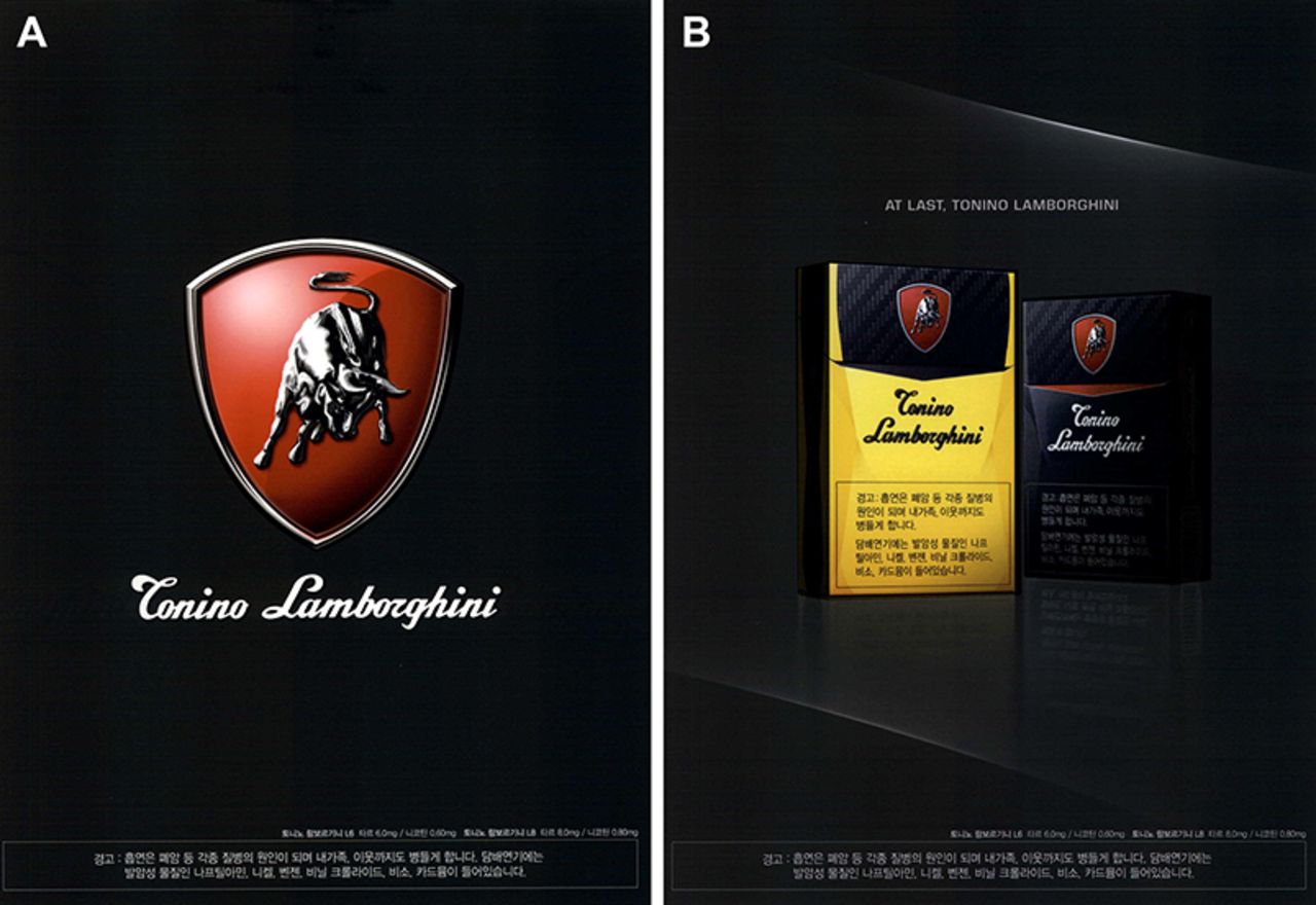
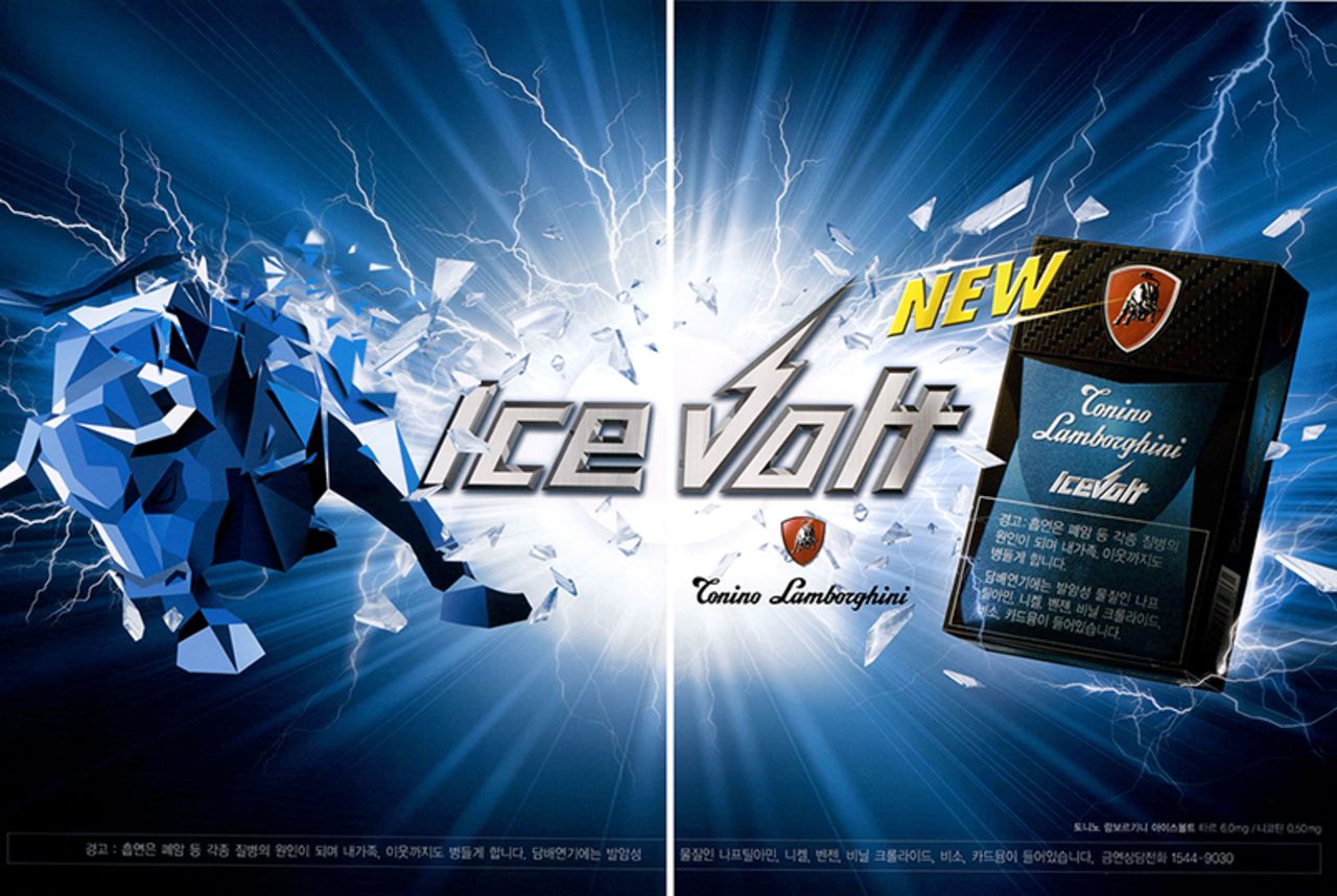
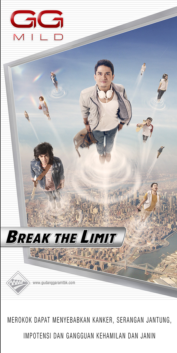
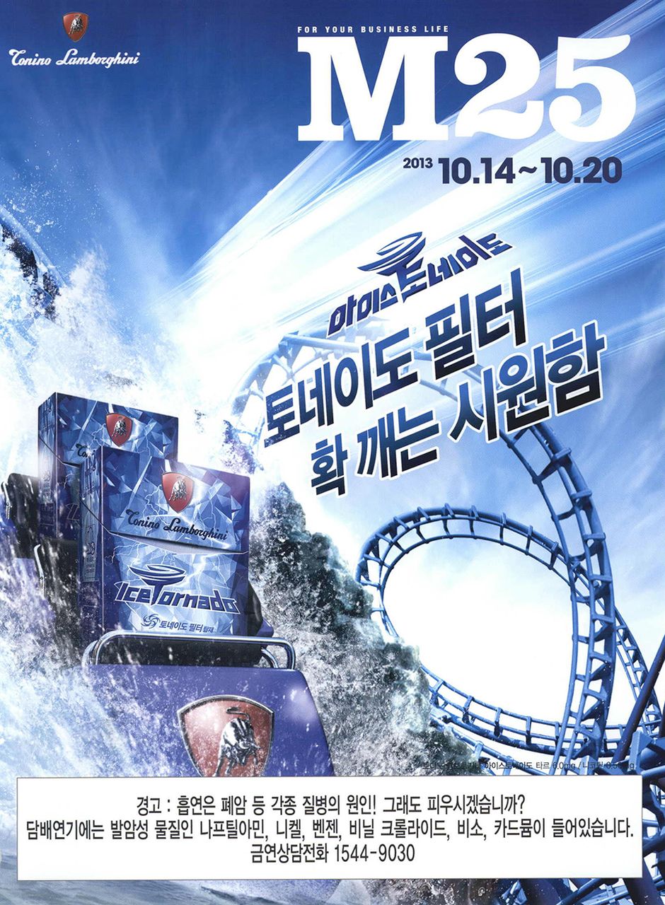
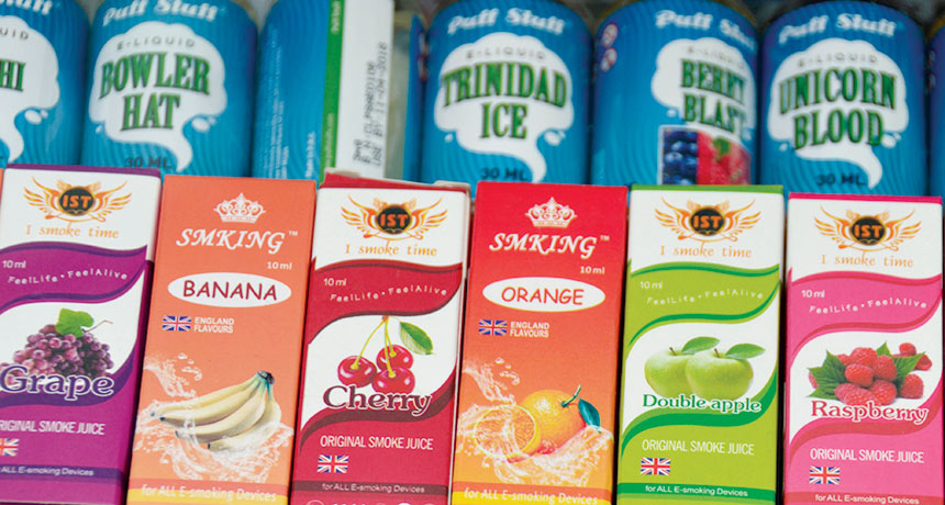
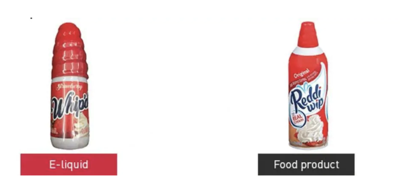
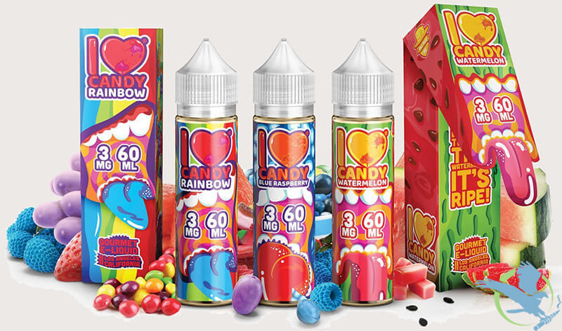
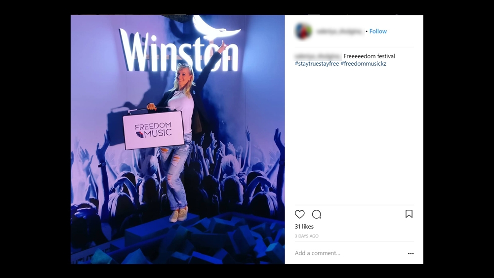
Top row: leveraging the cool factor of associated brands like Lamborghini to design creative that literally intends to evoke “cool” with names like “Ice Volt.” Middle row: smokeless tobacco companies target youth audiences by designing packaging tha…

Top row: leveraging the cool factor of associated brands like Lamborghini to design creative that literally intends to evoke “cool” with names like “Ice Volt.” Middle row: smokeless tobacco companies target youth audiences by designing packaging that resembles sweet treats and candy and fruit flavors. Bottom row: social media is the latest platform for big tobacco to target its audience paying influencers to set the stage of experience through “authentic” posts.

NEW OLD WAYS

My research revealed that Big Tobacco’s messaging and advertising approach varies globally based on regional laws as also confirmed by my classmates. Where advertising is permitted, it often comes with rules where the act of smoking is prohibited. Therefore, advertising targets the essence what makes smoking appealing: to be cool, be stylish, be exciting, be wild, be adventurous, be in the “it crowds.”

Some tobacco brands use brand association with other brands that are globally known for cache. Other brands use typography and design that exudes a literal sense of “cool” with names like arctic blast. And some brands are using interesting approaches to expressing “lift off” with images of people literally blasting through mid-air.

New methods include using the technological advances of smoking. Smokeless tobacco vis a vis, vaping has brought forth an entire legion of advertising and messaging that targets young people. Using packaging design that looks like candy and sweet treats as well as flavors that are far more appealing to a young audience: berry blast, pina colada.

Perhaps the most devious approach to messaging and advertising the tobacco industry has taken on is through social media influencers. Brands are paying influencers to post “authentic” images touting the coolness of smoking. This takes their messaging seemingly indirectly to where the audience are - on social platforms. There currently are not any laws that prohibit this approach to advertising leaving quite the loophole target for young audiences.  

REFERENCES

Boseley, S., Collyns, D., Lamb, K., & Dhillon, A. (2018, March 09). How children around the world are exposed to cigarette advertising. Retrieved from https://www.theguardian.com/world/2018/mar/09/how-children-around-the-world-are-exposed-to-cigarette-advertising

Investigation reveals tobacco companies are secretly using social media to promote smoking. (n.d.). Retrieved from https://truthinitiative.org/research-resources/tobacco-pop-culture/investigation-reveals-tobacco-companies-are-secretly-using

Jackler RK, Chau C, Getachew BD, Whitcomb MM, Lee-Heidenreich J, Bhatt AM, Kim-O’Sullivan SHS, Hoffman ZA, Jackler LM, Ramamurthi D. (2019, January 31). JUUL Advertising Over its First Three Years on the Market. http://tobacco.stanford.edu/juulanalysis

McGinley, L. (2018, May 01). Feds crack down on e-liquid packaging that looks like candy, juice boxes. Retrieved from https://www.washingtonpost.com/news/to-your-health/wp/2018/05/01/liquid-nicotine-for-e-cigs-looks-like-kids-juice-boxes-and-candy-government-says/?noredirect=on

Tobacco Social Media Marketing: Resources. (n.d.). Retrieved from https://www.tobaccofreekids.org/media/2018/wheretheressmoke


GDE710 W11 | Lecture Reflection & Research

Trends & Environment

Storytelling in a global environment

THEORY & SYMBOLISM BEHIND A MESSAGE

This week we hear from Professor Martin Hoskins on the dissemination of symbolism and theory. He defines communication as the message received, not sent. He contends that if the receiver did not receive the message as intended by the sender, then 100% communication did not occur. He references George Orwell in stating that the meaning of language is dependent on intention. Go goes on to explain that psychological images include intent, original core of process, and invisible shape or form at the heart of language is archetypes. Images carry meaning that rely on context.

SEMIOTICS

Semiotics is the study of signs and symbols and their use and interpretation. Founded by Swiss linguist, Ferdinand De Saussure in 1918, semiotics universally map the communication of meaning through different mediums.

Example-of-Signifier-and-Signified.png

SIGN

A sign is anything that conveys a direct meaning.

ICONS and SYMBOLS, and INDEX… OH MY!

Icons have a physical resemblance to the signified, for example a photograph.

Index implies some character of the object or original event.

Symbols bare no resemblance between signifier and the original signified and must be culturally understood, for examples numbers and letters. Symbols have implied meaning.

semiotics_pizza-01.png

Codes act as systems of signs that we use to navigate our shared environment and underpin our sense of community.

Decode is the way by which we read and interpret the codes and their signs so that we can navigate our way through the world

Anchorage is to pin down or guide intended meaning.

Relay includes text or images standing in complementary relationships. Both interplay to build two larger signifiers of an anecdote, story, or narrative. Copy and image reinforce one another.

Meaning comes from the relationship between the signifiers (the intended message) within a system and includes differentiation of understanding within a given sign code system.

SYMBOLISM AND SEMIOTICS: A CASE STUDY

Kris from Regular Practice takes us on a guided tour of the symbolism that is the Olympics Brand.

The Olympics has expressed at least three unique approaches to semiotics and symbolism throughout its storied history.

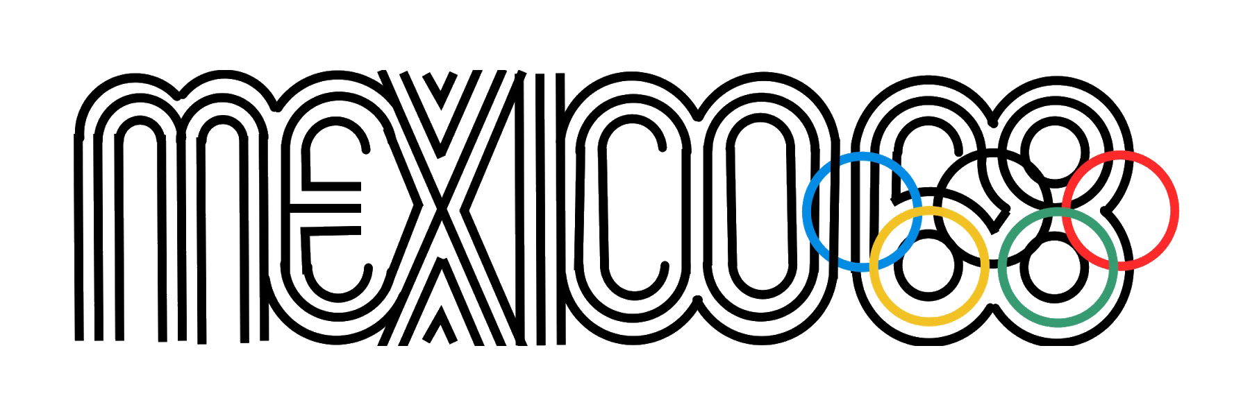
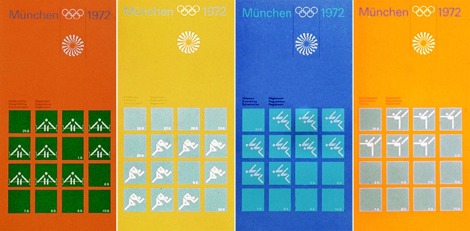
  1. Systematic approach where the identity is built upon and executed against a set visual system.

    • Examples include: Mexico 1968 and Munich 1972

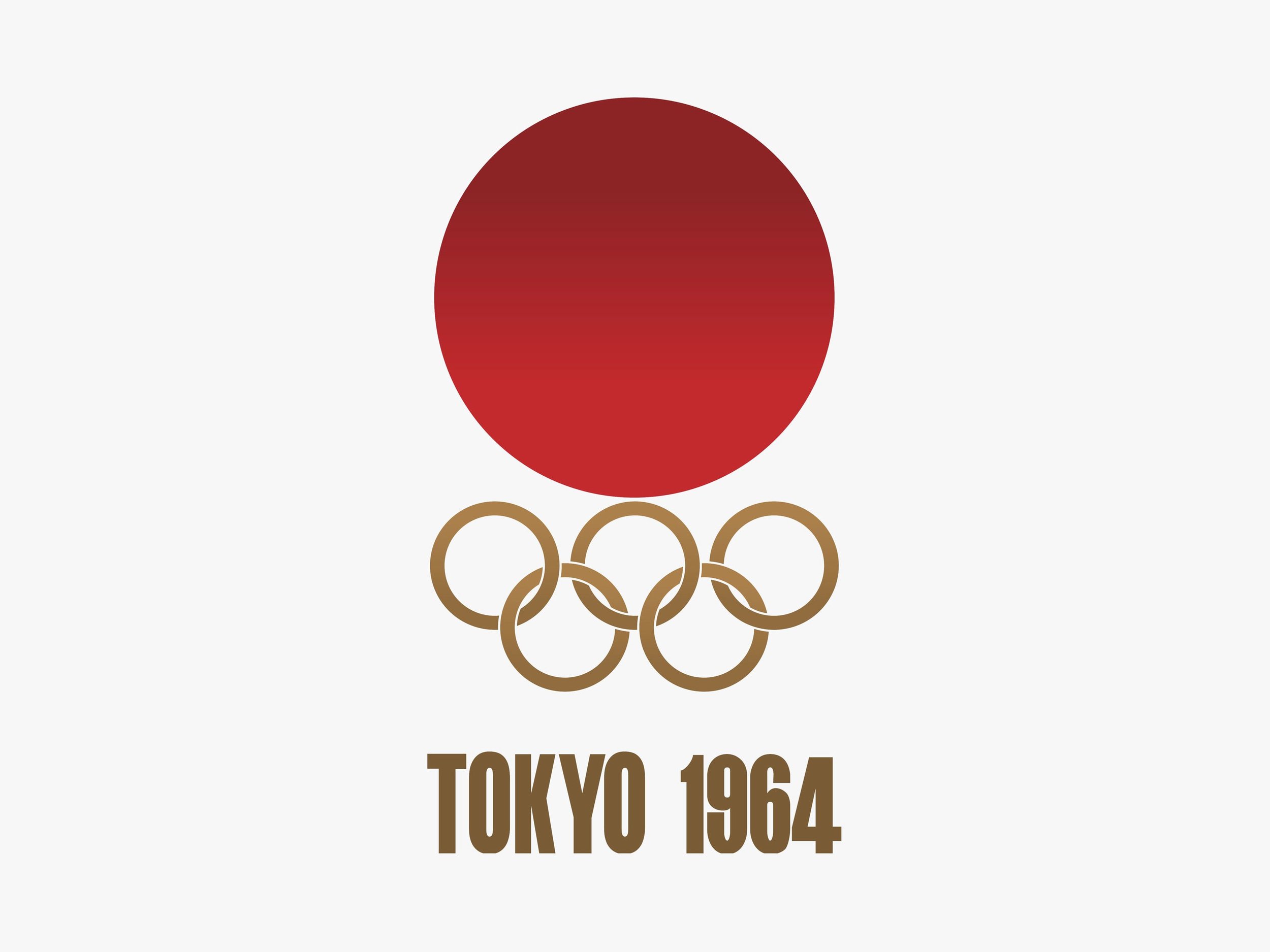
  2. Emblematic approach where the identity is built off of symbolic visuals that reinforce the essence and culture of host city in which the games took place.

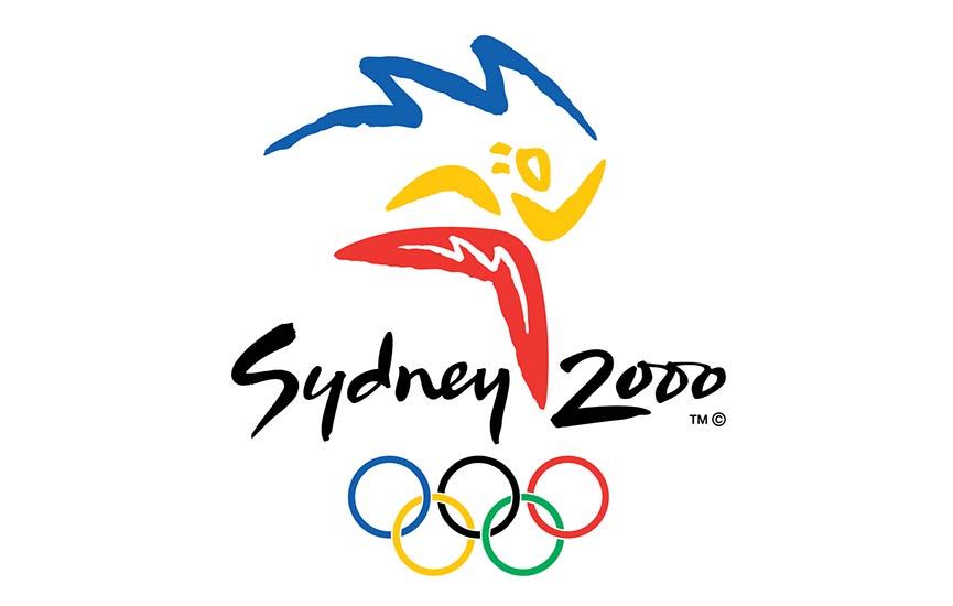
    • Examples include: Tokyo 1964, Sydney 2000, Athens 2004, Beijing 2008, and Rio 2016

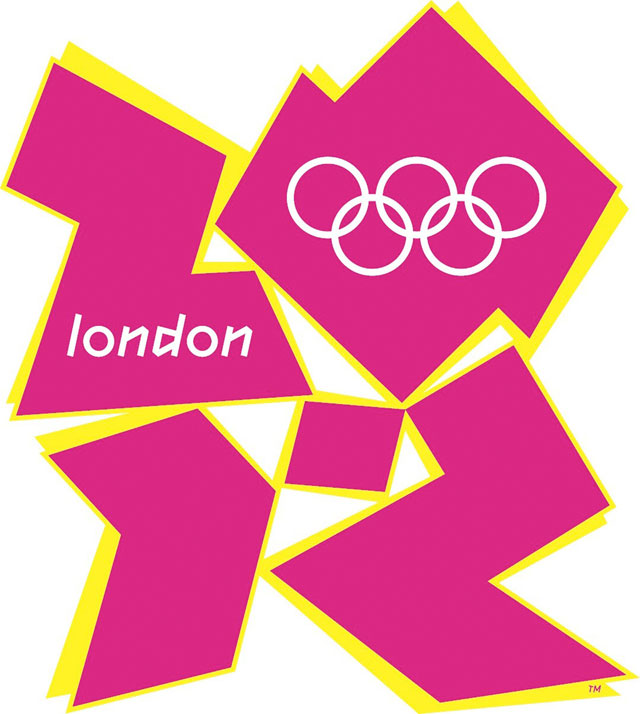
  3. Abstract approach where the identity is comprised of visual storytelling that is uniquely expressive of the location or the personality of the host city.

    • Example of abstract includes the London games of 2012

BREAKING NEWS 2.0

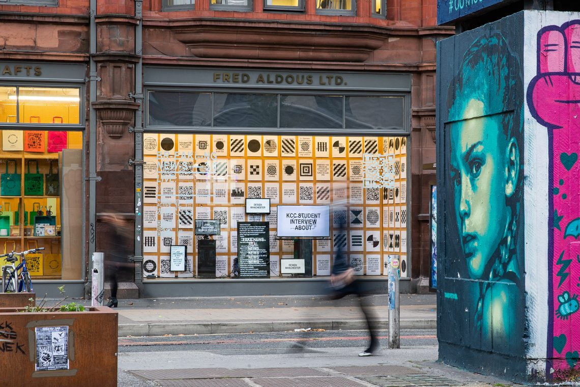
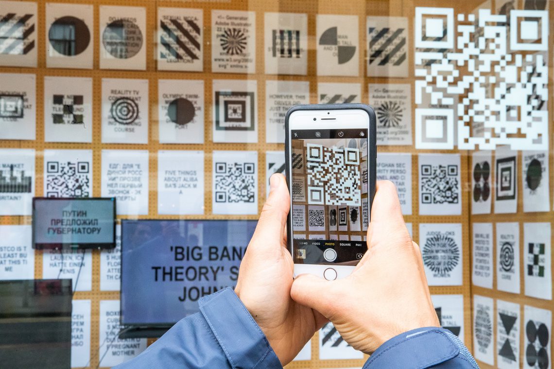
Patrick Thomas’ exhibit and experience at the London Design festival is a fluid, reflection of what is going on in the world. There is a freedom of expression, global digestion, and agnostic diffusion of news. I appreciate the simplistic approach to typography to further the transparency of the messaging.

REFERENCES

BBC (2016) Adam Curtis: Hypernormalisation Available at https://www.bbc.co.uk/programmes/p04b183c
Crow, D., (2003) Visible signs: An Introduction to Semiotics. AVA, London.
Heller S., (1999) Design literacy (Continued) Understanding Graphic Design. Allworth Press, New York.


GDE710 W10 | Lecture Reflection & Research

Type and Press

We start this week’s lecture off with a brief, yet effective walk through the history of typography. The eras of how type is executed is defined by the machines or platforms by which it is created. 

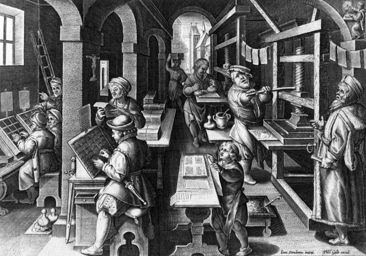
GUTENBERG PRESS

We begin in the 1400s with Johans Gutenberg, the inventor of the notion of moveable type and the Gutenberg press, the first machine to “mass produce” printed materials. Moveable type press created a standardization and a more effective way to share information. 

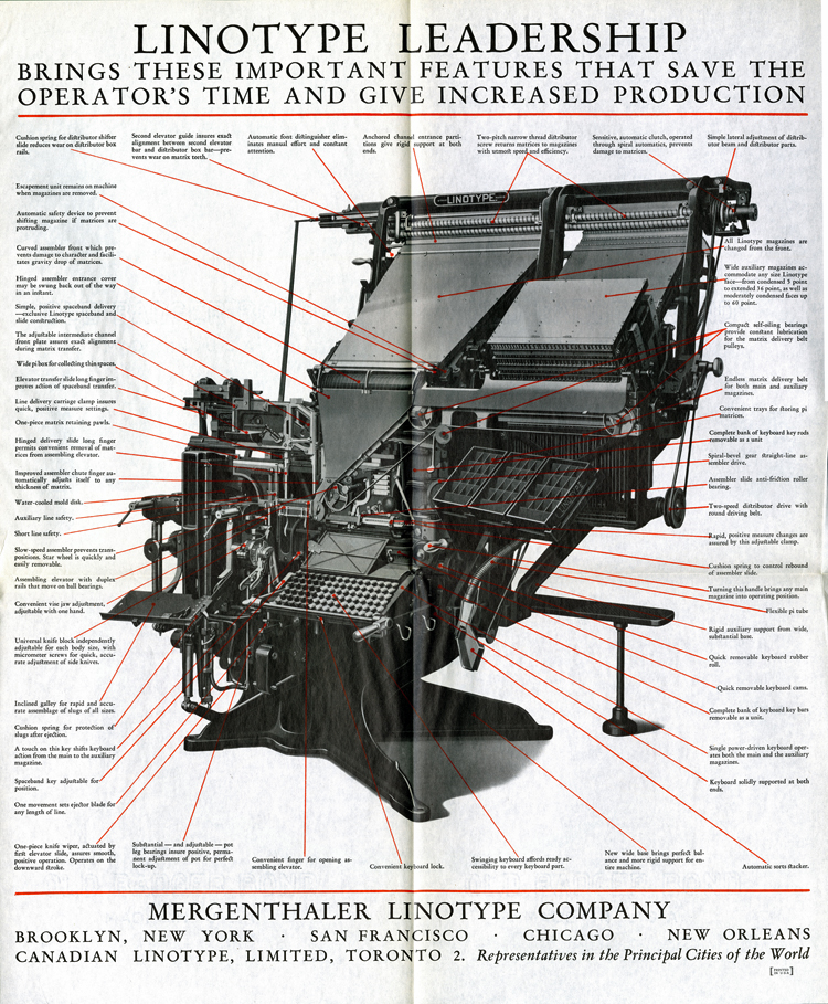
LINOTYPE MACHINE

Fast forward to the late 1800s, where Ottmar Mergenthaler’s linotype machine revolutionized typesetting and with it especially newspaper publishing, making it possible for a relatively small number of operators to set type for many pages on a daily basis. Before the linotype machine, daily newspapers were limited to
eight pages.

DRY TRANSFER

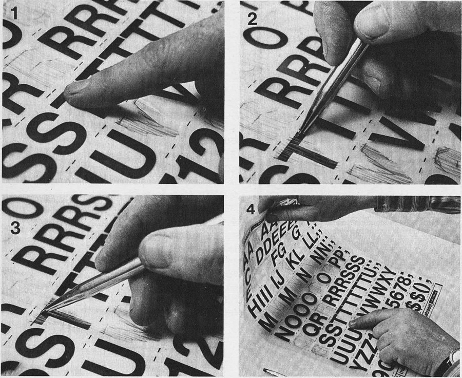
In the early 1960s — an age far before computer-aided design, Letraset revolutionised typesetting. This allowed for designers create to  headlines in mere minutes. The designer would select the desired letter from a typographic transfer sheet and rub it into the layout. This made typography far more economical and put the control of type design in the hands of the designer.

PHOTOTYPESETTING

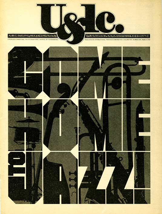
The 1970s brings with it the availability and use of phototypesetting machines which project characters onto film for offset printing. This method allowed for the scaling of typography providing greater flexibility.

LCD SCREENS: THE COMPUTER AGE

By the 1980s most previously mentioned methods of typography have been made redundant with the advent of the personal computer and computer design software such as QuarkXpress and Adobe Pagemaker. This trend will continue well into present day and likely for some time to come in the future.

Type and Page

We can in similar fashion review the historical trajectory of typography design through the ages. 

In 43 BC, Trajan is scribed with carving tools revealing an early system of type. 

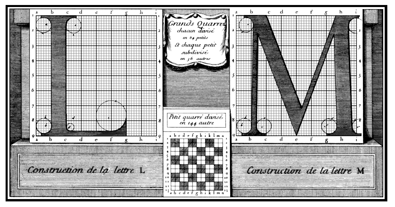
In the early 1600s, Roman Du Roi type is brought about through the kingdom of Louis XIV. 

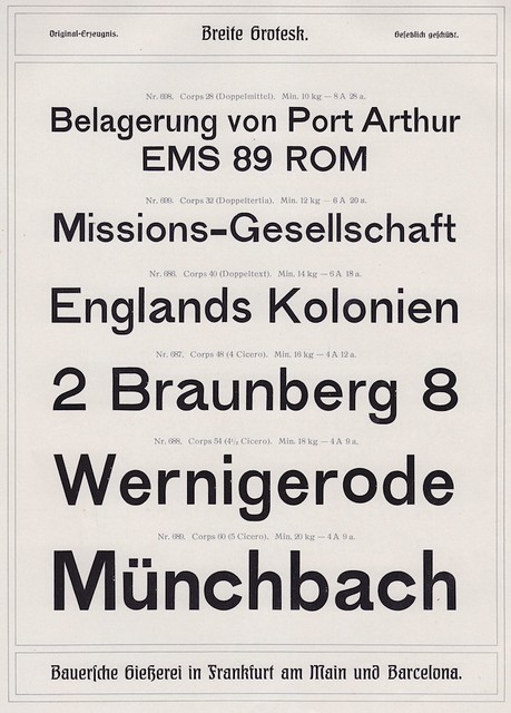
Breite Grotesk arrives in the late 1800s and is a pre-Helvetica san serif. This was quite radical for the era.

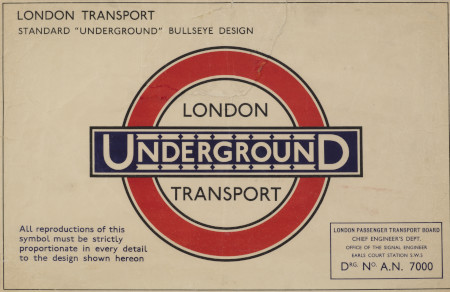
Johnson and New Johnson arrive in the 1930s and is used exclusively for the London Underground wayfinding information system. 

Dadaism is a design movement that arrived during the first World War. It came with it the free use of type to make meaning, illustration, and render sound. 

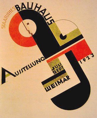
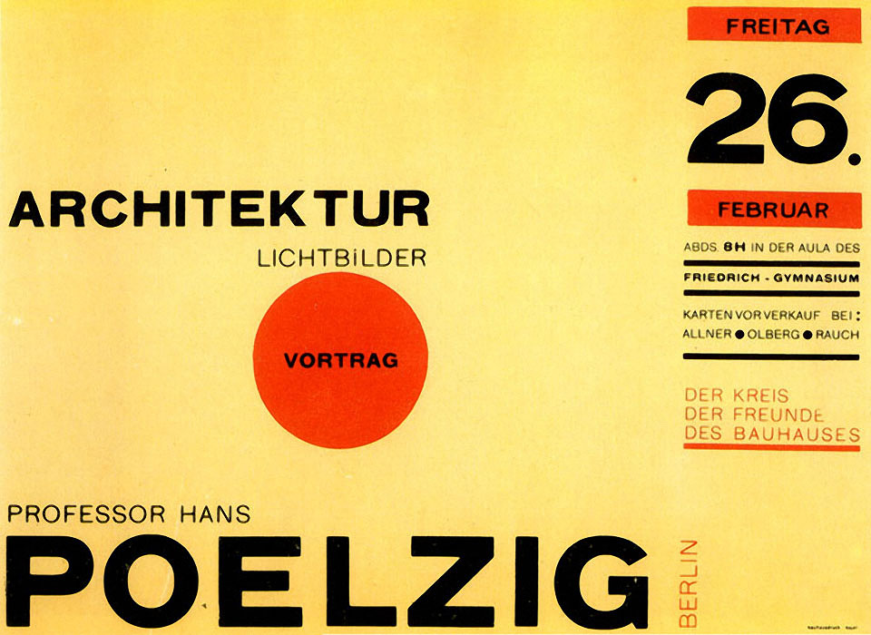
In the early 1900s, the Bauhaus movement brings with it a universal typeface from Herbert Bayer.

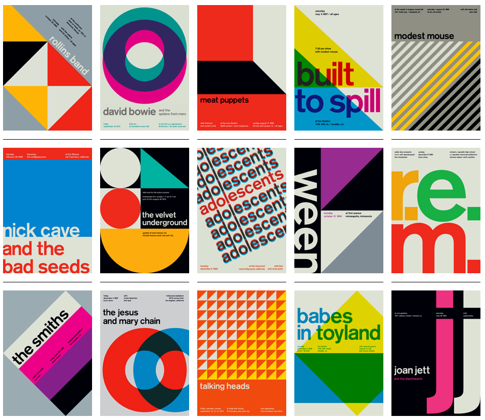
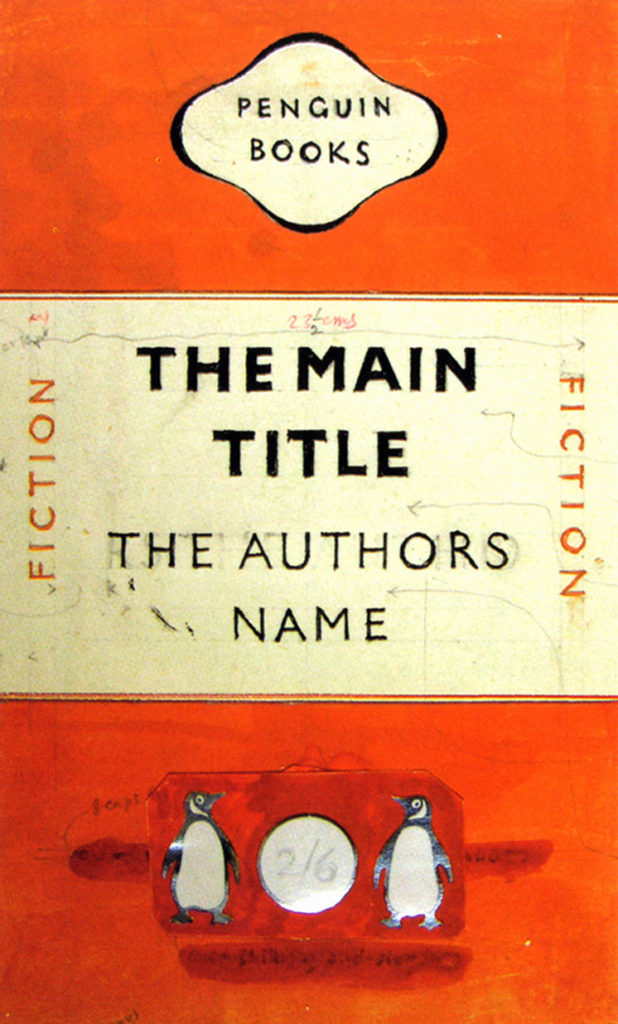
Jan Tischold creates a typographic hierarchy through his work with Penguin Books tarting in 1935. Swiss type appears in appears in the late 1800s and has profound influence well into the 50s and 60s ann beyond. It included a sysTematic approach to type with an extreme reliance on a grid system and system above all over meaning relative to design. 

Vim Karl, a Swedish typographer creates New Alphabet, a futuristic type with extreme precision. 

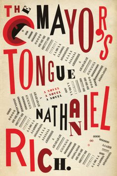
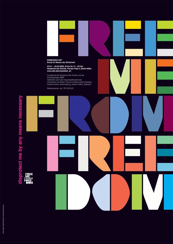
In the 1970s, Wolfgang Weingard, a Swiss designer leverages scale when working with type and design. Then Neville Brody introduces the world to a post-modern and all rules are broken, all bets are off!. 

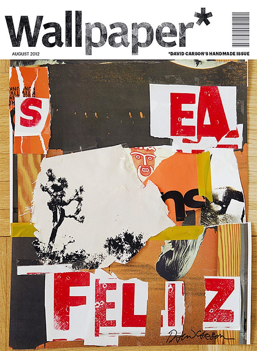
By the 1980s, David Carlson takes the design world by storm with his grunge approach to using Dry Transfer. 

By 1990s and into the early 2000s computer aided design creates greater access to typography and design. And with the 2010s through to present day, the entry is wide for type design. 

Spanning generations and intersecting cultures, technological advancements have ever served as milestones of significance in the history of type. 

REFERENCES

Baines, P. and Haslam, A., (2005) Type & Typography (Links to an external site.). London: Laurence King.
Barrett-Forrest, Ben. “The History of Typography - Animated Short.” YouTube, YouTube, 28 Apr. 2013, www.youtube.com/watch?v=wOgIkxAfJsk.
Kubel, H. and Williams, S., (2015) Type: New Perspectives in Typography (Links to an external site.). London: Laurence King.
Staff, Creative Bloq. “6 Graphic Design Icons Who Used Technology in Original Ways.” Creative Bloq, Creative Bloq, 27 Mar. 2014, www.creativebloq.com/graphic-design/icons-who-used-technology-31411147.