

BIG DATA
Collecting and visualizing the unseen. Beginning with cave paintings and a tapestry from the Battle of Hastings through to the poignant, illustrative information design of Mona Chalabi, Harriet Ferguson walks us through the history of data visualization.
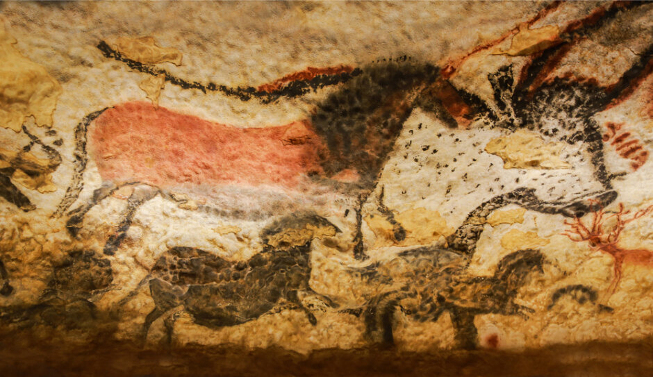
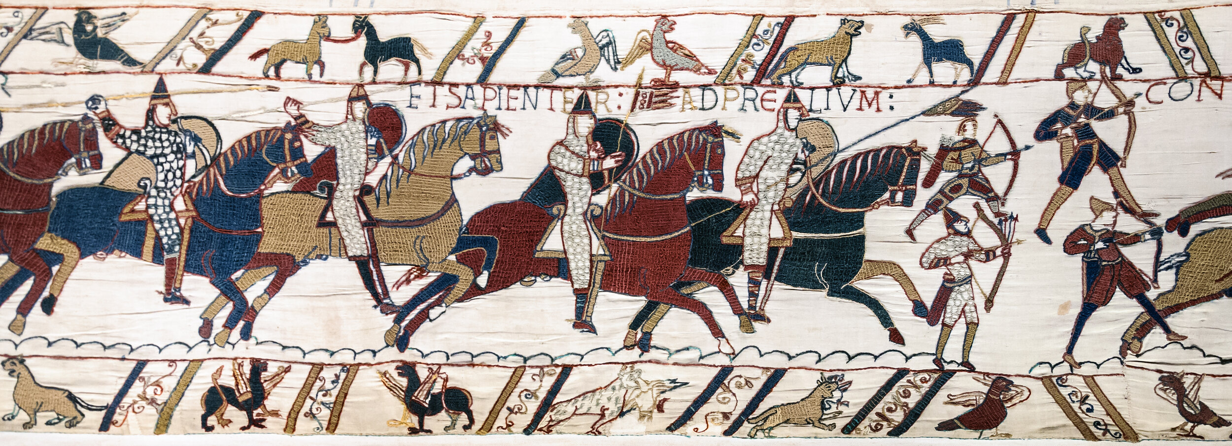
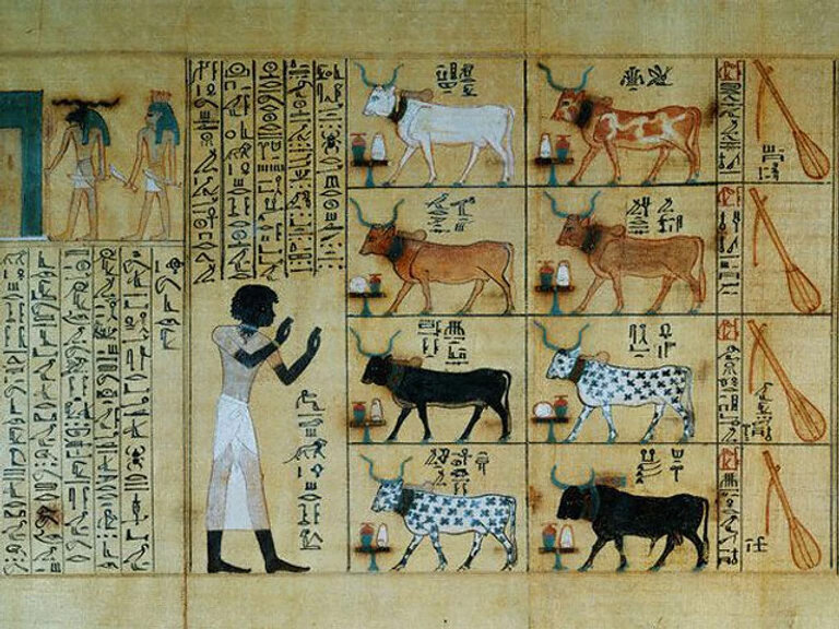
Bringing meaning to the masses, most of which who where illiterate, telling stories through symbology, iconography and data has been around since the dawn of time.

Again, taking advantage of the illiterate, the Church used storytelling via decorative stained glass windows as a way to use fear and power to reach the faithful and nonbelievers alike.

Chinese, Korean, Japanese, Egyptians, and Sumerians relied heavily on logograms, pictograms, ideograms, hieroglyphics, and cuneiforms to tell stories and record history. A pictogram or pictograph is a symbol representing a concept, object, activity, place or event by illustration. Pictography is a form of writing whereby ideas are transmitted through drawing. An ideogram or ideograph is a graphical symbol that represents an idea, rather than a group of letters arranged according to the phonemes of a spoken language, as is done in alphabetic languages.


Fast forward to the 19th century, and we’re introduced to information design with a beautiful examination of Napoleon’s Campaign on Russia by Minard (1869). Not only does the piece translate thousands of points of data, but visually expresses the significance of Russia’s ability to play into the weakness of Napoleon’s ego and ultimate retreat.

Moving into the 20th century, with the advent of the internet and technological era, data visualization continues to evolve and grow in it’s usage as a way to transform information and compress knowledge into visual stories, cultural commentary, and comparisons across seemingly never ending sources. Data is used to visualize the beauty of cooking, impacts on health and medicine, artistic expression of atypical data sets such as a stock exchange, activism. David McCandless, a visual data designer, writer, and journalist - an expert in the field of information design - says it best:
Data is the new soil. Let the data set change your mind set.
- David McCandless
McCandless emphasizes the need for context when using data to tell stories and craft narratives. “Relative figures that connect you to other data to see a fuller picture.”
David McCandless’ data visualization of fears reported by the media over time. Note the gap in fears during 2001-2002 for which the 9/11 terrorist attacks could be responsible.
REFERENCE:
Cheng, Joanne (2014, updated 2015) Analyzing Minard's Visualization Of Napoleon's 1812 March ’, Thoughtbot, 8 June, (Accessed: 7th December 2018)
Falmouth University (2018). Big Data | Lecture. History and Futures GDE720 19/20 Part-Time Study Block S2 (Falmouth, UK: Falmouth University)
Felton, Nicholas (2015) Transforming data into meaningful stories | The Conference 2015, 14 January, (Accessed: 7th December 2018)
History of Visual Communication: Ideograms. (n.d.). Retrieved from https://www.historyofvisualcommunication.com/02-ideograms
Information is Beautiful (2018) Information is Beautiful (Links to an external site.), (Accessed 10th December 2018)
Interaction Design Foundation (2016) Information Visualization – A Brief Pre-20th Century History, (Accessed: 7th December 2018)
McCandless, David (2010) The beauty of data visualization, July, (Accessed: 7th December 2018)
McCandless, David (2008), Information is Beautiful. (New York: HarperCollins).
Morton, Timothy (2013), ‘Chapter 1: What Are Hyperobjects? and Chapter 2: The Time of Hyperobjects’ in Hyperobjects: Philosophy and Ecology after the End of the World , (Minneapolis: University of Minnesota Press).