GDE710 W10 | Workshop Challenge

TYPOGRAPHIC TASK

AMERICA MUST CHANGE

APPROACH

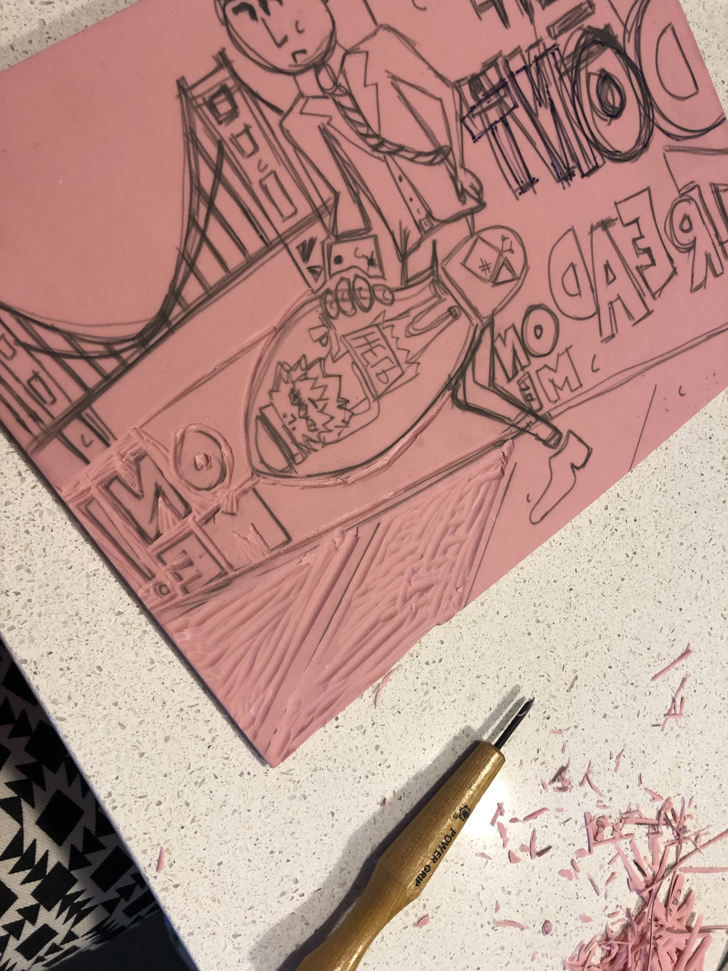
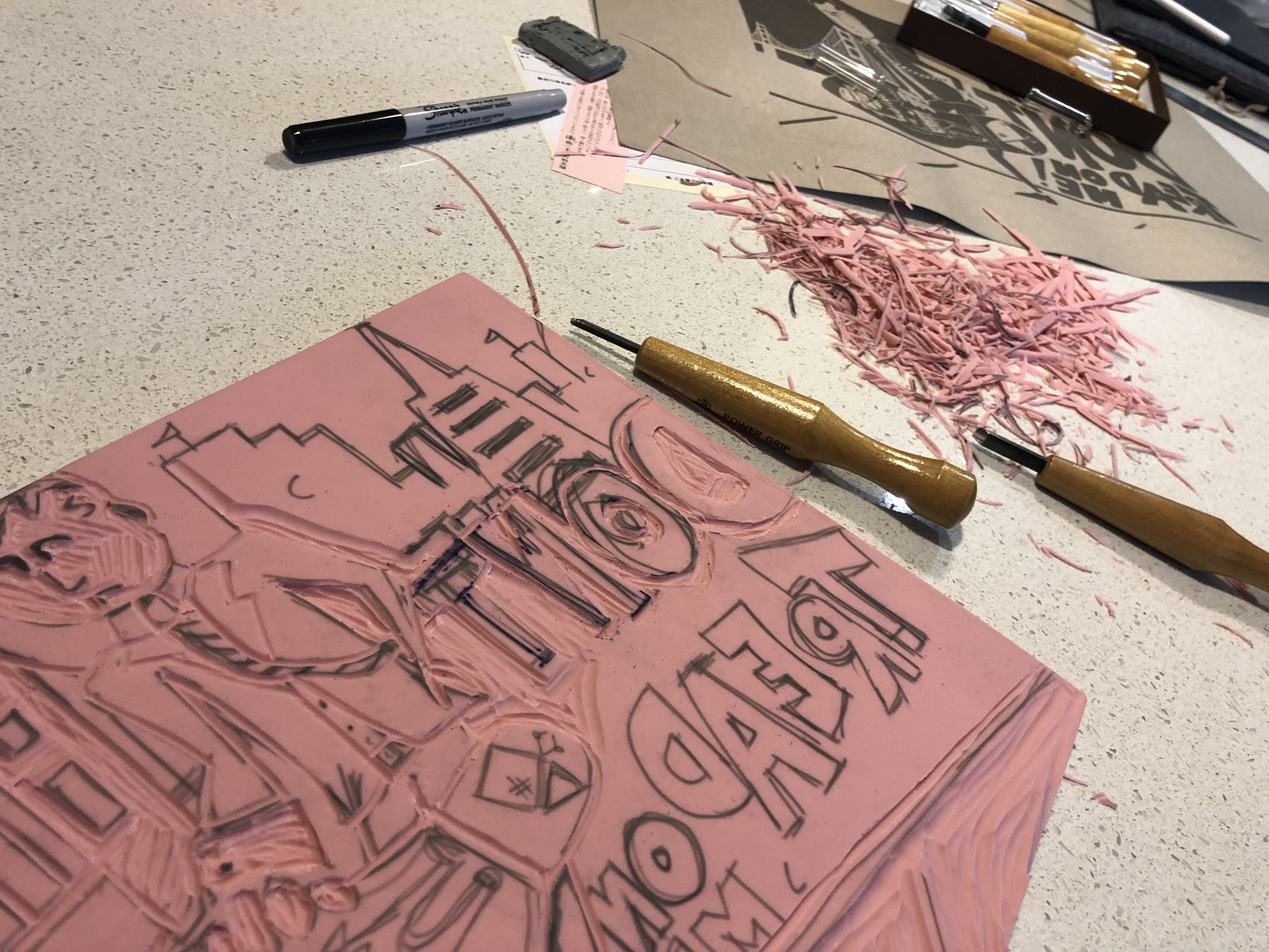
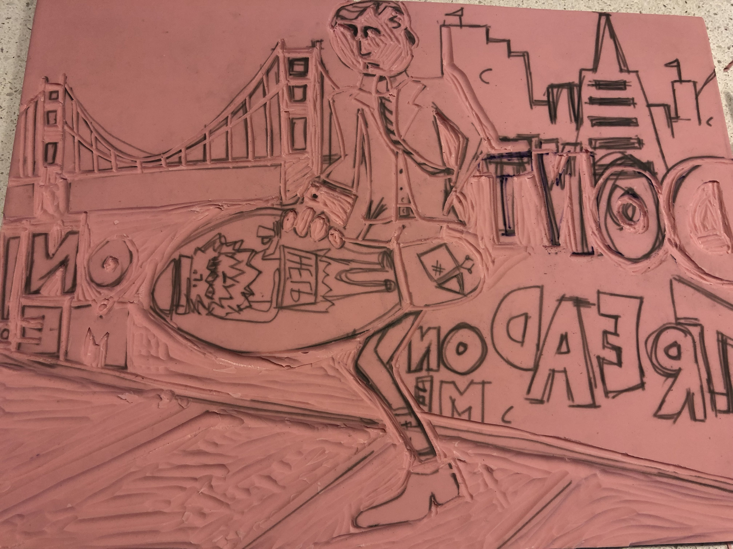
For this week’s challenge, I wanted to create a piece in response to the mass shootings that have been happening in the United States and to our country’s inability to inact powerful gun legislation. The final illustration is on the following page.

I created a scene using the powerful words that former US President Obama shared after the mass shootings in Gilroy, CA, El Paso, TX, and Dayton, OH. 

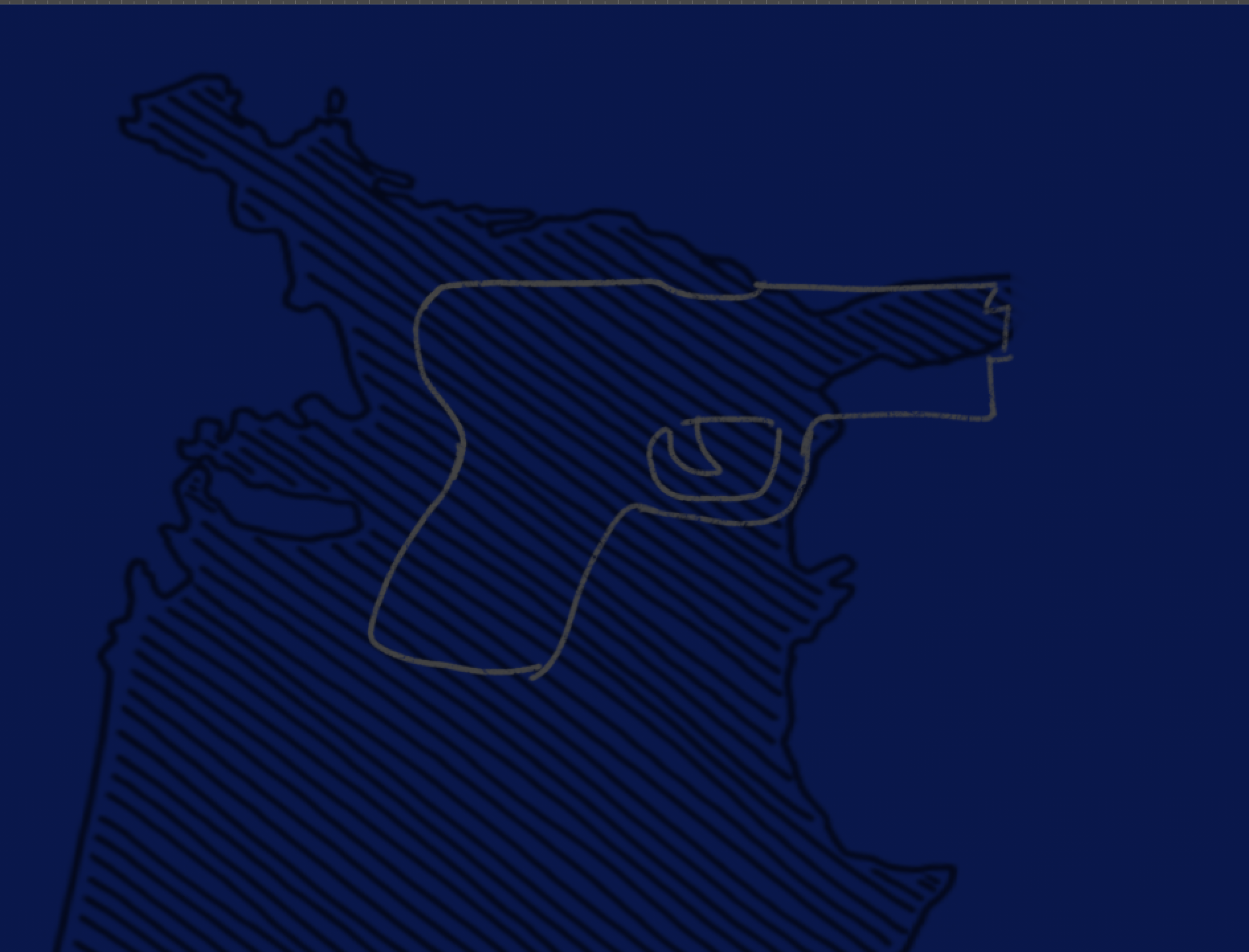
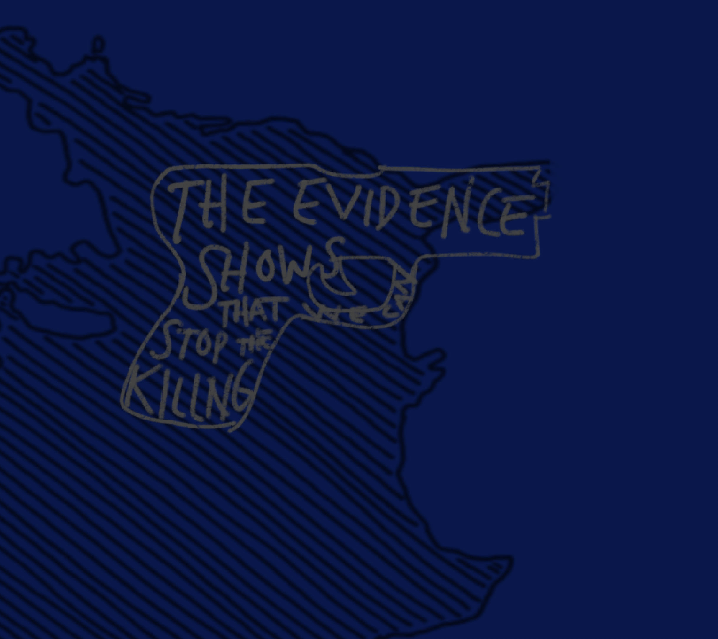
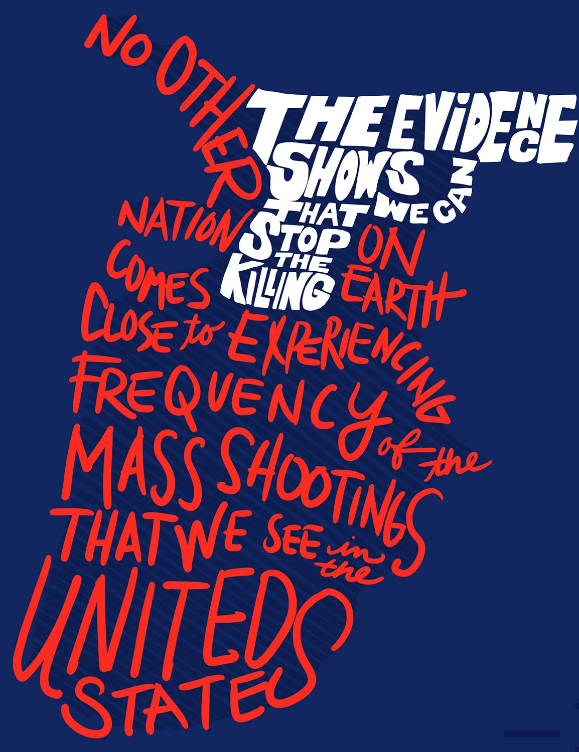
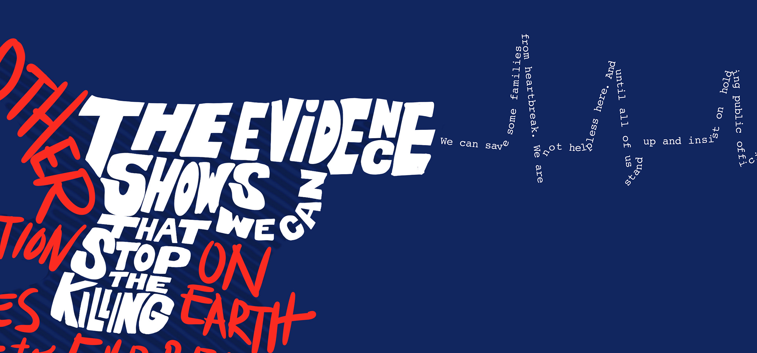
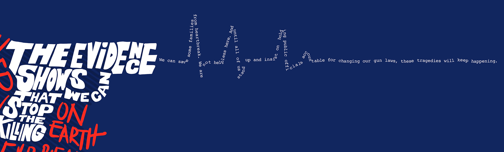
Using Obama’s words to form the shape of the U.S. I chose to place the shape of the country on its end, as a nation I believe we are in the upside down. I formed a gun and started to rough in the typography with a powerful portion of the statement and placed it in the southern portion of the states, where a majority of Second Amendment fanatics reside. 

I chose hand made lettering for the entire portion that makes up the United States as this is a social and human problem.

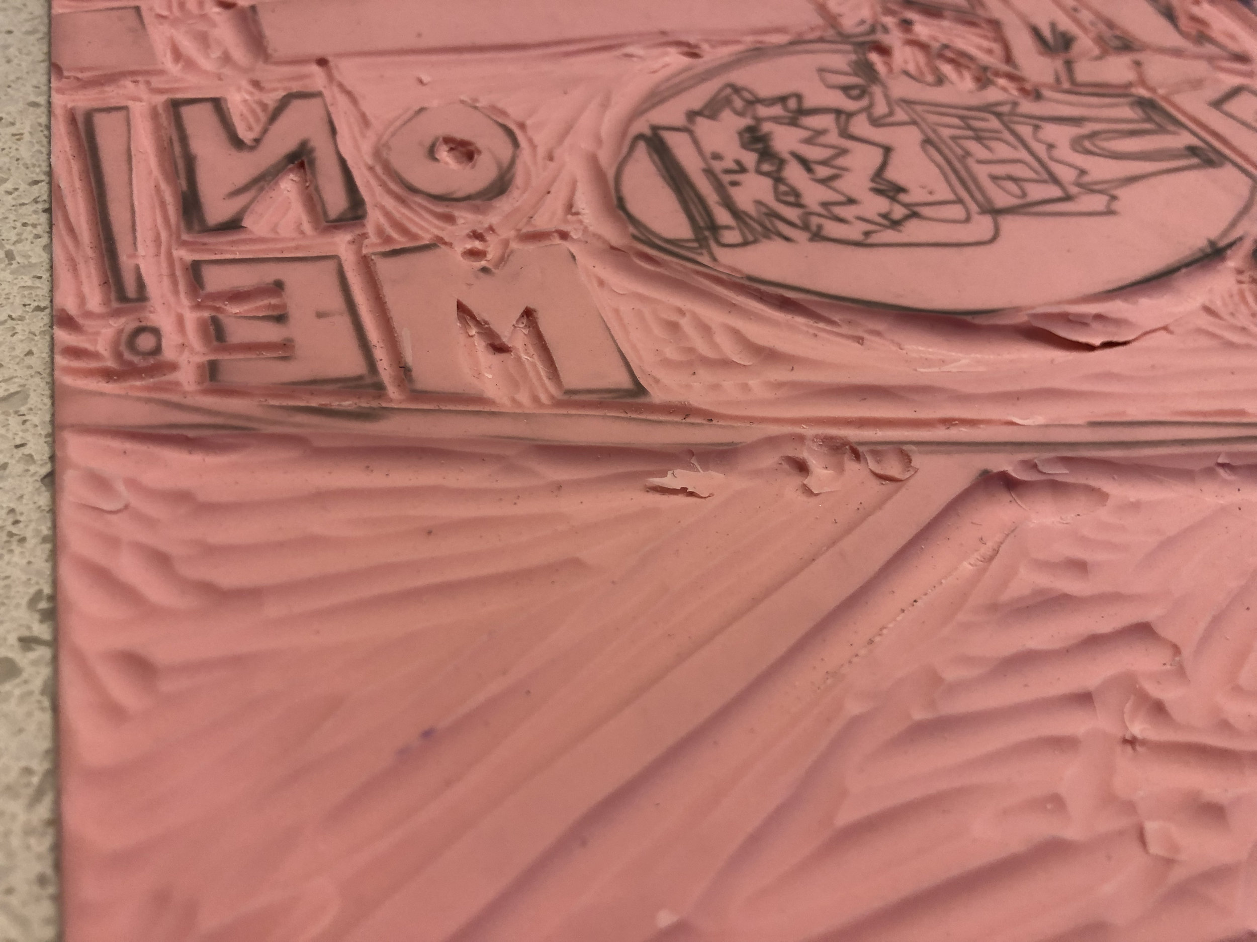
Lastly, I illustrated the data point that last year alone over 59% o f the American population was negatively impacted by gun violence by omitting 59% of the letters in the Second Amendment. Who is this amendment serving? Not the majority.

REFERENCES

Kim, C. (2019, August 05). Obama denounces gun violence and white nationalism after recent mass shootings. Retrieved from https://www.vox.com/2019/8/5/20755303/barack-obama-mass-shootings-dayton-el-paso-gun-violence-white-nationalism

Mass Shootings in America, 2009 to 2017. (n.d.). Retrieved from https://everytownresearch.org/reports/mass-shootings-analysis/

GDE710 W9 | Workshop Challenge

MESSAGE vs. MEDIUM

This week’s workshop challenge asks, “How can a message be enhanced through the medium in which it is implemented?”

We are challenged to communicate an emotion you perceive your city or location is about, then take the word and use an appropriate material, form or medium – 2D, digital, 3D or immersive.

My city is San Francisco, and the word I chose is contradiction. While I am a recent import to the city, and am having quite a grand love affair, I am privileged. Not everyone is as fortunate to hold this lovely city in the highest regard.

Since the first tech boom of the 1990s, San Francisco has been on a course of contradiction. San Francisco has always been a city of pioneers, progressives, freaks and geeks, artists and academics. All together in a community stew of vibrant discourse, advancement, social exploration and evolution at the edge. With the tech booms — past and present — a shift has happened where the city has become less vibrant, dynamic, and diverse. The economics and extreme wealth associated with this new San Francisco is changing it from a city for all to a city for the one percent. The middle class is disappearing and the homeless population grows at a rapid rate.

APPROACH

I chose to illustrate this tension of contradictory emotions about San Francisco through something tactile: a linocut carving and subsequent print. I’ve never done linocut before and opted to again challenge myself to do something experimental and take some risks.

My inspiration was Käthe Kollwitz, prolific artist who utilized lithography and wood cuts has her medium to express herself and her observations and storytelling of the human experience. Her work is haunting to me. She reveals the struggle of the human condition and class through deep cuts that are minimal, but at the same time so very expressive.

The People

The People

I started a sketch, then built my illustration that would serve as my linocut carving.

I start with the contradiction: a posh businessman is angered by stepping in it. “It” being a homeless man.

I start with the contradiction: a posh businessman is angered by stepping in it. “It” being a homeless man.

I add the city as a backdrop and the type “DON’T TREAD ON ME!”. The number of homeless living on the streets in San Francisco has lead to an outrage of “the haves” in response to the amount of human feces belonging to “the have nots” on sidewalks. T…

I add the city as a backdrop and the type “DON’T TREAD ON ME!”. The number of homeless living on the streets in San Francisco has lead to an outrage of “the haves” in response to the amount of human feces belonging to “the have nots” on sidewalks. The outrage is clearly misplaced.

Next up: let’s get cutting! Progress shots…

I had to make some adjustments based on how the vinyl material responded to my inexperienced hand as well as the amount of detail in the original drawing.

And now for some ink…

FINAL PIECE

This image shows the final piece, the ink transferred to a lovely Strathmore printmaking sheet. I like how the entire piece can serve as a metaphor for the contradiction that is San Francisco: while some are in the one percent, some cannot even carve out a living and are left to the streets. The inking and carving proves permanence that this situation as it is will remain until truly and empathetically addressed. The transfer of ink to paper via a pressing and peeling tracks to the pressure of the city to acknowledge this shift as well as the literal scraping of human shit off of one’s fancy shoe.

It turned out a lot rougher than I’d imagined, but like how that furthers the imperfection of my commentary on San Francisco.

IMG_3980.jpg

REFERENCES:

Heshmat Ph.D., Shahram. “What Does It Mean to Have Mixed Feelings?” Psychology Today, Sussex Publishers, www.psychologytoday.com/us/blog/science-choice/201603/what-does-it-mean-have-mixed-feelings.

“Käthe Kollwitz: MoMA.” The Museum of Modern Art, www.moma.org/artists/3201.

GDE710 W8 | Workshop Challenge

MIND THE GAP

This week’s Workshop Challenge asks us to investigate and identify our skills as graphic designers as well as any gaps.

MY SKILLS

as a graphic designer, and in my work as a creative director:

  • adobe creative suite

  • advocacy

  • active listening

  • articulating ideas

  • belief

  • brainstorming

  • bullshit detector

  • concepting

  • creativity

  • curiosity

  • design foundations

  • editorial design

  • emotional intelligence

  • empathy

  • endurance

  • flexible

  • giving critical feedback

  • good instincts

  • hope

  • intuition

  • marketing

  • motivating others

  • observing

  • project management

  • print production

  • receiving critical feedback

  • self awareness

  • typography

MY GAPS

Note: items in bold italics are gaps that are areas of most need, or most significant gaps:

  • alternative perspectives

  • animation

  • art & design history

  • boldness

  • confidence

  • desire

  • effective storytelling

  • experimentation

  • exploration

  • inspiration

  • letterpress

  • linocut

  • making

  • mentorship

  • networking

  • patience

  • persuasive

  • photography

  • proactive outreach

  • procrastination

  • saying “no.”

  • side projects

  • social design

  • videography

  • willing to take risks

  • workload management

APPROACH

In reviewing my list, it occurred to me that my skills tracked well to the body’s anatomy. Further, my highschool fascination with the medical illustrations in Grey’s Anatomy compelled me to make an infographic poster using an illustration style that I’d never attempted before to portray my skills and their respective gaps. No better time than the present to tackle those gaps (exploration, experimentation, etc.)

This started with a quick doodle paired with the list to map each skill to a different area of the body (head, heart, back, hands, etc.)

anatomy concepting.jpg

Then a rough sketch of my self-portrait.

Anatomy of a Graphic Designer 1.jpg

FINAL PIECE

Inspired by the poster designs of James Victore, I decided to make a poster for my final piece. I chose a color palette that was electric, a illustration style that was fluid and more abstract. For my skills, I chose to use white as the color to signify the most concrete or solidified of my skills. Using two hues of blue from the illustration to indicate my gaps: the darker the blue, the wider the gap.

The Anatomy of Graphic Designer, Kris Miller

Anatomy of a Graphic Designer MOCKUP.jpg
Screen Shot 2019-07-24 at 8.46.38 PM.png
Screen Shot 2019-07-24 at 8.47.31 PM.png
Screen Shot 2019-07-24 at 8.47.44 PM.png

REFERENCES

Victore, James. (2010) Victore, or, Who Died and Made You Boss? Abrams.

GDE710 W8 | LECTURE REFLECTION & RESEARCH

SKILLS & MAKING

LECTURE REFLECTION

This week’s lecture proposes two essential questions to reflect and investigate:

  1. What would you like to be doing that you are not doing in your work?

  2. How important are side projects and are you working on them?

We hear from each of our studio professionals with regard to both of the aforementioned questions and it is quite clear they are all (Simon Manchimp, Sam Winston, Regular Practice, Sarah Boris, and Intro) doing what they want to be doing and are not lacking or longing for work they currently do not have. This may well be as they all loud side work as a necessary component to supporting and enhancing their daily practice.

Key takeaways from their common responses include:

  • Side projects encourage you to “think differently.” - Simon Manchimp

  • Give yourself space as a means to find solutions, new ideas, avenues, and creative projects. - Sam Winston

  • Authorship serves an important role within side projects not as often afforded in day-to-day work. You get to define who you are and what you want to present. - Regular Practice

  • Side projects can define how you and others see you as a designer. No compromises. -Sarah Boris

  • Side projects feed the day-to-day. Get to learn new crafts, be inspired, and are wholly owned. -Intro

RESEARCH

OBLIQUE STRATEGIES: Brian Eno develops card-based system for promoting creativity and pushing through creative thought.

The card is trusted even if its appropriateness is unclear.

-Brian Eno


”KEEP GOING” School of Life piece teaches thoughtful, empathetic, and practical approaches to creating:

  • Gap between what you wanted to make and what you’ve made

  • Forgive yourself for the horror of the first draft

  • Talents will come up to speed with your tastes

  • Work hard. Little by little you will improve

“THE IMPORTANCE OF VULNERABILITY” - School of Life explains the value and practicality of being vulnerable

  • offers connection and respect

  • exchange of sympathy and consolation

  • creates a safe place via the gift of risk given to someone else

ADDITIONAL RESEARCH:

JAMES VICTORE

I am deeply inspired by artist, designer, protagonist, and braveheart, James Victore. In exploring, investigating, and evaluating my skills during this week’s assignments, I came to a greater familiarity with Victore. I purchased and read his book, Who Died and Made You Boss, a reflection of his work as described by the author but also in service to other designers (and non-designers) to find their voice, to fail, to be brave, to not give a shit as to what others think of your work, and to press on.

His self directed works are some of the most inspiring to me. No one hired him to speak up, speak out, and find a place in this world for his message. He just did it because he felt it was important and needed to be done. One in particular that stands out to me is his work to counter former New York City Mayor, Rudy Giuliani’s MTA campaign to diminish the giving of money to panhandlers and the homeless.

MTA poster for New York’s subway system discouraging the giving of monies to panhandlers and homeless.

MTA poster for New York’s subway system discouraging the giving of monies to panhandlers and homeless.

Victore’s self-published response to the MTA campaign.

Victore was bold enough to appropriate the MTA logo for his poster, and therefore it found its way hanging directly alongside the actual MTA-backed campaign. Brilliant.

REFERENCES

Rock, M. (2017) 2x4 Multiple Signatures on Designers, Authors, Readers and Users. New York: Rizzoli.

Brian Eno, Oblique Strategies (2018) Via https://en.wikipedia.org/wiki/Oblique_Strategies

Victore, James. (2010) Victore, or, Who Died and Made You Boss?Abrams.