GDE740 W12 | Workshop Challenge

THE CHALLENGE

  • Record a five minute presentation to analyse and evaluate the development of your chosen Industry Set project brief.

  • Reflect on the project evolution, strategy, innovation, user testing, positioning and final delivery.

  • Record your presentation in the format or media of your choice (for example, a Keynote slide presentation, video recording, podcast or website).

  • Ensure you articulate the project’s relationship to its original research and strategic starting point.

FINAL DESIGN OUTCOME AND REFLECTION

Below you can see a recording of the app design. I am really pleased with the way it turned out. It was a very educational project and experience.

Imposter syndrome is something that impacts over 70% of people at some point in their lifetimes. Often far more than just once. There are even higher rates of imposter syndrome in the creative community.

Developing a mechanism for conversation around this dilemma is key. This app is a good start. Further development is greatly needed to normalize and mitigate the negative impacts of imposter syndrome.

What would I do differently?

In terms of project or campaign deliverables, and given more time, I would design a robust GottaBe.Me Imposter Syndrome kit which would include posters, tip sheets for engaging in group discussions for instructors and creative students, for counselors and for employers. Additionally, I would create social media assets so that folks can relay what they’ve learned about themselves with regard to imposter syndrome and provide a mechanism for having their own conversations.

From a technical perspective, I would have liked to create assets that are more dynamic like the mycreativetype.com animated characters as well as work with age-appropriate content developers such as student writers and skilled motion graphic specialists. This would really take the campaign to the next level.

All in all, I am really pleased with the way the project evolved. I really appreciate the input of my fellow cohort members and instructors as well as my colleagues in my professional community which is a university teaming with the target audience for whom my projects was developed. I work side-by-side young designers every day which made the project personally and professionally very rewarding. Lastly, I am delighted that I stretched myself to learn a new tool: Adobe XD. I was intimidated at first, but likely more due to my own imposter syndrome than the overall complexity of this very intuitive and well designed program.

The only real downside to this project was my inability to keep up with the course as it progressed. I faced a very difficult professional workload this course which definitely impacted my ability to focus on my studies in real-time. This taught me a lot about what I can do differently moving into the next course with regard to time management, establishing effective boundaries, and asking for help.

REFERENCE:

Skillshare (2018) Adobe XD Masterclass: Design a Mobile App & Website Wireframe. Retrieved from https://www.skillshare.com/classes/Adobe-Xd-Masterclass-Design-a-Mobile-App-Website-Wireframe/1543837313/lessons.

Beirut, M. (2015) How to use graphic design to sell things, explain things, make things look better, make people laugh, make people cry, and (every once in a while) change the world, London, Thames & Hudson.

AWWWARDS, (2018) Redefining Reality with Geoffrey Lillemon, Creative Director of W+K's Department of New Realities. Retrieved from: https://youtu.be/AUuTjsbNvpk

99U, (2019) Joel Beckerman: Designing With Sound. Retrieved from: https://vimeo.com/343057666

Glug, (2019) Marcello Google Creative Labs. Retrieved from: https://youtu.be/LdCBnqbCtm8

Skillshare, (2013) Design as Idea with Bob Gill. Retrieved from: https://youtu.be/_-nuzlpiKag


PreviousNext


GDE740 W12 | Lecture Review

OUTCOME & AMBITION

This week we learn from four new agencies who answer the question:

  • How does project evaluation help you, client, or the audience measure effectiveness of the project’s final outcome?

lily-banse-Kue5QvRhuQw-unsplash.jpg

FELD

FELD believes project evaluations or debriefs to be highly valuable. They look at this as “lessons learned.” What worked or what didn’t work on a project. Or what would you do differently. Moreover, they see that the debrief part of the project provides the necessary space to effectively reflect on the project in order to best present is significance and narrative. When you’re deep in the project, it is more difficult to see the bigger picture. Evaluation helps to reveal or remind us of that bigger picture.

ACCEPT & PROCEED

Accept & Proceed’s project evaluations vary by client. They tend to simplify the evaluation process down to whether or not they get repeat work from a given client. That is their litmus test for success. I personally see that as a portion of the key aspects of a debrief or evaluation, but not the sole input of valuable project reflection.

STUDIO DUMBAR

Studio Dumbar debriefs projects with the client in person and again via anonymous survey. They share the results of that evaluation with the entire project team and immediately respond to anything that they see as an opportunity to improve, especially if it is in regard to client relationships. Rarely, when budgets allow, they will seek out more scientific methods of evaluation including cognitive biofeedback studies where subjects are connected to electrodes that read brainwaves as they are asked questions about a given project.

EDENSPIEKERMANN

EdenSpiekermann’s branding projects can run for a very long time with year-long launch plans making it difficult to seek client evaluation. Their digital projects conversely provide immediate results. They debrief their projects to reflect on what worked or didn’t, how they can improve their processes, and to determine whether or not they met the needs of the brief by solving what they set out to solve.

The takeaway here for me is that there is a wide range of inputs methods that you can obtain when a project concludes. The key is to reflect and learn in order to improve and grow.

REFERENCE

Falmouth University (2018). Outcome & Ambition | Interviews. Application and Interactions GDE740 19/20 Part-Time Study Block S1 (Falmouth, UK: Falmouth University)

GDE740 W11 | Workshop Challenge

THE CHALLENGE

  • Seek key stakeholder feedback to ensure your project answers the original project brief, strategy and target audience.

  • Respond to this feedback and refine the design of your final outcome.

DESIGN DEVELOPMENT

The app’s design development proceeded nicely even though I’d never before used Adobe’s XD software application. XD is pretty intuitive and flexible. If you’ve got InDesign and Illustrator experience, you will find yourself with a leg up in Adobe XD. After a few tutorials, I was implementing the design, the UX/UI and beta testing the app on my iPhone.

The feedback I was given was largely positive. There were some UX concerns with legibility and therefore increased the size of the font overall. The colors, transitions, and overall design was very positively received, especially among the target audience.

Design development of the GottaBe imposter syndrome app.

CHARACTER DEVELOPMENT AND FINAL DESIGNS

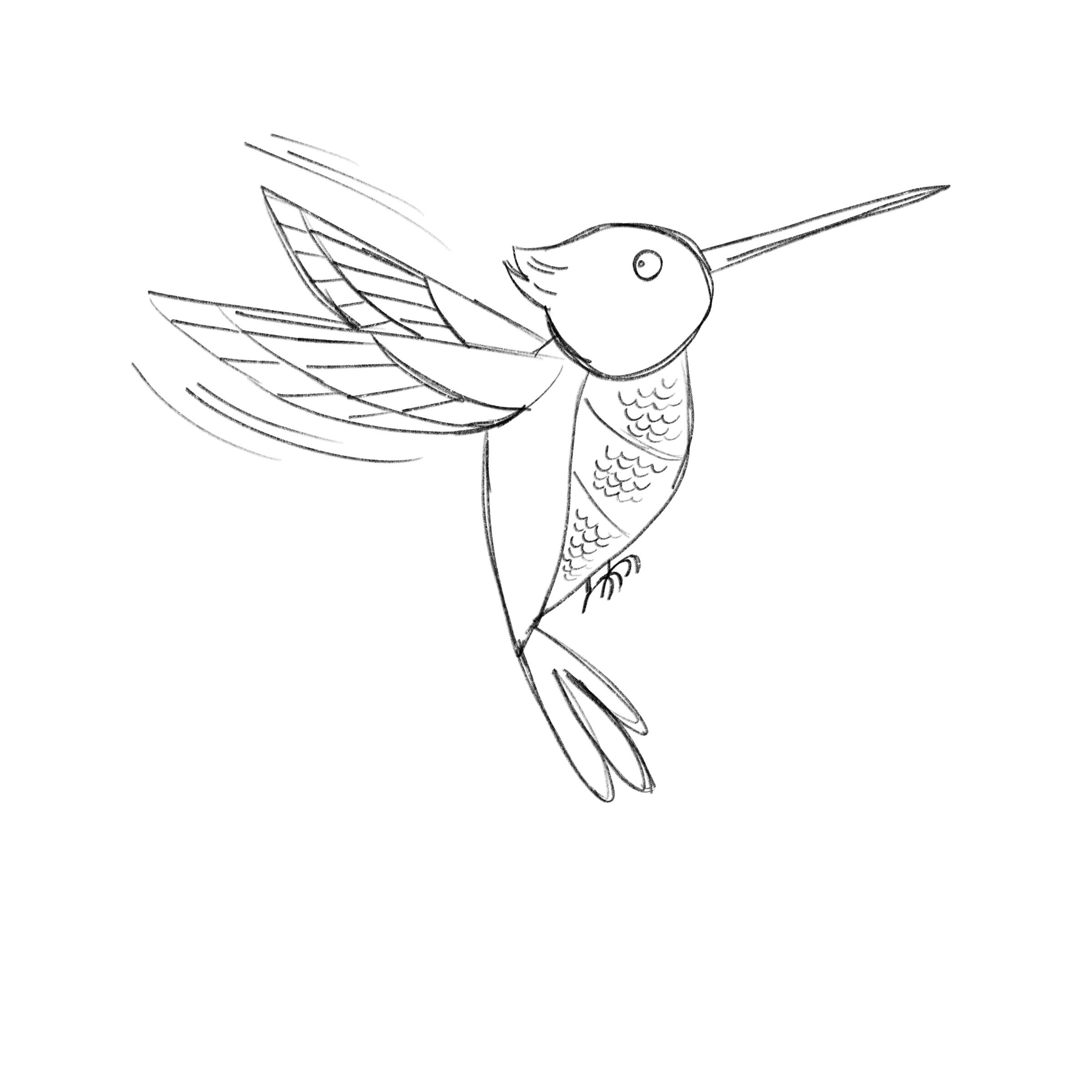
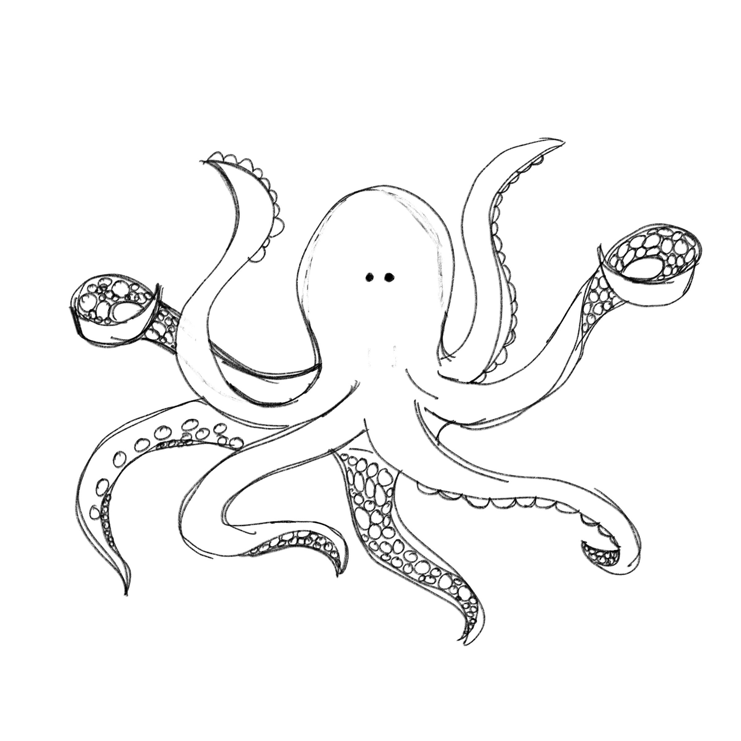
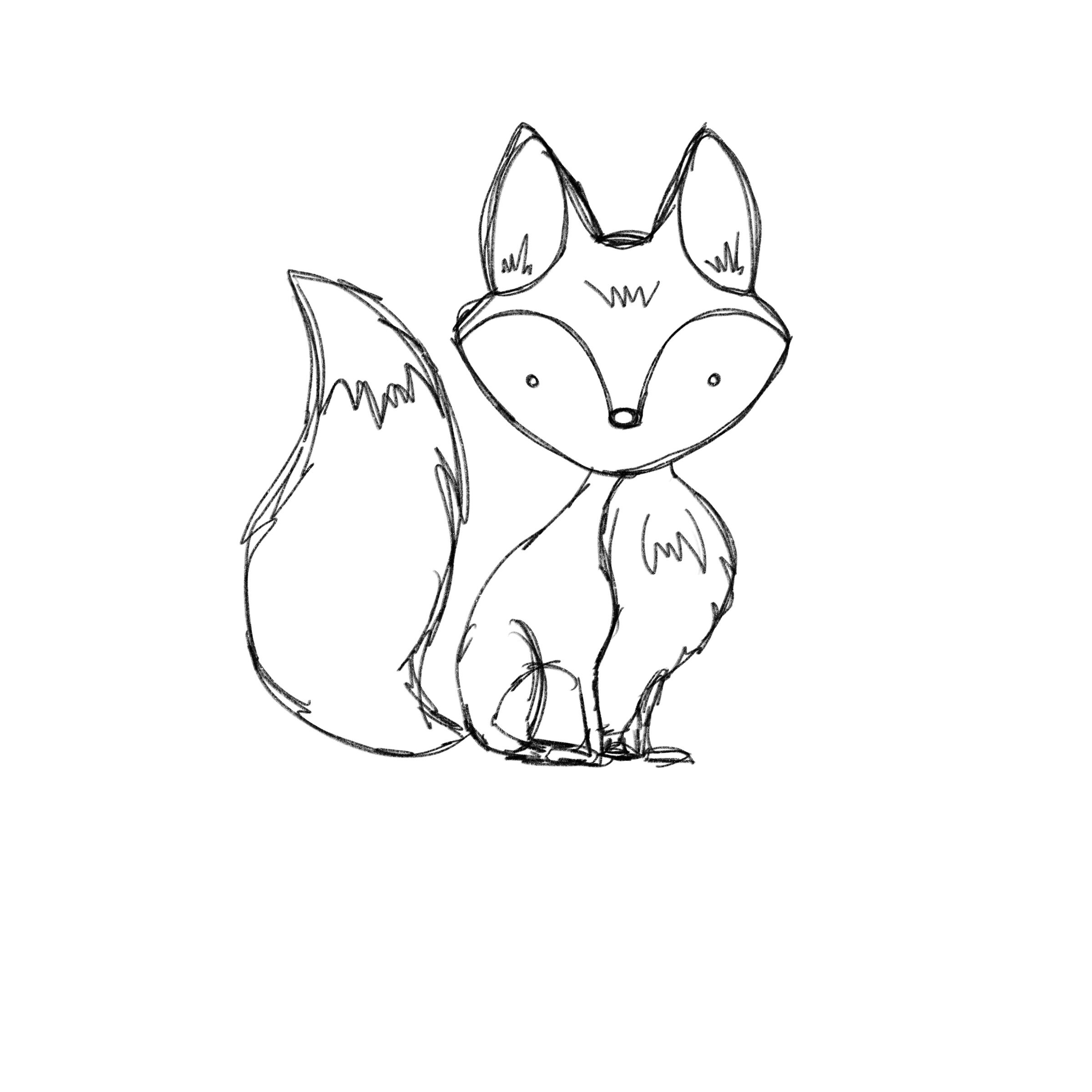
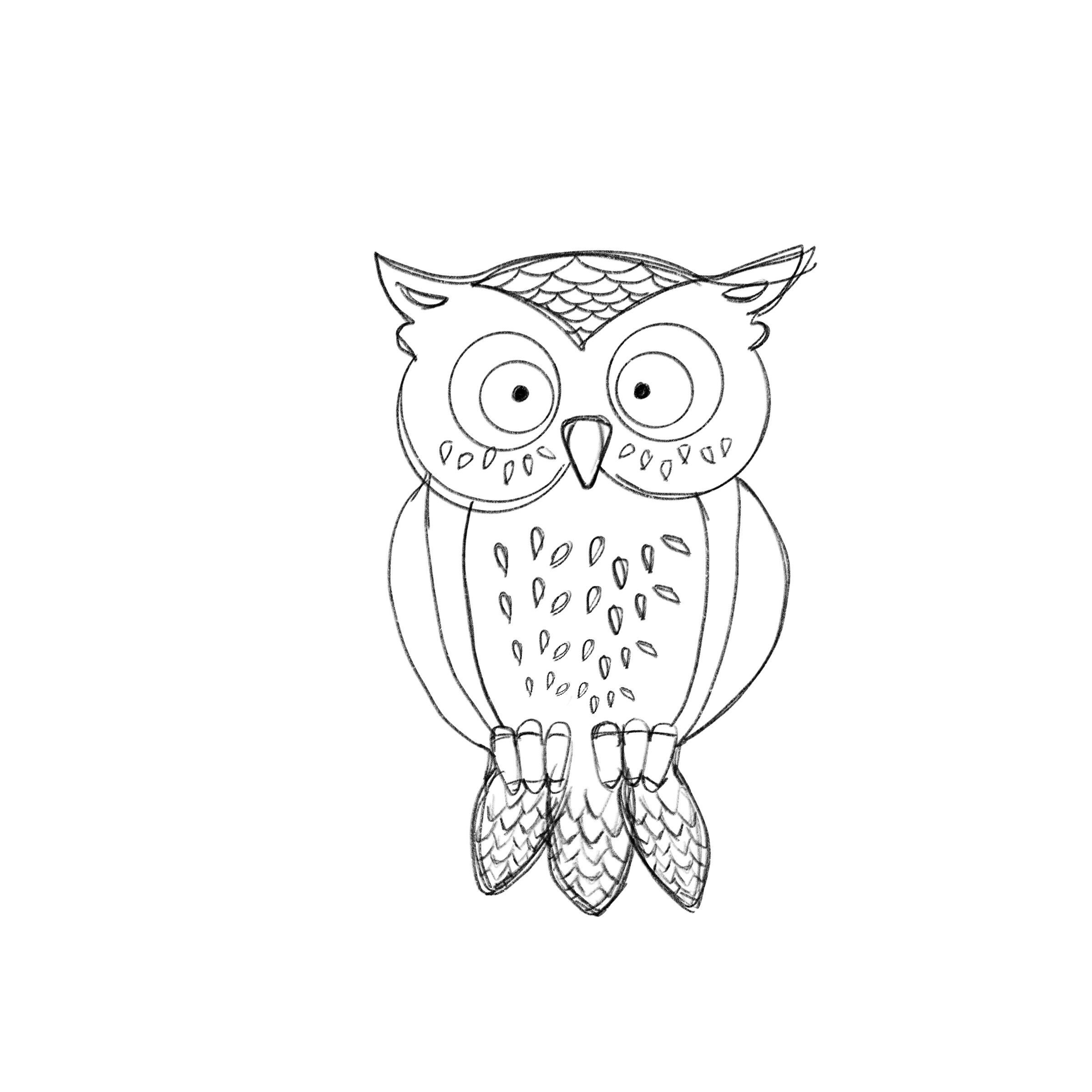
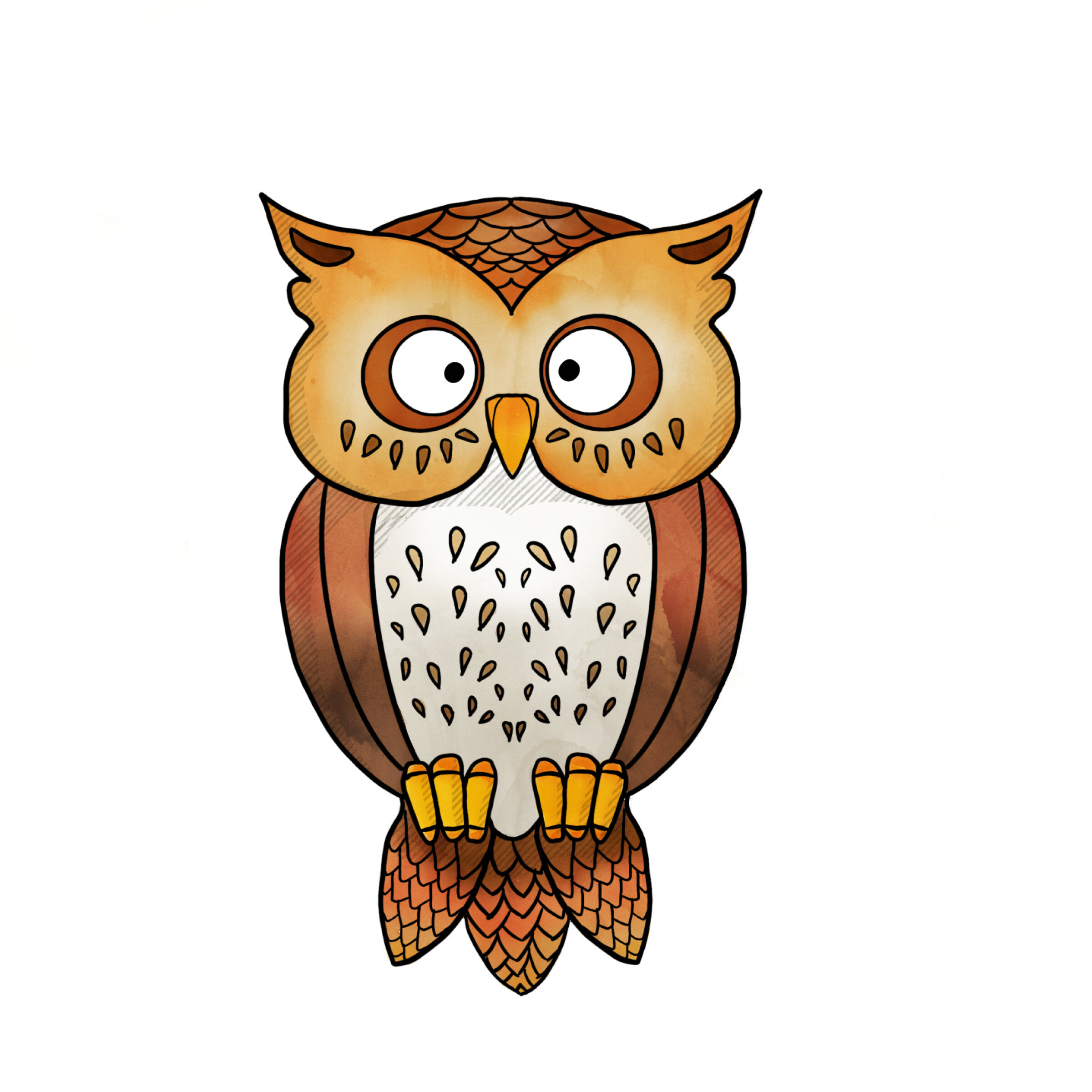
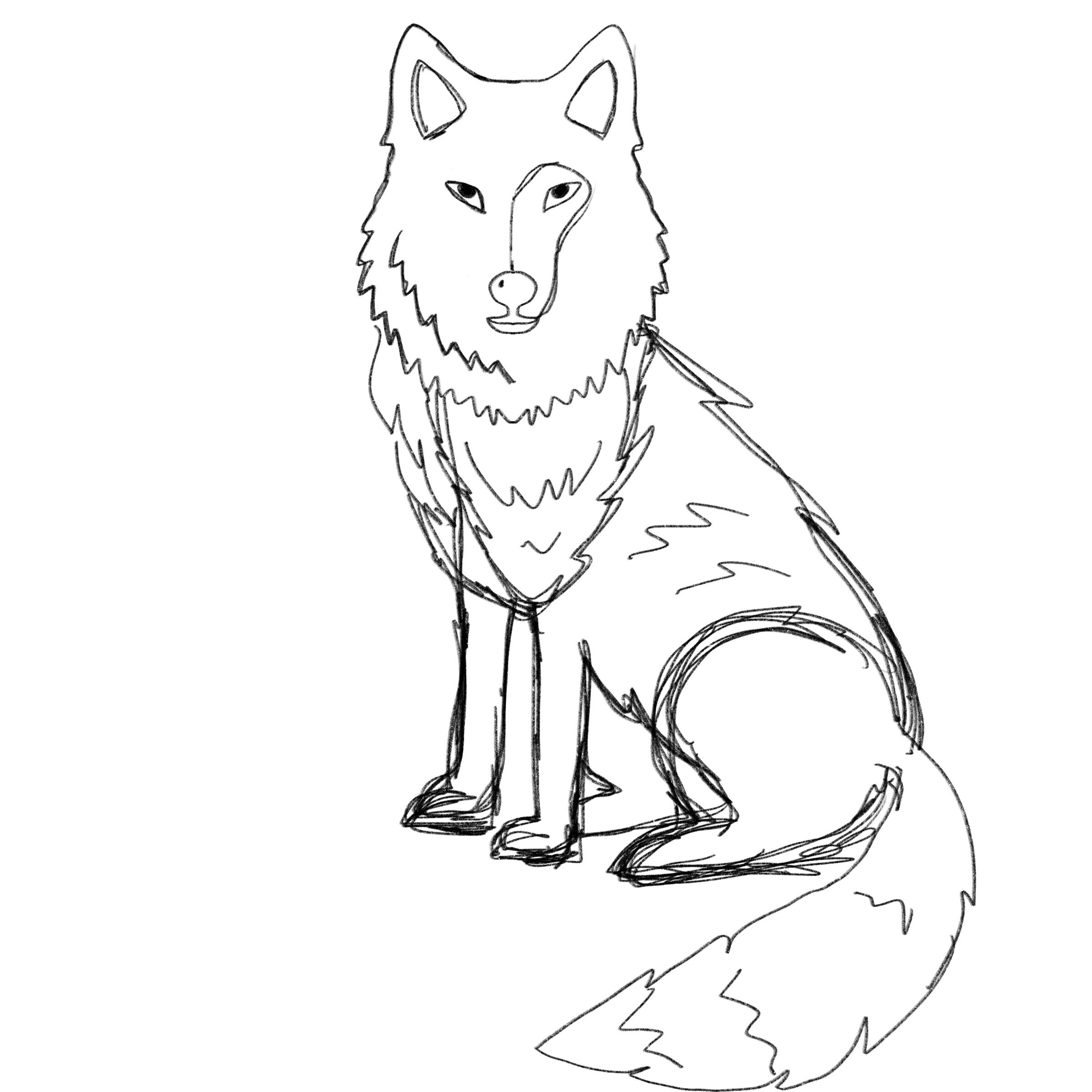
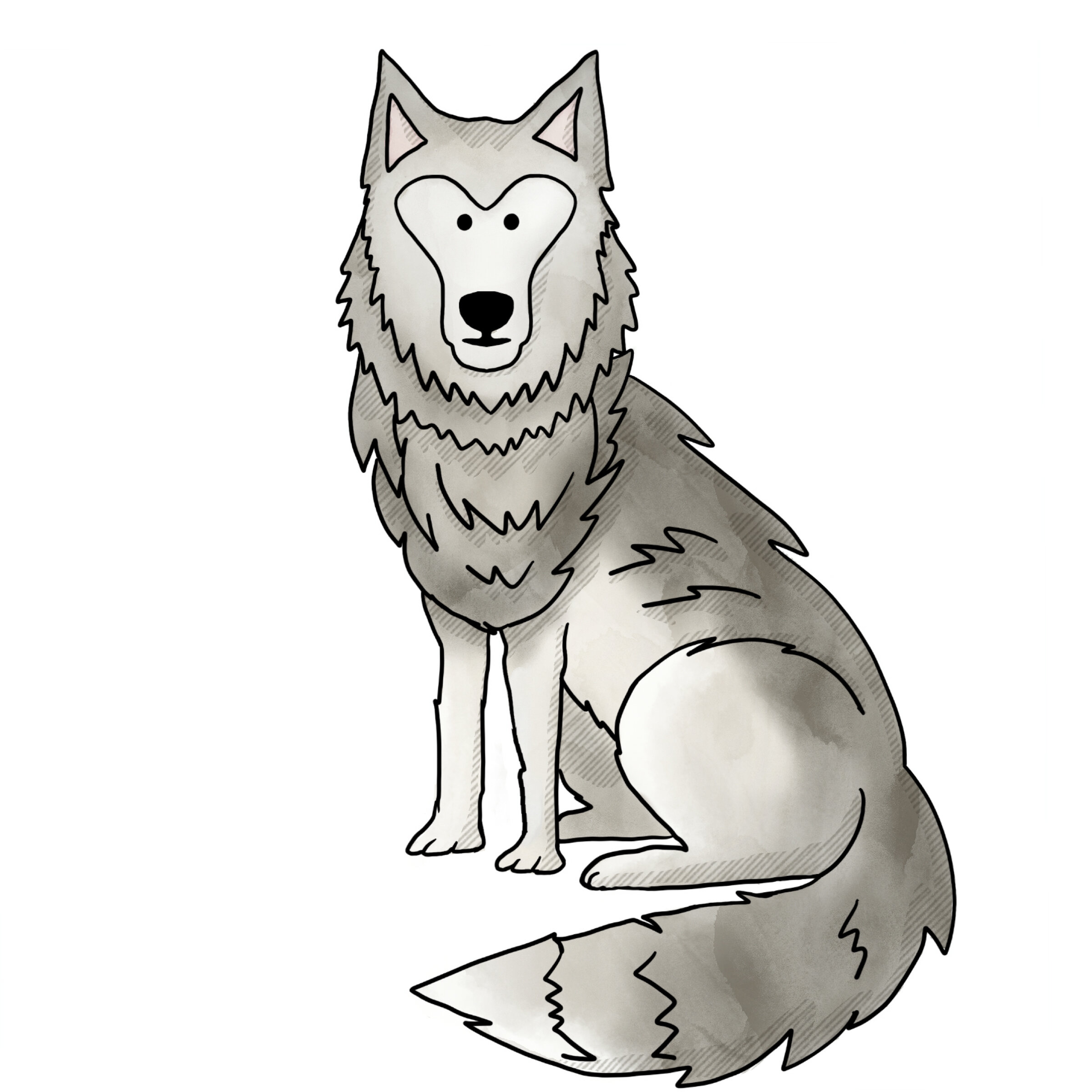
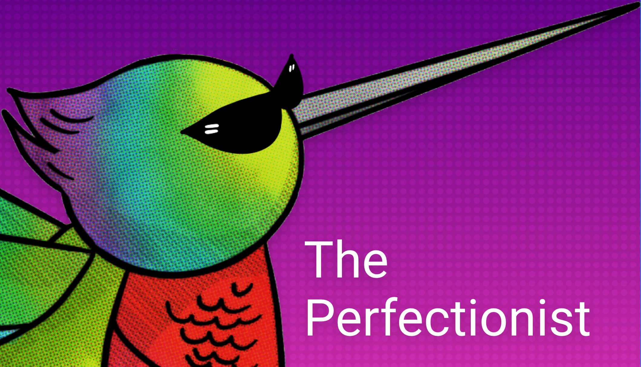
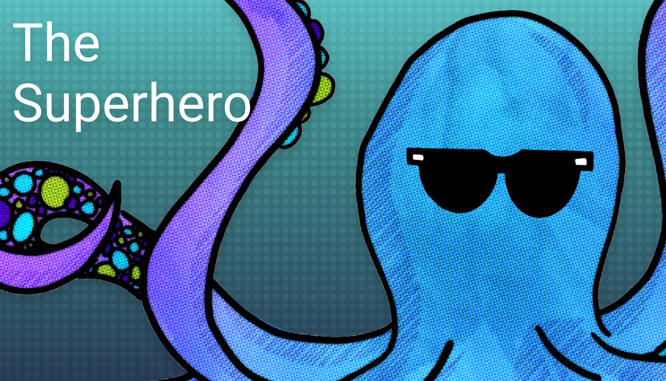
While the feedback for the app design overall was very positive the original approach to character development was to create something more approachable for my target audience and to use animals that represent the different behavioral traits associated with each persona. Shown below is the final character development.

ADDITIONAL CHARACTER FEEDBACK

Given the target audience, Gen Z creative students, I did receive some last minute feedback that the characters needed an edge. I included sunglasses for the initial application thumbnails to coincide with the "imposter” aspect of the app context. Further, I applied a comic book grit/halftone to the characters to give them a bit more edginess and to better align with other aspects of the app design from a pattern perspective.

REFERENCE:

Skillshare (2018) Adobe XD Masterclass: Design a Mobile App & Website Wireframe. Retrieved from https://www.skillshare.com/classes/Adobe-Xd-Masterclass-Design-a-Mobile-App-Website-Wireframe/1543837313/lessons.

Beirut, M. (2015) How to use graphic design to sell things, explain things, make things look better, make people laugh, make people cry, and (every once in a while) change the world, London, Thames & Hudson.

AWWWARDS, (2018) Redefining Reality with Geoffrey Lillemon, Creative Director of W+K's Department of New Realities. Retrieved from: https://youtu.be/AUuTjsbNvpk

99U, (2019) Joel Beckerman: Designing With Sound. Retrieved from: https://vimeo.com/343057666

Glug, (2019) Marcello Google Creative Labs. Retrieved from: https://youtu.be/LdCBnqbCtm8

Skillshare, (2013) Design as Idea with Bob Gill. Retrieved from: https://youtu.be/_-nuzlpiKag


PreviousNext


GDE740 W10 | Workshop Challenge

THE CHALLENGE

  • Design your selected project concept and engage with key stakeholders to prototype and user test your developments.

  • Collaborate with key stakeholders to gather feedback; evaluate this feedback to ensure your project is in line with the original brief, strategy and target audience.

  • Make prototypes and user test your design developments.

DESIGN DEVELOPMENT

Using Adobe XD, I have created formal wireframes for my imposter syndrome web app for mobile. It is comprised of a welcome screen, twenty survey questions, a character landing page, five character (or persona) pages, a resources page, an about page and potentially a sign-in/up page. I am not sure about the sign-up/in page as I worry about it deterring folks from participating in the survey or engaging with the app.

WIREFRAME

APP NAME AND URL

I’ve decided to name the app GottaBe. The name is friendly, affirming, and has several opportunities for connection. For example: “Gotta be me,” I gotta B - and that’s okay because I don’t need to be perfect, “Gotta be real,” “Gotta be honest,” “Gotta be loving myself,” etc. I’ve registered the domain: www.gottabe.me.

COLOR PALETTE

A number of studies on the relationship between color and branding reveal that up to 90% of snap judgments made about products can be based on color alone, that colors influence how consumers view the ‘personality’ of the brand in question, and that the relationship between brands and color hinges on the perceived appropriateness of the color being the right ‘fit’ for the particular brand.

Therefore, I want to develop a palette that is friendly, approachable, and light-hearted. Here the the palattes I am exploring so far:

CHARACTER DEVELOPMENT

I’ll be looking at creating characters for each persona. I like the ambiguous characters from the mycreativetypes.com app, but will not be able to develop animated 3D characters within the timeline for this project. Adding some unique aspects of each persona to the characters might help make them more palatable and relatable for the audience.

I’ve identified four different approaches to illustrative styles — ranging from figurative to whimsical to abstract to animalistic — for this project and are shown below:

SURVEY QUESTIONS

The survey will consist of four questions persona for a total of 20 questions. The way the question are answered will deduce which persona the participant is assigned. More on this in the next week.

REFERENCE:

Skillshare (2018) Adobe XD Masterclass: Design a Mobile App & Website Wireframe. Retrieved from https://www.skillshare.com/classes/Adobe-Xd-Masterclass-Design-a-Mobile-App-Website-Wireframe/1543837313/lessons.

Beirut, M. (2015) How to use graphic design to sell things, explain things, make things look better, make people laugh, make people cry, and (every once in a while) change the world, London, Thames & Hudson.

AWWWARDS, (2018) Redefining Reality with Geoffrey Lillemon, Creative Director of W+K's Department of New Realities. Retrieved from: https://youtu.be/AUuTjsbNvpk

99U, (2019) Joel Beckerman: Designing With Sound. Retrieved from: https://vimeo.com/343057666

Glug, (2019) Marcello Google Creative Labs. Retrieved from: https://youtu.be/LdCBnqbCtm8

Skillshare, (2013) Design as Idea with Bob Gill. Retrieved from: https://youtu.be/_-nuzlpiKag

PreviousNext