
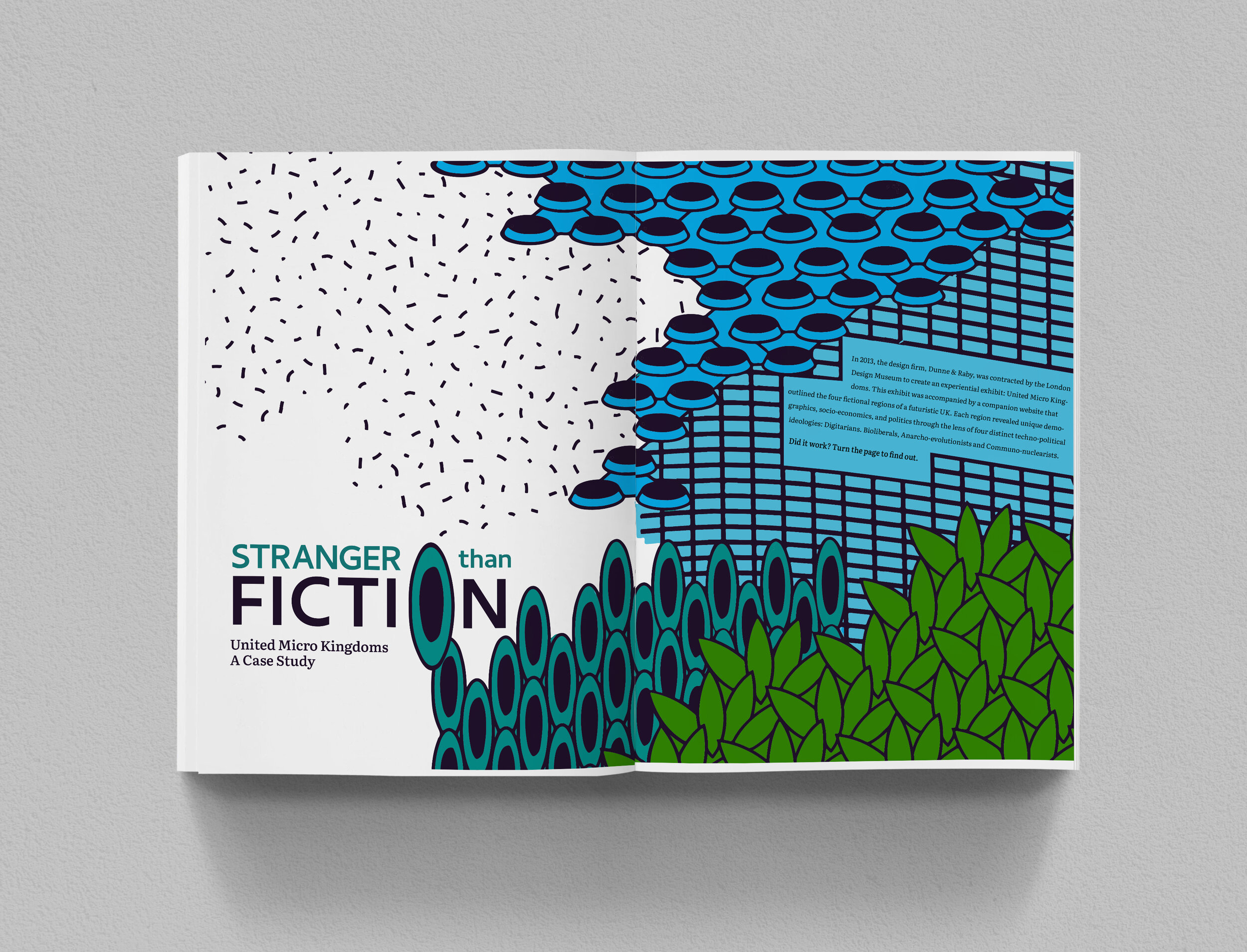
STRANGER THAN FICTION
In 2013, the design firm, Dunne & Raby, was contracted by the London Design Museum to create an experiential exhibit: United Micro Kingdoms. This exhibit was accompanied by a companion website that outlined the four fictional regions of a futuristic UK. Each region revealed unique demographics, socioeconomics, and politics through the lens of four distinct techno-political ideologies: Digitarians. Bioliberals, Anarcho-evolutionists and Communo-nuclearists.
Did it work?
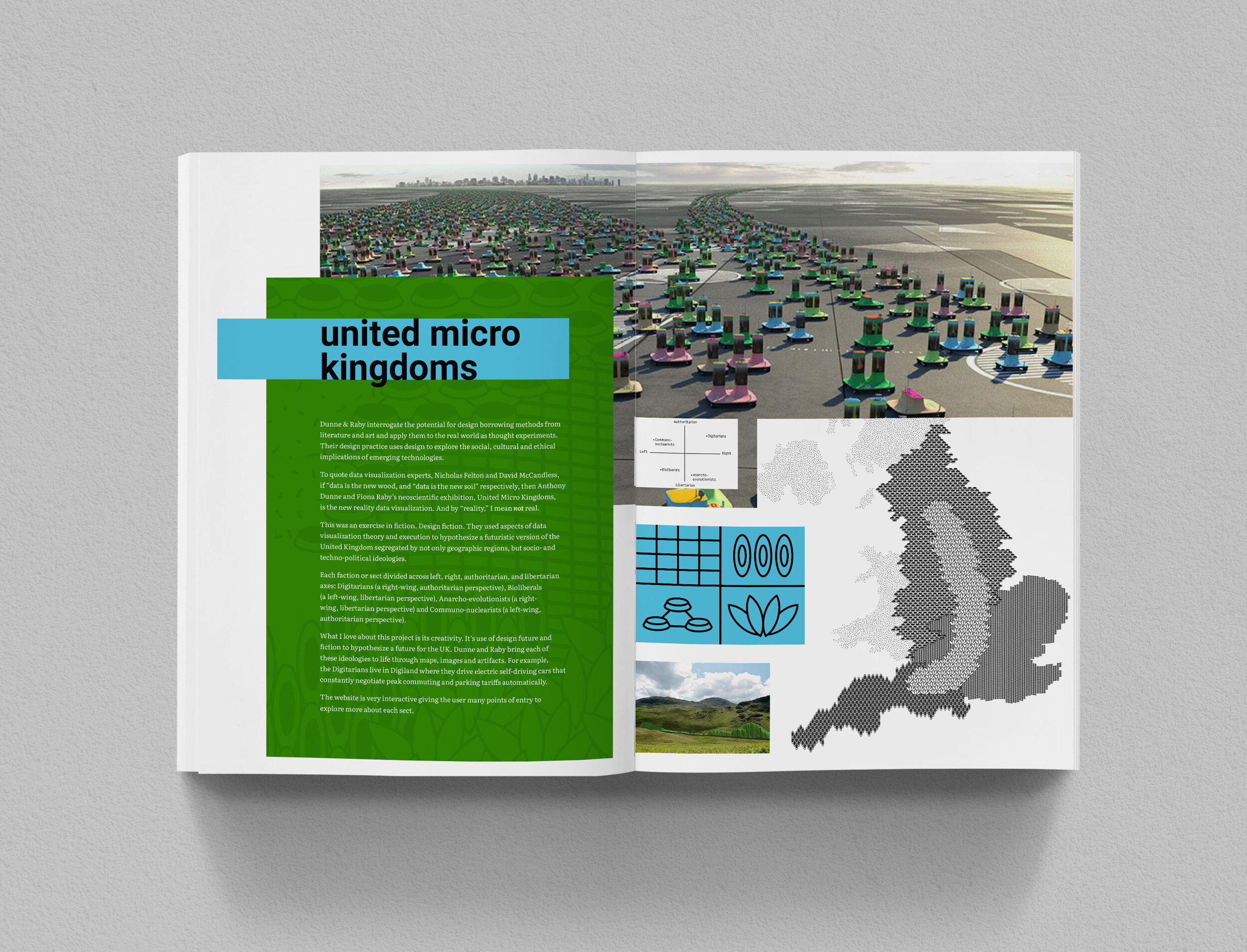
UNITED MICRO KINGDOMS
Dunne & Raby interrogate the potential for design borrowing methods from literature and art and apply them to the real world as thought experiments. Their design practice uses design to explore the social, cultural and ethical implications of emerging technologies.
To quote data visualizaiton experts, Nicholas Felton and David McCandless, if “data is the new wood, and “data is the new soil” respectively, then Anthony Dunne and Fiona Raby’s neoscientific exhibition, United Micro Kingdoms, is the new reality data visualization. And by “reality,” I mean not real.
This was an exercise in fiction. Design fiction. They used aspects of data visualiztion theory and execution to hypothesize a futuristic version of the United Kingdom segregated by not only geographic regions, but socio- and techno-political ideologies.
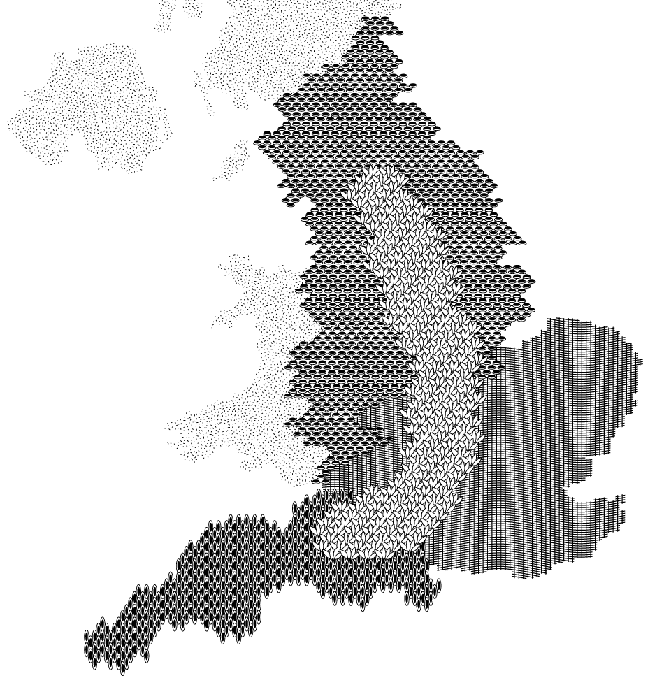
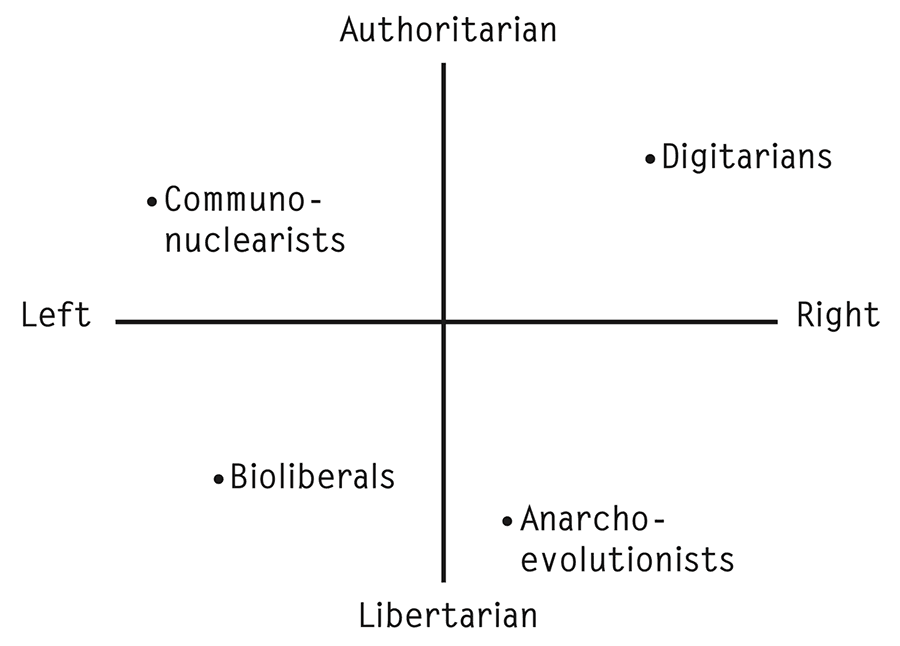
Each faction or sect divided across left, right, authoritarian, and libertarian axes: Digitarians (a right-wing, authoritarian perspective), Bioliberals
(a left-wing, libertarian perspective), Anarcho-evolutionists (a right-wing, libertarian perspective) and Communo-nuclearists (a left-wing, authoritarian perspective).
What I love about this project is its creativity. It’s use of design future and fiction to hypothesize a future for the UK. Dunne and Raby bring each of these ideologies to life through maps, images and artifacts. For example, the Digitarians live in Digiland where they drive electric self-driving cars that constantly negotiate peak commuting and parking tariffs automatically.
The website is very interactive giving the user many points of entry to explore more about each sect.
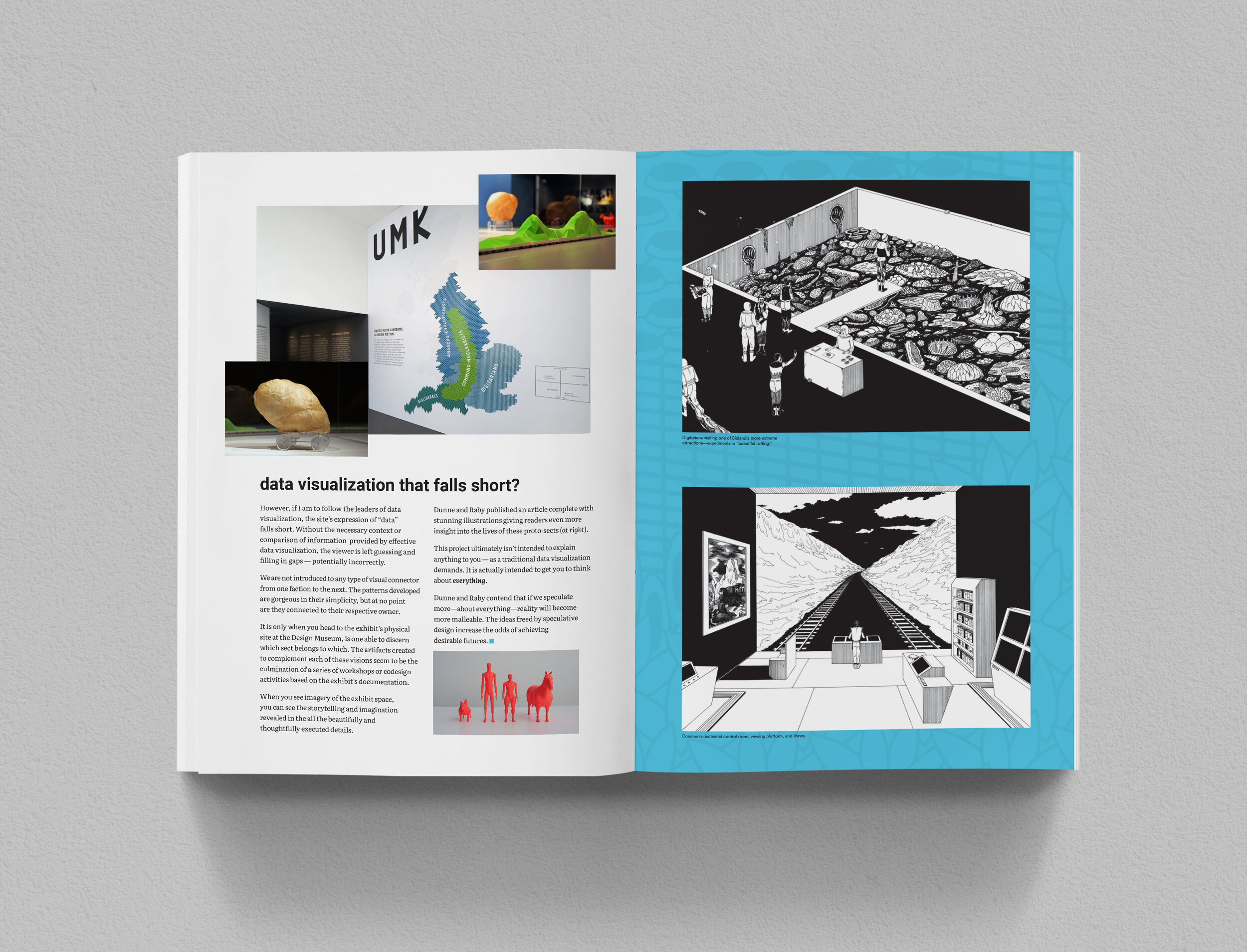
DATA VISUALIZATION THAT FALLS SHORT?
However, if I am to follow the leaders of data visualization, the site’s expression of “data” falls short. Without the necessary context or comparison of information provided by effective data visualization, the viewer is left guessing and filling in gaps — potentially incorrectly.
We are not introduced to any type of visual connector from one faction to the next. The patterns developed are gorgeous in their simplicity, but at no point
are they connected to their respective owner.
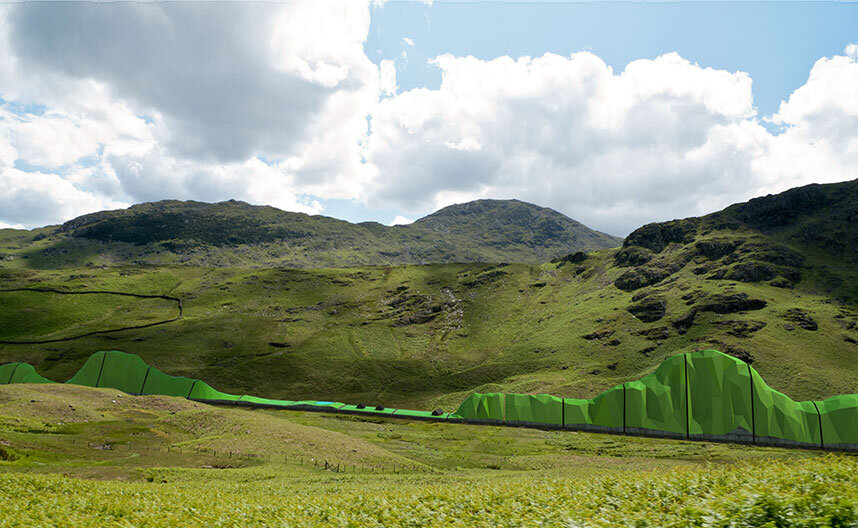
It is only when you head to the exhibit’s physical site at the Design Museum, is one able to discern which sect belongs to which. The artifacts created to complement each of these visions seem to be the culmination of a series of workshops or codesign activities based on the exhibit’s documentation.
When you see imagery of the exhibit space, you can see the storytelling and imagination revealed in the all the beautifully and thoughtfully executed details.


Dunne and Raby published an article complete with stunning illustrations giving readers even more insight into the lives of these proto-sects (at right).
This project ultimately isn’t intended to explain anything to you — as a traditional data visualization demands. It is actually intended to get you to think about everything.
Dunne and Raby contend that if we speculate more—about everything—reality will become more malleable. The ideas freed by speculative design increase the odds of achieving desirable futures.
My editorial design of United Micro Kingdoms can be downloaded via this LINK. Mockups are shown below.
REFERENCE:
Cheng, Joanne (2014, updated 2015) ‘Analyzing Minard's Visualization Of Napoleon's 1812 March (Links to an external site.)’, Thoughtbot, 8 June, (Accessed: 7th December 2018)
Dunne, A., Raby, F. (2013) UMK United Micro Kingdoms. (2013)
Falmouth University (2018). Big Data | Lecture. History and Futures GDE720 19/20 Part-Time Study Block S2 (Falmouth, UK: Falmouth University)
Felton, Nicholas (2015) Transforming data into meaningful stories | The Conference 2015, 14 January, (Accessed: 7th December 2018)
Information is Beautiful (2018) Information is Beautiful (Links to an external site.), (Accessed 10th December 2018)
Interaction Design Foundation (2016) Information Visualization – A Brief Pre-20th Century History, (Accessed: 7th December 2018)
McCandless, David (2010) The beauty of data visualization, July, (Accessed: 7th December 2018)
McCandless, David (2008), Information is Beautiful. (New York: HarperCollins).
Morton, Timothy (2013), ‘Chapter 1: What Are Hyperobjects? and Chapter 2: The Time of Hyperobjects’ in Hyperobjects: Philosophy and Ecology after the End of the World , (Minneapolis: University of Minnesota Press).