SAN FRANCISCO
Using the DNA of my five previously selected typographic specimens shown in the carousel below, I developed a display typeface to spell out the name of my city, “SAN FRANCISCO.”
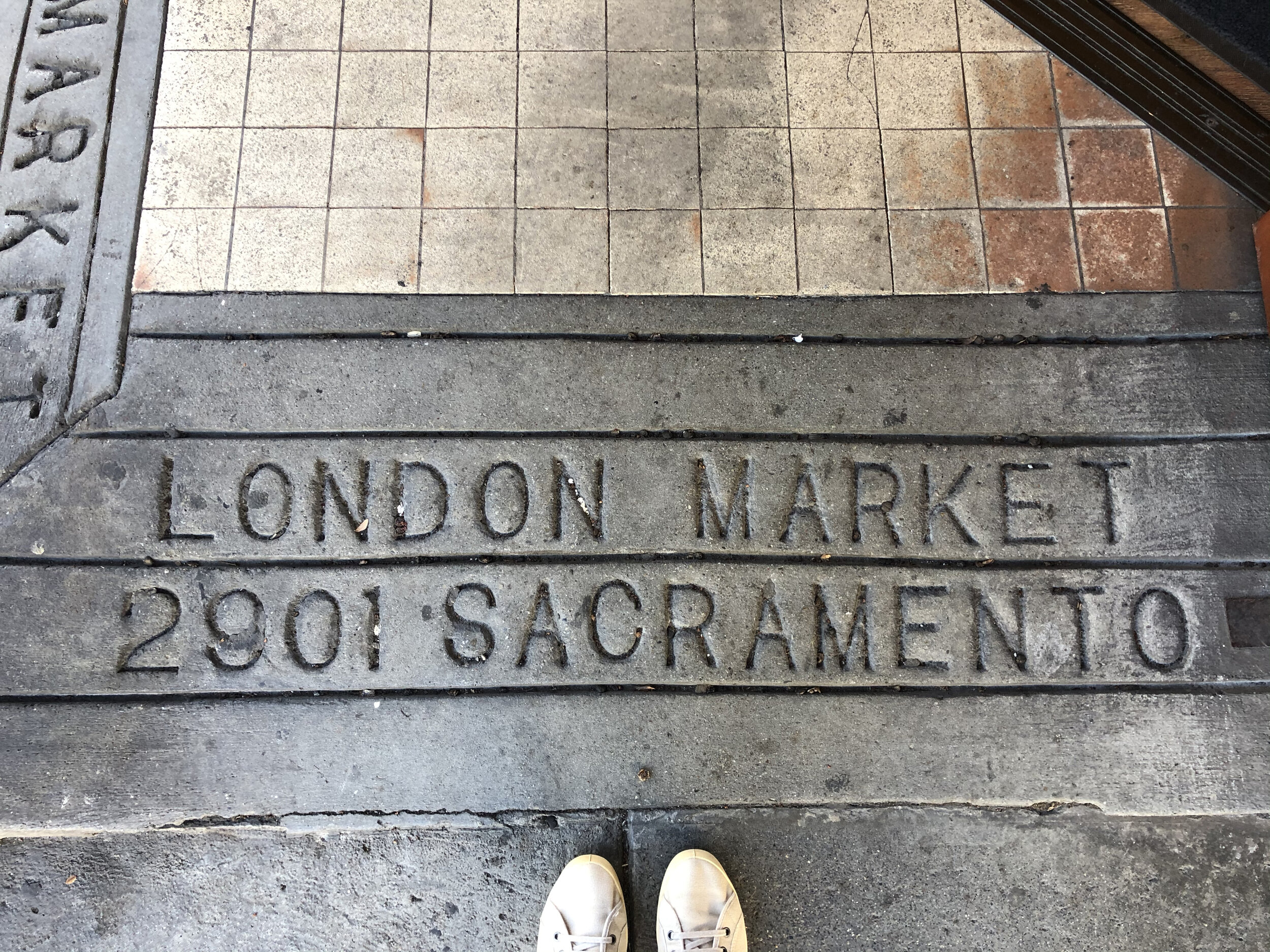
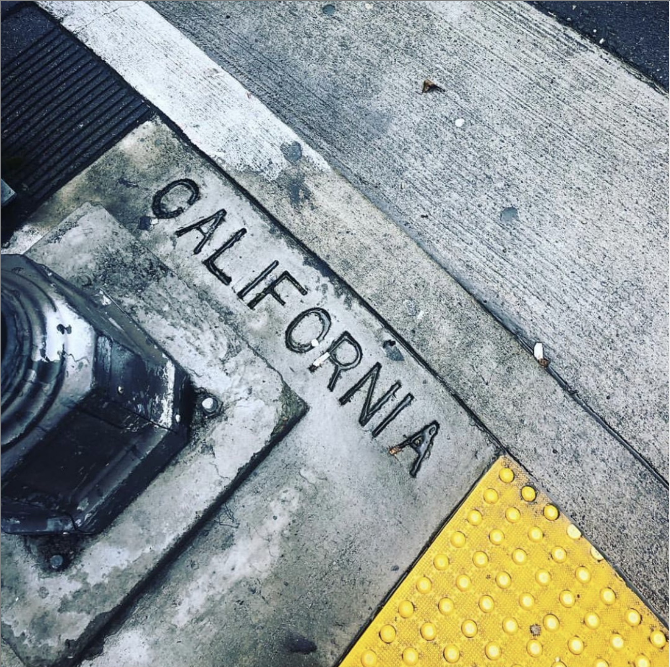
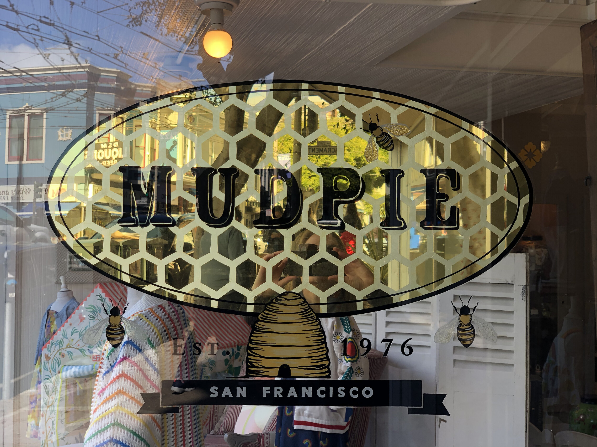
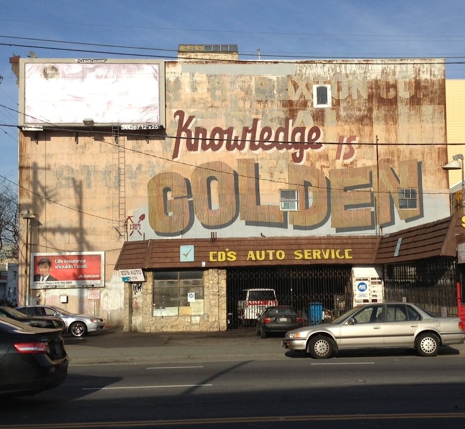
I began with leaning on the first face that I identified as unique to San Francisco, the sans serif type that is stamped into each sidewalk intersection to identify the street names. I set the type along a banner wave baseline to create dynamism and movement, aspects that are very San Francisco.


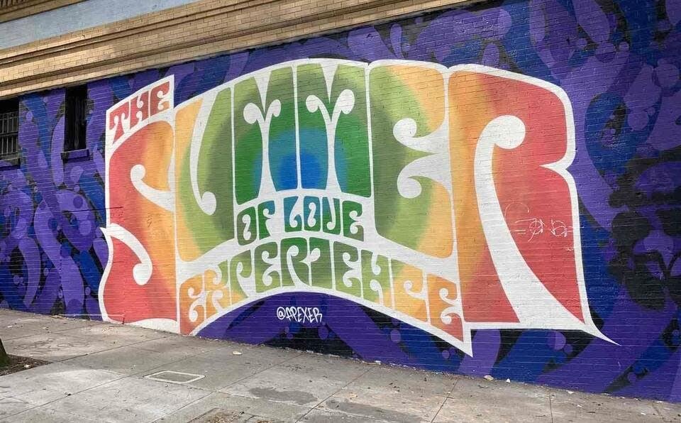
I then added flourished serifs to the letterforms. This is not only a nod to the pioneer-era letterforms of the Gold Rush in San Francisco, but also the psychedelic type of 1960s San Francisco.
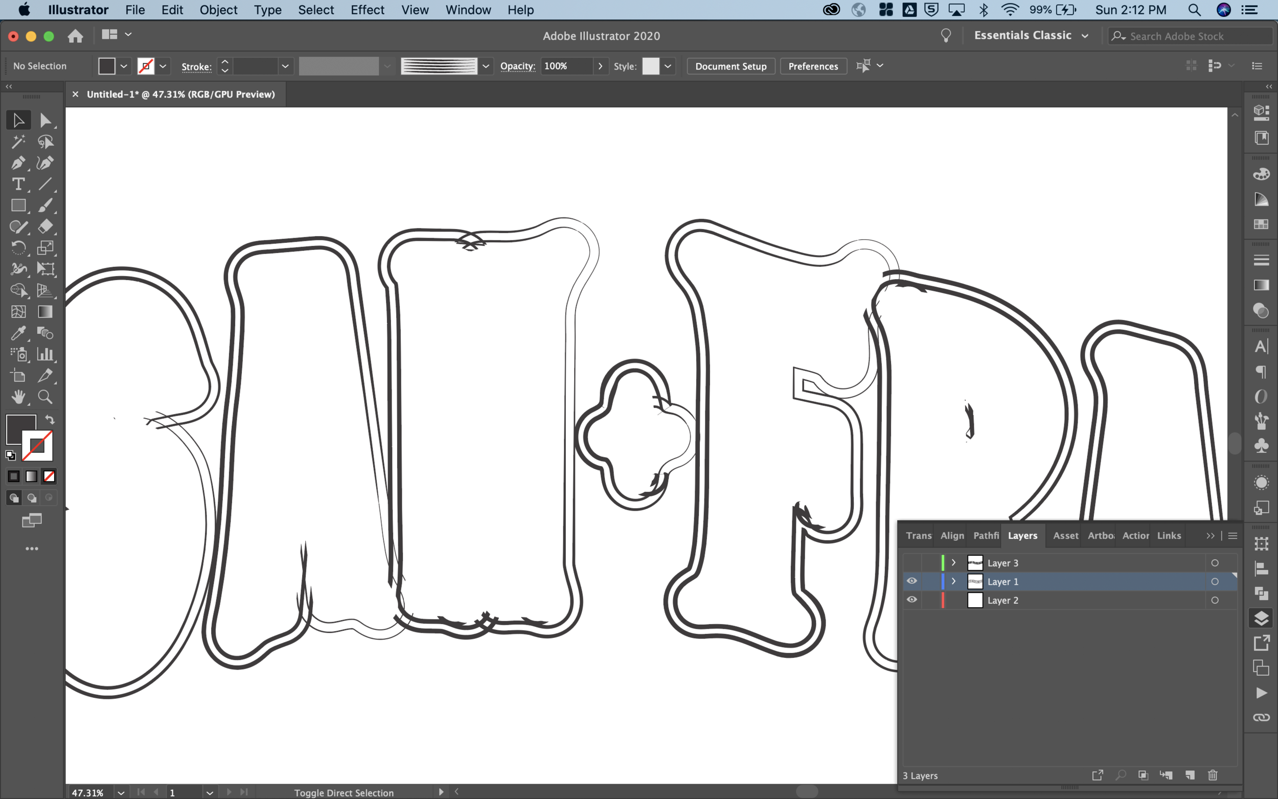
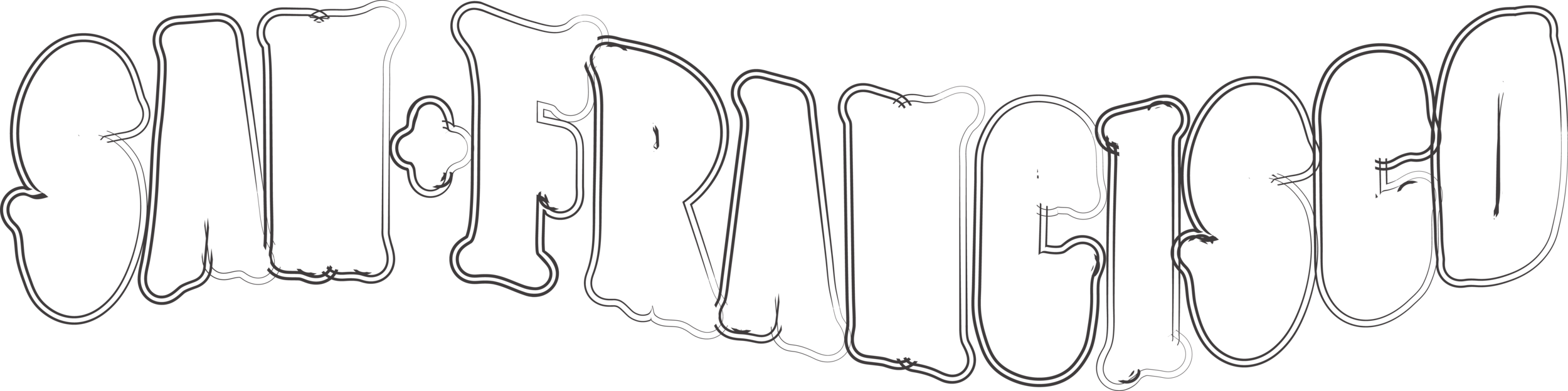
Next I layered the serif type overtop the outlined bubble letterforms and added a think san serif typeface to connect back to the sidewalk stamps.

I then worked on and texture color reminiscent of both the 1930s, 1960s, and present-day San Francisco.
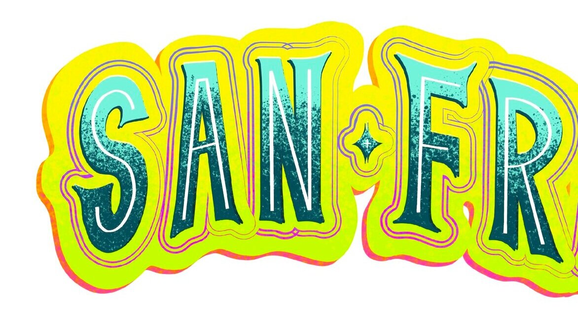
The final piece is the amalgamation of the DNA of the five selected type specimens identified in Week One.
Below is a video of how the final letterforms were built.
REFERENCE:
Falmouth University (2018). Story Told |Lecture. History and Futures GDE720 19/20 Part-Time Study Block S2 (Falmouth, UK: Falmouth University)