
STORIES TOLD
IT’S A LOCAL THING.
Colophon Foundry
For Ed Harrington and Antony Shera, working internationally has expanded their understanding of design type for global consumption and has informed each of their projects. They utilize and collaborate with consultants for all of their regional, national and cultural work.
Their work for the Welsh government to create a bespoke type needed to be intrinsically Welsh. Leaning on extensive research and collaborating with Smörgåsbord Design Studio out of Amsterdam and a Welsh text professor from Cardiff, they incorporated unique characteristics of Welsh typographic heritage into the new forms.

Harped letterforms were included to honor the legacy of the Welsh language and type

Diagraphs like the "double d” were treated like ligatures.
CASE STUDIES
British Airways: one brand, three designs.
Negus & Negus recruited by British Airways — newly formed from a merger between BEA (British European Airways) and BOAC (British Overseas Airways Corporation) 1974. Elements of both of their identities were incorporated to create a new streamlined evolution of the BOAC and BEA insignia by way of a quartered Union Flag with a red tip on the tailfin and the Speedbird symbol on the nose. This new airline’s brand was to embody overall: its Britishness, speed, luxury and travel. The serif forms were both upper and lower case, leaning in with Airways with a lower case “a” created a sense of familiarity and welcome for the brand.
In 1980, Landor introduces streamlines the graphic elements of the logo and introduces all-capped serif letterforms for British Airways. Over time, the British Airways serif wordmark left the brand looking stiff, stuffy, and too conservative.
Newell & Sorrell changed the game for British Airways introducing the notorious world image tailfin designs which was considered very daring for the time. Sadly, it was to be phased out two years later.

The most current iteration may have dropped the world images tailfins, but retained the bespoke wordmark developed by Monotype using Mylius typeface.
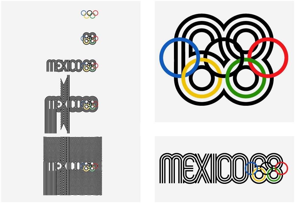
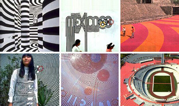
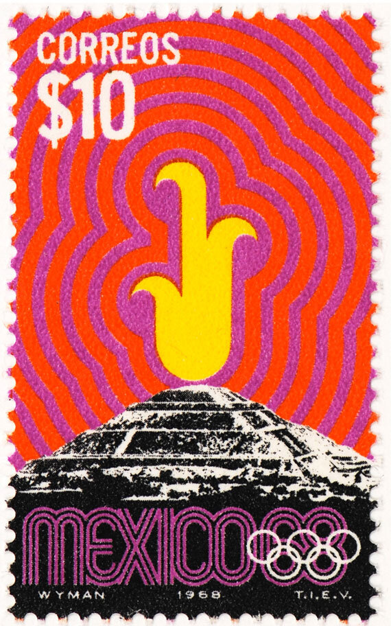
An Identity for and by the Ages
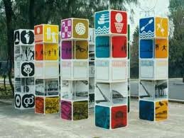
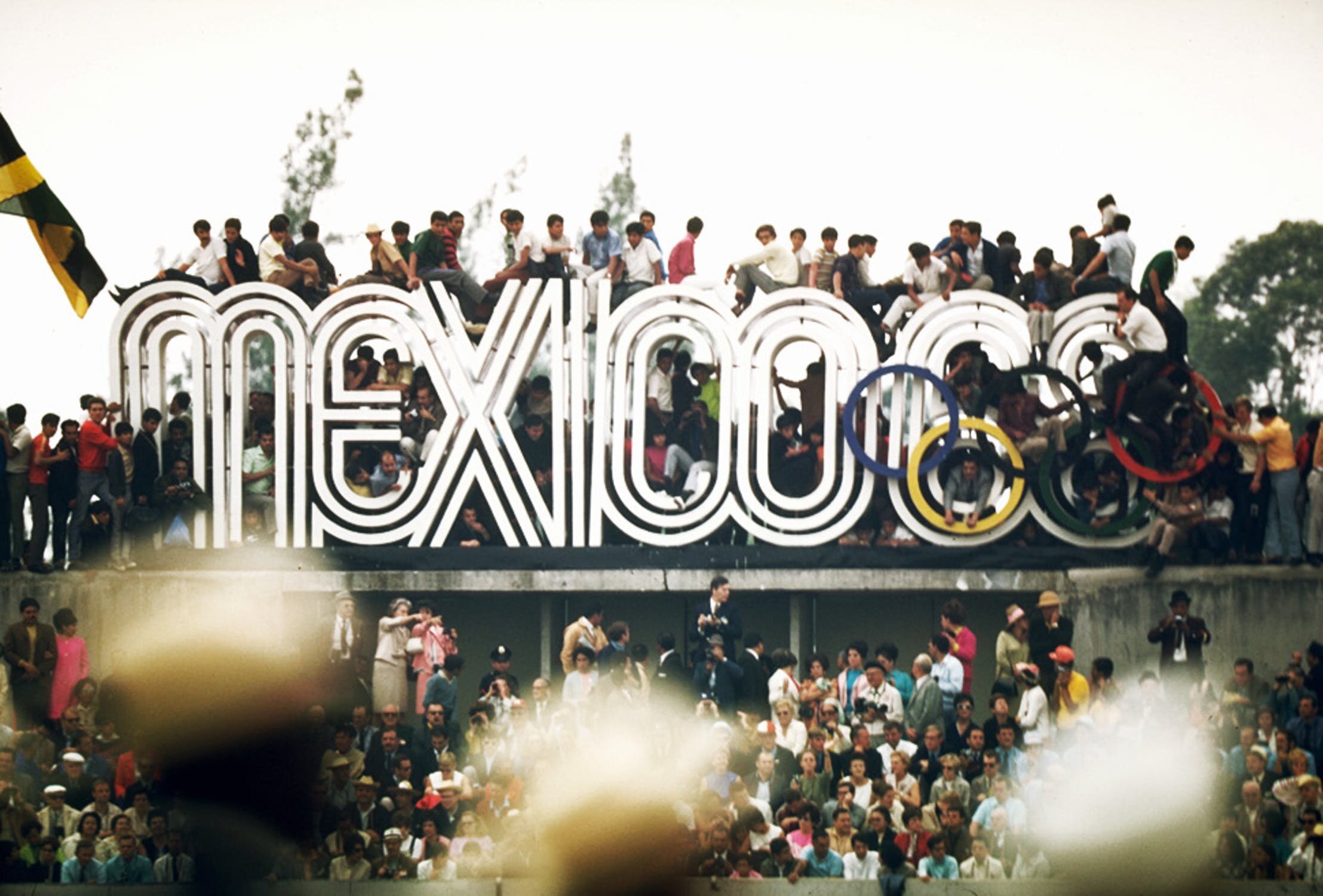
Lance Wyman travels on a one-way ticket to secure the business of the 1968 Olympics Games in Mexico brand assignment. It’s a good thing he got the gig. Wyman did significant research to best understand the native art forms of Mexico. Looking back to go forward, Wyman used ancient Greek Olympic silhouettes to inform new creations including tickets, wayfinding. Creating a sense of place using he used Mayan glyphs to adapt to symbol iconography as well as Mexican tulas to inform environmental and dimensional designs. The use of the Olympic rings and Op Art’s use of geometry and energy a radiating, culturally, and politically relevant identity system that is one of the most reference identity systems ever created.
REFERENCE:
Blackwell, Lewis (2000) Edward Fella: Letters on America, Princeton Architectural Press
99% Invisible (2017) Mexico 68 [podcast] 27 June, (Accessed: 7th December 2018)
Grey London (2014) Dan Rhatigan on Ryman Eco 20 August, (Accessed: 7th December 2018)
Creative Review (2018) The CR podcast episode 14: Making, changing and documenting places, 1 November, (Accessed: 7th December 2018)
Falmouth University (2018). Stories Told | Lecture. History and Futures GDE720 19/20 Part-Time Study Block S2 (Falmouth, UK: Falmouth University)
Typo Labs (2017) Dan Rhatigan | Variable Fonts: Progress Report (Links to an external site.), 6 April, (Accessed: 7th December 2018)