GDE720 W1 | Workshop Challenge

TYPOGRAPHY OF SAN FRANCISCO

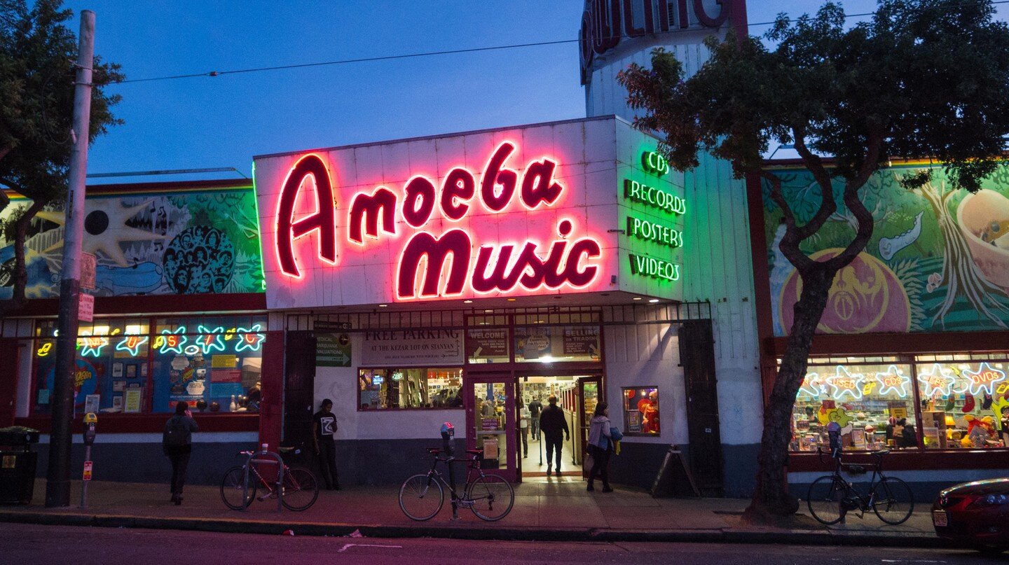
My journey to research letterforms in the city of San Francisco took me just beyond my own neighborhood of Lower Pacific Heights over to the Fillmore District, Downtown San Francisco, the Mission District, Haight-Ashbury, and Fort Point. Below is a gallery of all of the typography collected during my adventures throughout the city. I couldn’t help but also include some art prints from my apartment as typography is also a really big influence in my life (see last row of the gallery).

FINAL TYPOGRAPHIC SPECIMENS

My final selections can be found below and on the GeoType Wall.

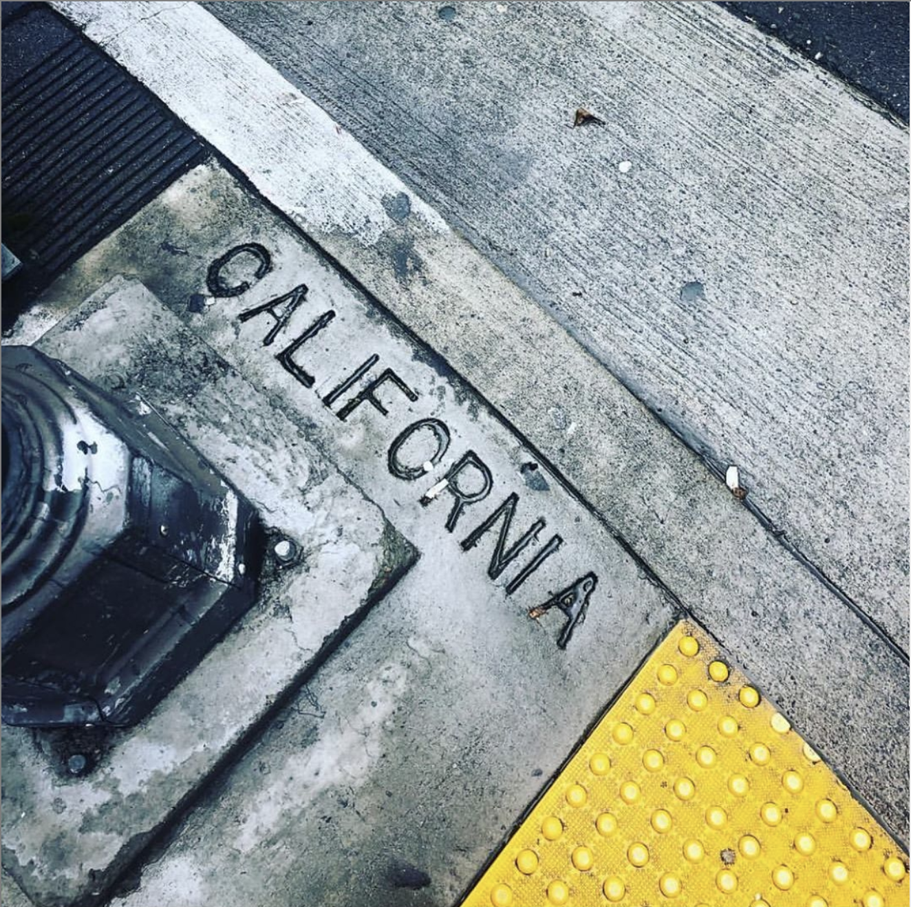
SAN FRANCISCO SIDEWALK STAMPS - CITY WIDE

The all caps, sans serif typographic sidewalk stamps used on every corner in San Francisco is clean, accessible, and informational – literally making its mark. San Francisco is among the few cities to systematically engrave street names on every corner. As for how this unique custom of engraving street names first started, some theorists believe the tradition began after the devastating 1906 earthquake that destroyed much of the city and made it difficult for resident to recognize where they were. However, the original ordinance that started the practice was actually placed into effect on Nov. 6, 1905. The result is not only useful, but also historically nostalgic in its origins. 

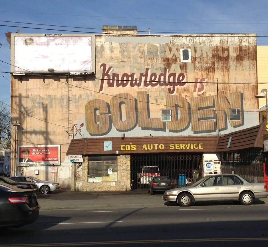
KNOWLEDGE IS GOLDEN MURAL - SOMA DISTRICT

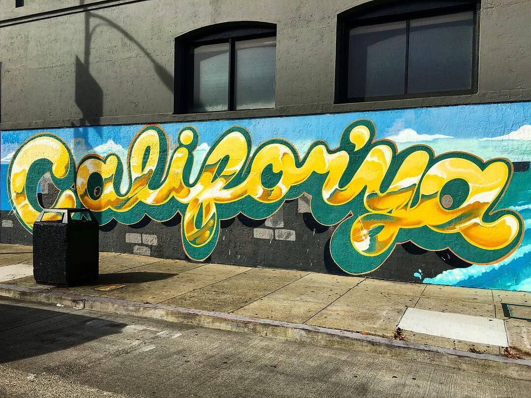
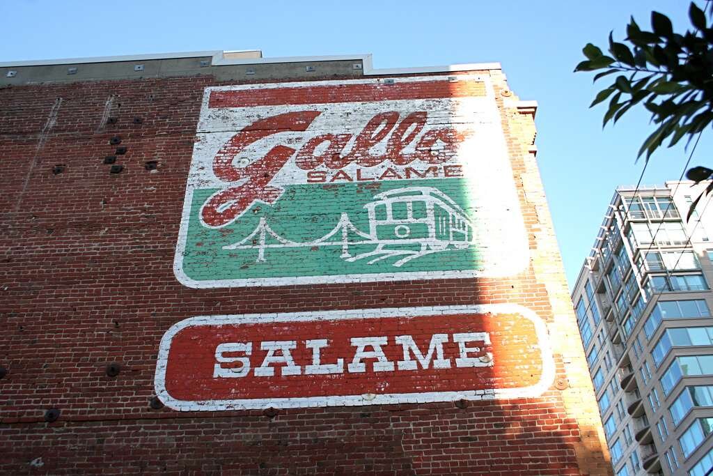
California is the Golden State. This mural, painted atop a ghost sign in San Francisco's SOMA district reflects the personality of the city through its grit, textured, and layered appearance. The juxtaposition of script and a bold serif is inviting, strong, and prophetic. For “Knowledge is Golden” the inspiration was specific to the area which the mural was done. Dan Pan, one of the mural artists, said, "San Francisco is seeing its second gold rush with information and knowledge being the currency of today, with technology leading the transformation." Pick axes and gold pans have been replaced by Google buses, startups, and big data. While seemingly a reminiscent piece it is actually a beautiful commentary on the present and future of San Francisco.

Summer of Love 545 Ashbury.jpg

SUMMER OF LOVE MURAL - HAIGHT ASHBURY

Quintessential San Francisco 1960s "Summer of Love" mural in the infamous Haight-Ashbury neighborhood could very well be seen as cliche. But psychedelic typography was born and raised in San Francisco. Many artists, most famously Wes Wilson, Victor Moscoso and Bonnie MacLean, were headquartered here, and received a great number of commissions for poster designs from local rock ‘n roll concert venues like The Fillmore and the Bill Graham auditoriums. And remember, these were all drawn by hand, no computer. The psychedelic typography of San Francisco is experimental, curious, and it doesn't care if you can read it. Ya dig?

ELITE CAFE & MUDPIE - FILLMORE DISTRICT

A hat tip to the pioneers of the Gold Rush which created a massive migration to California, especially San Francisco. It's polish comes from the fine details of the serifs which also nods to the posh Art Deco era of the 1900s-1930s. Elite Cafe was a stalwart member of the Fillmore District for nearly a half century having recently closed its doors. Mudpie furthers the contemporary softened serif that harkens to the slabs of the pioneer typographic poster of the 1800s West. This version includes a unique foiled background and detailed drop shadows.

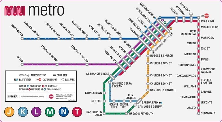
THE MUNI WORM - CITY WIDE

Created for the San Francisco Municipal Authority and to be adorned on cable cars, buses, underground rails and above ground lightrails in the 1970s by industrial designer, Walter Landor the founder of globally recognized Landor agency, and the designer behind the Coca-Cola script and Levis logo (another native San Francisco brand). The Muni "worm" connects native California and Mexican roots to (at the time) modern day San Francisco. The letterforms are connected in a way that is funky and uniquely San Francisco with a convergence of Opt Art and psychedelia. In 1997, there was city-wide outrage when the head of the SFMTA recruited students of the Academy of Art to create a new mark for MUNI claiming lack of funds to hire a proper firm to do the work. Needless to stay outside of a slight facelift in 2015, the Muni "worm" remains intact today and likely for some time to come. 

REFERENCE:

Falmouth University (2018). History Revealed | Lecture. History and Futures GDE720 19/20 Part-Time Study Block S2 (Falmouth, UK: Falmouth University)

GDE740 W1 | Workshop Challenge

Self-Initiated Project

CREATIVE BRIEF: women for women

OVERVIEW

Create a campaign that engages women for women. Provide a compelling narrative to inspire working and non-working women to appreciate the value of "better together" and aim to break down the societal mores associated with unproductive rancor and the unhealthy way women act on an otherwise healthy feeling of competitiveness through a series of storytelling, opportunities for engagement, and ultimately, a point of pride (wearable).

Within the last decade a shift has taken place regarding women in the workplace and women in general with regard to equality and social constructs. The #MeToo movement and Women’s March has underscored this sea change.

This project’s aim is to create a campaign that capitalizes on the momentum of the aforementioned movements and leverage both legacy and start-up platforms to engage deeper, more productive connections and support for women through a point of pride piece.

WHAT SPECIFIC OBJECTIVE IS THIS PROJECT TRYING TO ACHIEVE?

Show the value of female camaraderie and support.

WHAT SINGLE THOUGHT SHOULD THE AUDIENCE COME AWAY WITH?

Women can be better together.

TARGET AUDIENCE(S)

  • Primary: Adult women ages 20+ up

  • Secondary: Youth women ages 12-18

  • Vehicle audience: Human Resources Departments, Employment Agencies, Youth Organizations

PROJECT CRITICAL CONTEXT

Leverage the brand recognition of NOW (National Organization for Women), the largest organization of feminist grassroots activists in the United States and the business approach and baked in community of The Wing, a startup brand that creates spaces all over the world for women to work, gather, connect, and thrive on their own terms for the target adult audience. Partner with Girl Scouts of America for the youth population. Will connect both adult and youth women together, but span generations from young through to mature.

ANTICIPATED OUTCOME

A system of collateral and communication tools for organizations to implement greater opportunities for women to connect and support one another. These could include (but are not limited to):

  • Point of pride and kinship

  • Swag / Poster

  • Social media creative

  • OOH

  • Microsite

  • Printed collateral

WHAT IS THE TONE?

Inspirational, strong, warm, inviting

WHAT IS THE CALL TO ACTION?

Join the movement, get connected

CREATIVE MANDATORIES

Create a piece that becomes instantly recognizable by other members or piques the interest of women to get involved. It should convey an inviting playfulness, but also confidence.

TIMLELINE

Four weeks that include four phases:

  • Week One: identify subject for self-initiated project

  • Week Two: research and exploration

  • Week Three: assess findings, implementation

  • Week Four: initial campaign designs and plan for rollout

ASSETS

All to be created

POTENTIAL BARRIERS AND/OR CONCERNS

Timeline to launch final system is tight (less than four weeks). A phased approach of deliverables is likely most practical.

SUCCESS METRICS

Membership, web, and social analytics

RESEARCH

Straight Ally symbol for LBGTQ community - denotes a safe place, safe person.

Straight Ally symbol for LBGTQ community - denotes a safe place, safe person.

Pussy hats from the Women’s March

Pussy hats from the Women’s March

REFERENCE

Phillips, P (2004) Creating the Perfect Design Brief: How to Manage Design for Strategic Advantage. (New York: Allworth Press)

Falmouth University (2018). Brief Analysis | Podcast Videos. Application and Interactions GDE740 19/20 Part-Time Study Block S1 (Falmouth, UK: Falmouth University)