GDE740 W3 | Workshop Challenge

Self Initiated Project Production

THE CHALLENGE

This week I was to make and produce my self initiated project idea per the following.

  1. Imagine and make one design response to your self initiated project brief, as outlined on your mood boards. Demonstrate your development. Upload initial ideas and sketches to the Ideas Wall and reflect on them in your blog.

  2. Make prototypes and experiment with design and production techniques to ensure you engage with your target audience. Do not forget to record all tests, even if they fail, and add them to the Ideas Wall.

  3. Design and deliver your final outcome, in line with your original aim and objectives

Athena, Greek goddess of wisdom

Athena, Greek goddess of wisdom

SYMBOLISM

In order to arrive at a visually compelling and meaningful design, I looked to symbols of female strength, wisdom, creativity, and unity. I wanted to be able to tell a story that aligns with the values of this campaign: women for women and the virtues of joining together to create greater empowerment, collaboration, and community for women in the workplace.

ATHENA

My search for appropriate and meaningful symbolism lead me to Athena, the greek goddess of wisdom, courage, inspiration, civilization, law and justice, strategic warfare, mathematics, strength, strategy, the arts, crafts, and skill.

She is known most specifically for her strategic skill in warfare and is often portrayed as companion of heroes and is the patron goddess of heroic endeavor.

Athena and her owl

Athena and her owl

What a better place to start exploring symbols and creative expressions for my enamel pin.

ATHENA’S OWL

Athena kept an owl on her shoulder that revealed truths to her and represented wisdom and knowledge. In some versions of the mythology, the owl was said to illuminate Athena's "blind side," allowing her to see the entire truth. Owls were widely associated with Athena's blessing, and Greek soldiers viewed the sight of owls before a battle as a symbol that the goddess was on their side.

The owl was a symbol for Athena before the Greeks gave their pantheon human forms. In Ancient Greece, the owl was a symbol of a higher wisdom, and it was also a guardian of the Acropolis.

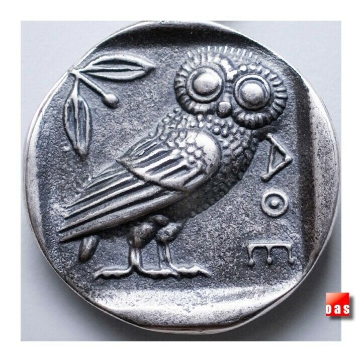
The best-known image of Athene’s owl, the Little Owl, is seen on ancient Athenian coins dating from the fifth century BCE.

Athena Coin Ca 454-404 BC.jpg

MAKING CONNECTIONS

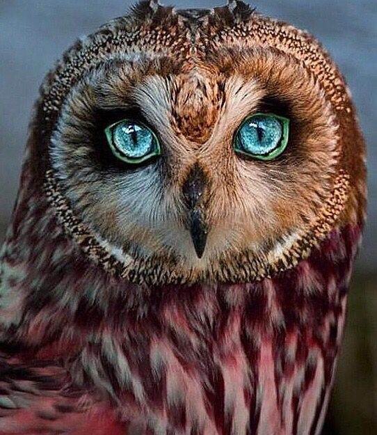
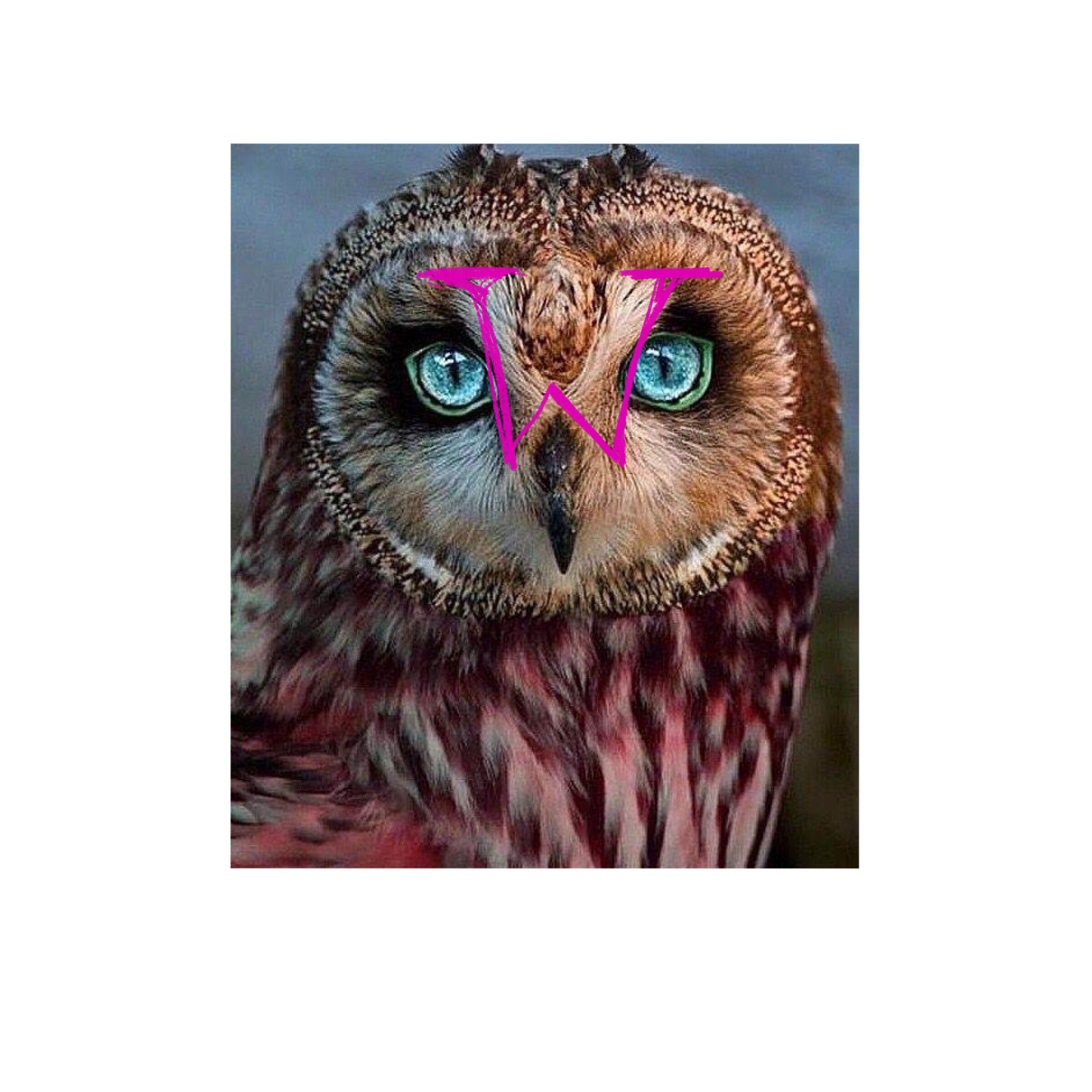
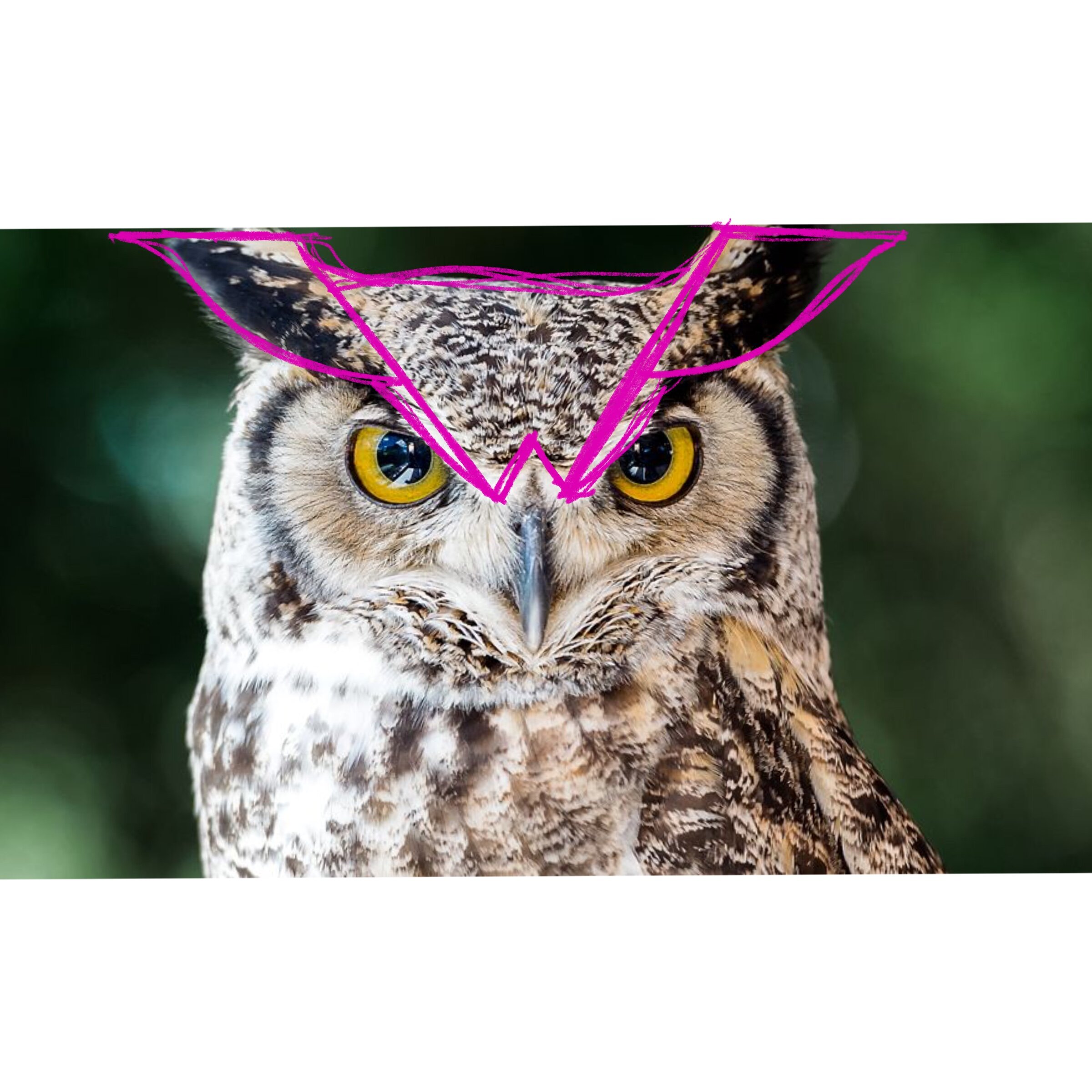
In looking at numerous images of owls and their storied meanings, I began to see some connections. In looking at their anatomy, I could see the letter “w” for Women. Further, the symbolism of the owl — and Athena — also connect to the community and connection aspect of my project.

The term mentor, originated from Homer's story of a king, who entrusted his son's development to Mentor, before he left for war. Athena disguised herself as Mentor to guide the boy. By traditional definition, mentoring is described as an older (and presumed wiser) person who assists a younger one to grow, to take someone "under their wing" to help them to develop personally and professionally. With wings in place, the owl seemed an apt symbol for my project.

INITIAL SKETCHES

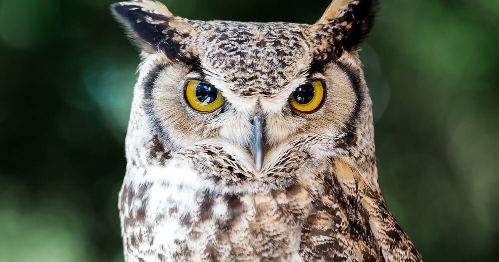
I began sketching different approaches to my owl. By self-imposed boundary in my attempt at greatest connection, and compelling story, each iteration needed to leverage the letter “w” in some way. I began with two ancient references and the photos of the owls as my guide.

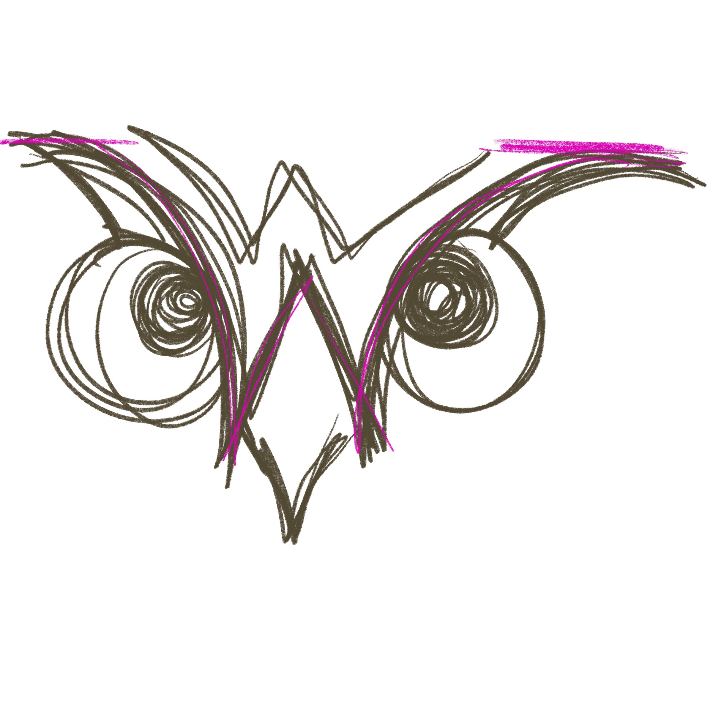
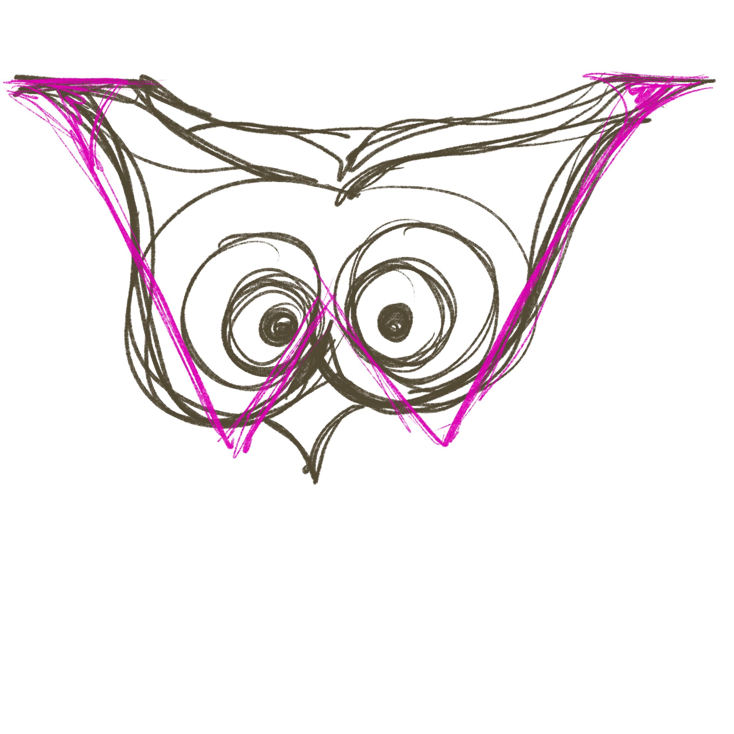
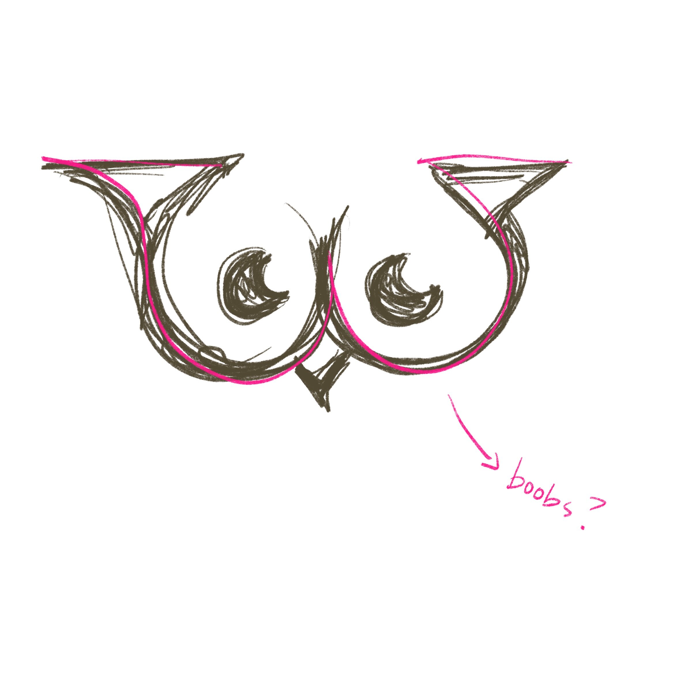
While I was pleased that I could easily identify ways to incorporate the letter “w” into the owl sketches, I felt that these initial versions were not strong enough to carry the symbolism I’d wanted them to evoke: empowerment, protection, community, and wisdom. I moved the sketches in a more geometric direction to emphasize the strength missing in the previous versions. The line work was to be clean and clear.

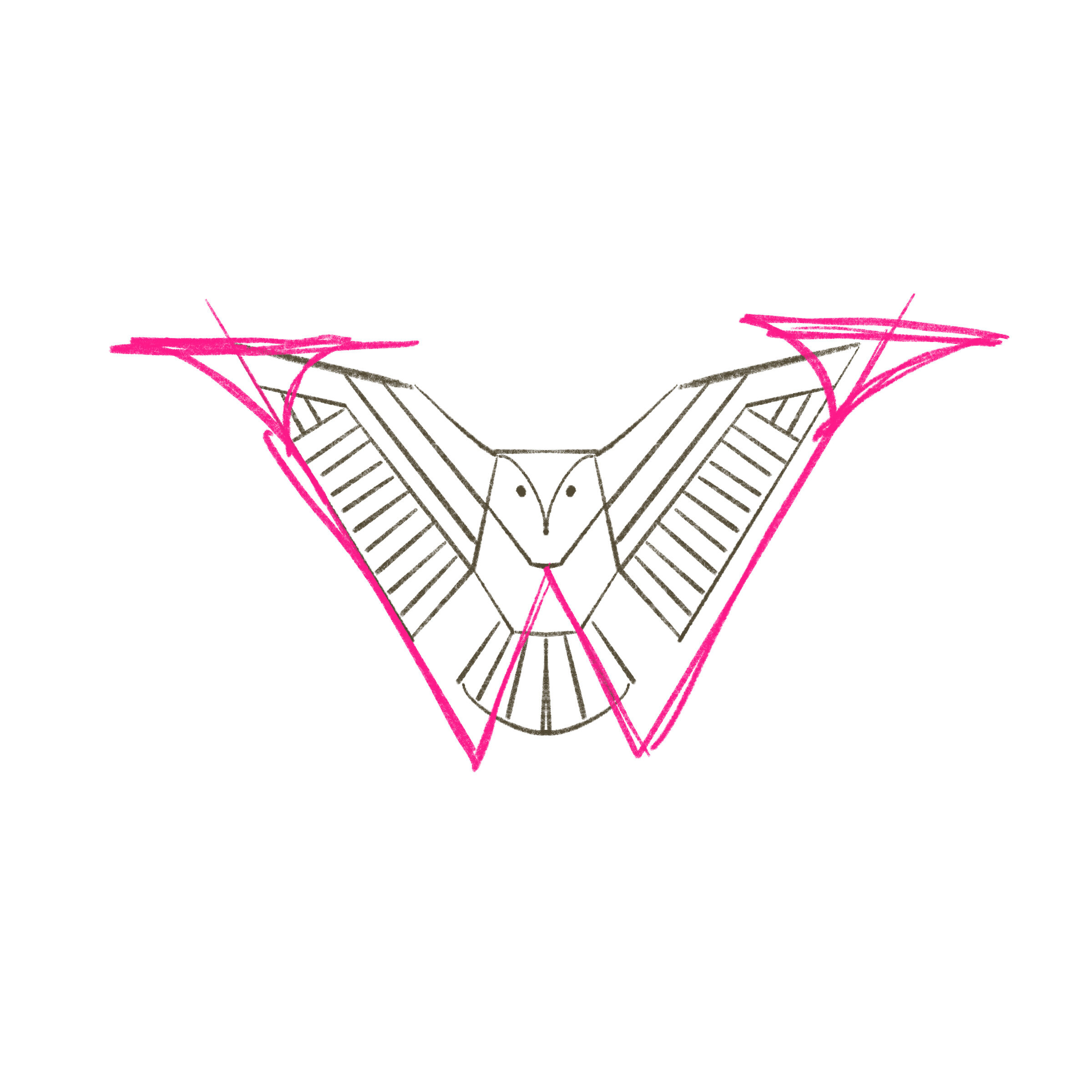
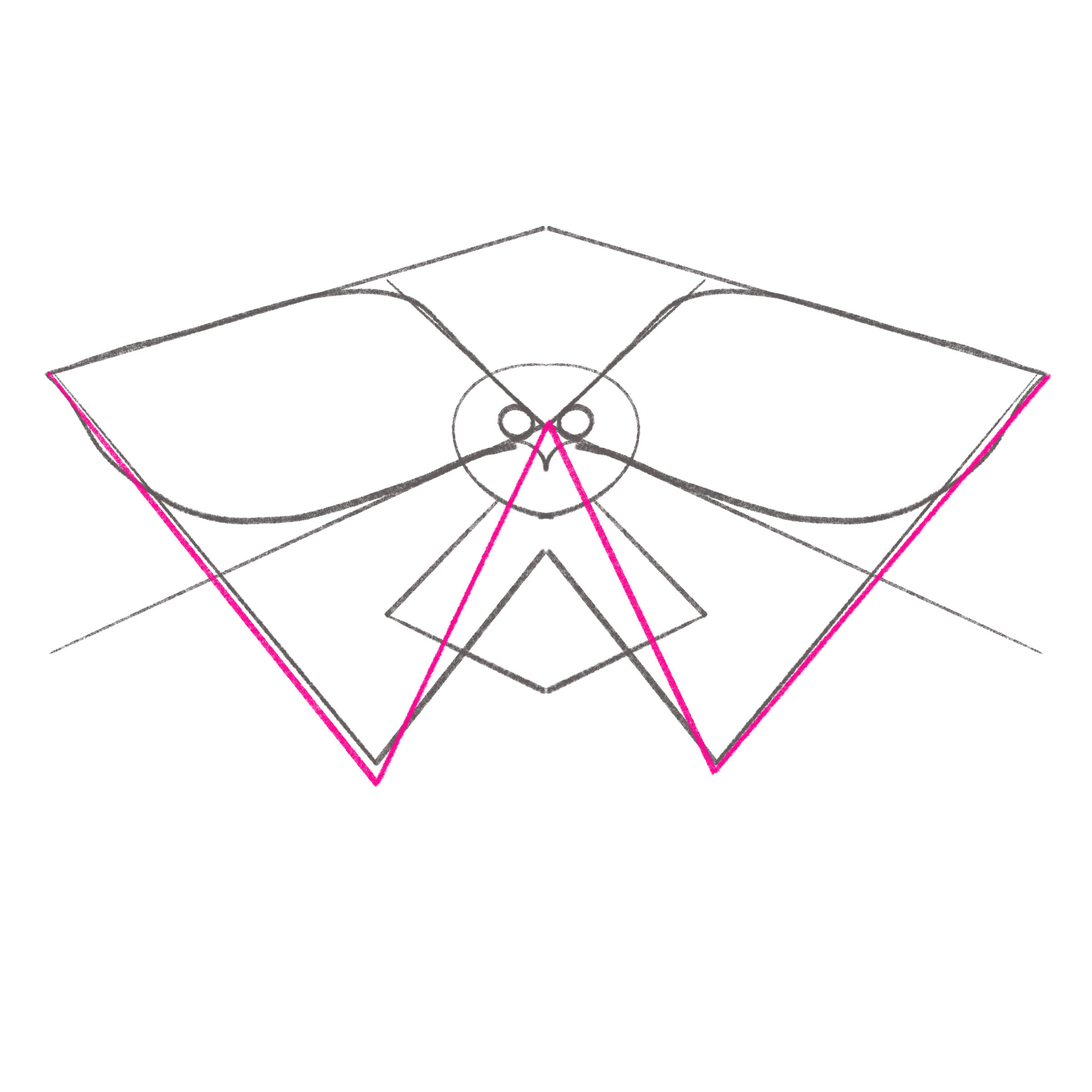
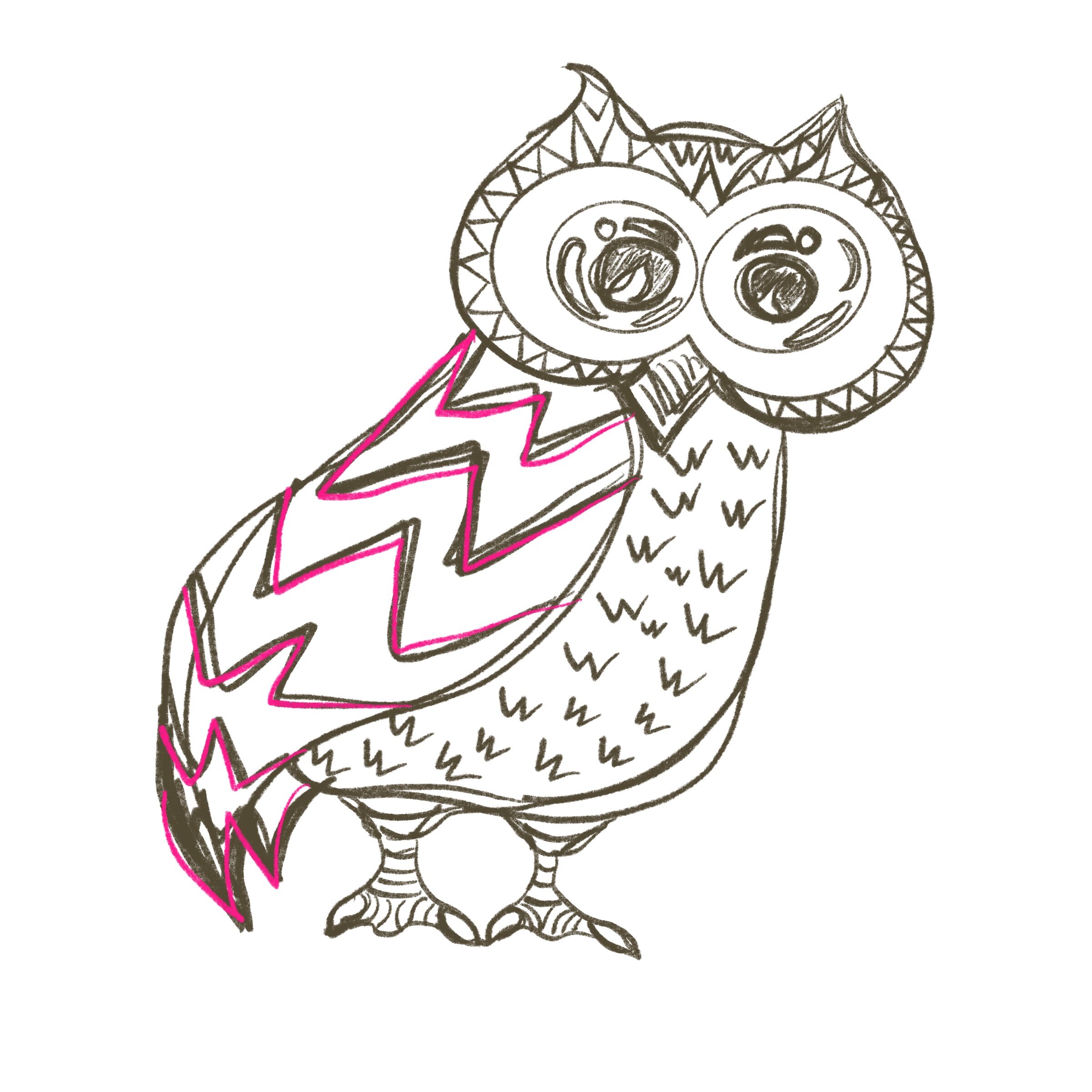
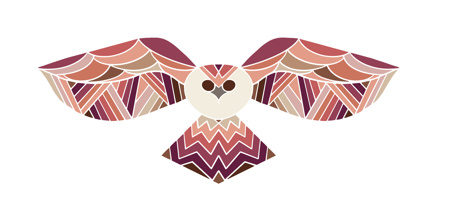
I chose the owl on the right as the version to move ahead into final design. It evoked an energy and dynamism for me that aligned to the tone of my project: Inspirational, strong/confident, warm, inviting. I continued to work on the illustration to add in detail that continued to connect the symbol to the project via the letter “w.”

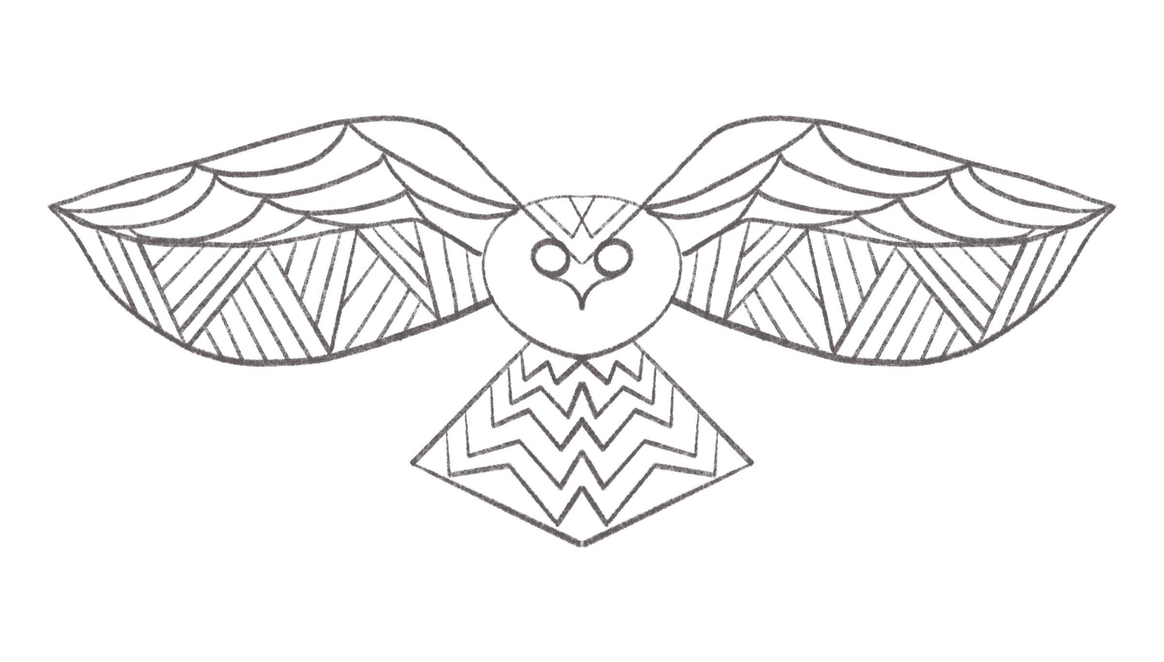
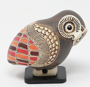
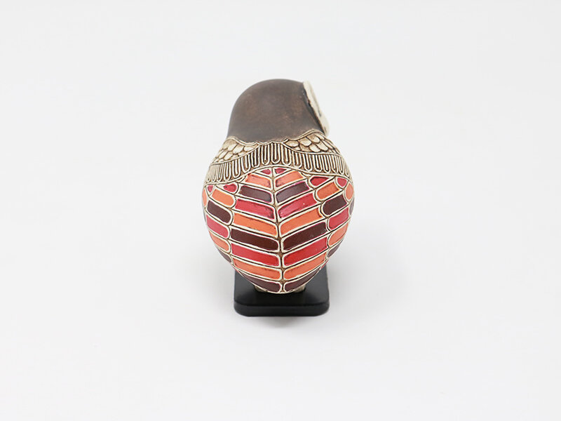
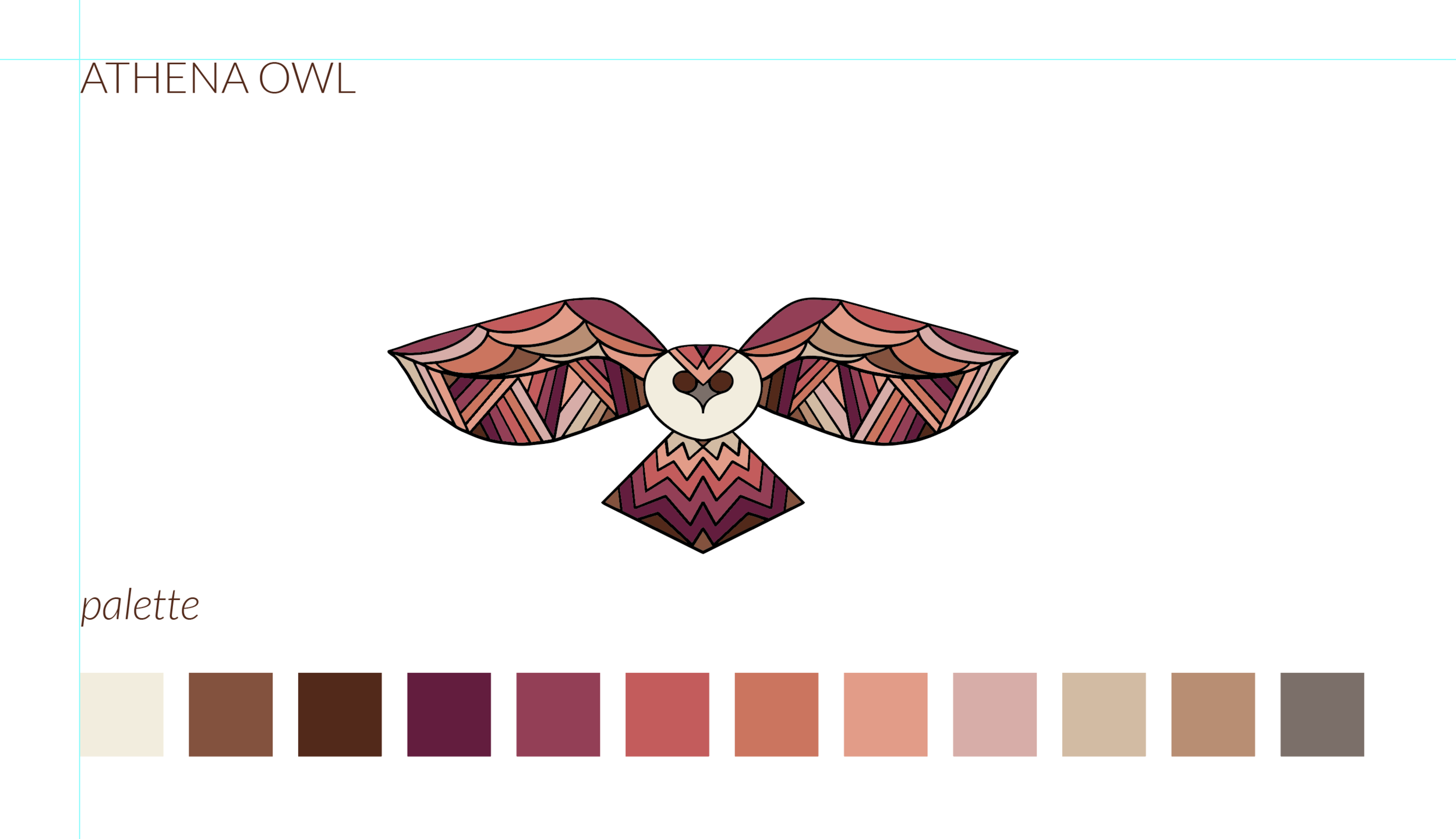
I brought my final sketch into Adobe Illustrator to clean up the line work and add color. I chose a color palette that evokes femininity, warmth, strength, and the various colors of skin that women embody — and was inspired by the ancient Athena owl painted clay sculpture shown previously in the blog.

Each section of the illustration includes a hidden or not-so hidden “w”. Look closely… can you see them?

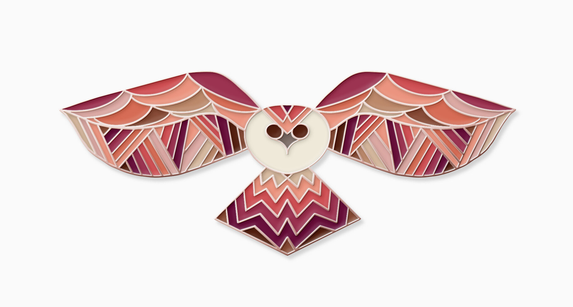
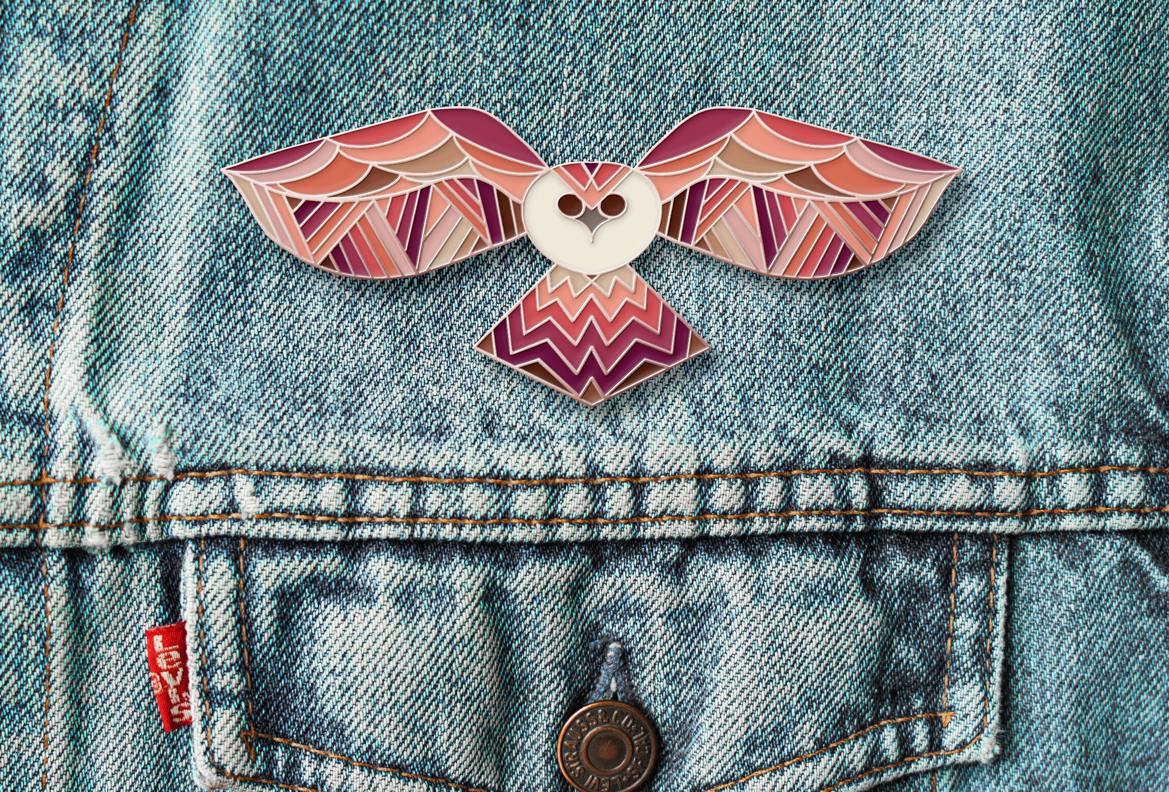
The final piece will be a soft enamel pin with copper or rose gold inlay to further express femininity and strength. I see this piece as a true conversation starter and look forward to having it made. I am excited to see where this self-initiated project will take me next.

REFERENCE

Athena, Goddess of Wisdom. (n.d.). Retrieved from http://www.perseus.tufts.edu/Herakles/athena.html.
Eason, C. (2008). Fabulous creatures, mythical monsters, and animal power symbols: a handbook. Westport: London.
Falmouth University (2018). Development | Podcast Videos. Application and Interactions GDE740 19/20 Part-Time Study Block S1 (Falmouth, UK: Falmouth University)
Rolfe, A. (2014). Taking mentoring to the next level in organisations. Training & Development (1839-8561)41(2), 26–2
Walsh, N. (2015). Greek mythology: gods of ancient Greece and the heroic myths ; discovering Greek history and mythology. San Bernardino, CA.: Moonrun Publishing.

GDE740 W3 | Lecture Reflection

Development

CREATIVE PRACTITIONERS

This week our creative practitioners were asked:

  • What is your development and reflection process?

  • How has production, risk, failure and your own personal ambition affected the outcome?

mt_rocky-1-(credit-Mother)_1600_1067_85.jpg

OFFSHORE

In addition to their research, Offshore prefers to get deeply into the details of the work as soon as possible. Try out their ideas via experimentation early on to challenge them to prove that they work (or not). Their collaboration sustains this approach as Isabel gets into the design with few approaches neatly and precisely where as XX comes at their projects by trying many things. They then apply that synchronization across the unique phases of the project. They also purposefully add in moments of pause to step away from projects in order to return to them with greater clarity and potential opportunity for seeing new things or seeing things differently. Trial and error is a welcome albeit intense aspect of their work.

They prioritize creating a creative space that allows for a lot of experimentation, risks, failure, testing, implementation, and reflection. They also try to learn something new on any self-initiated projects whether it’s software, ways of thinking, formats, production processes. These desires also have to overlap with the limitations of client-based work, but believe that initiated projects afford more freedom. They acknowledge that could also run the risk of not moving forward at all if too many directions or explorations are afforded. They believe that the more you try (and fail), the better your work gets. They are self-admitted control freaks which has known impact on a given project — especially knowing that you simply cannot control everything.

HEY

Vernonica Fuerte and her team spend a lot of time identifying the root simplicity for a given project, and then begins to iterate when the chosen direction has been selected.

They opened up an online and physical shop to showcase their self-initiated work.

FROST COLLECTION

Vince Frost IS the client on self-initiated projects. He reflects on the project a lot, prints out his ideas and designs, places them on the wall and visits and revisits, iterates and tweaks until he feels he’s got it just right.

“Failure is not great.” Funding has had big impact on the success (or lack thereof) of a given project. Self-initiated projects take a lot of time, but also blitz them or shelf them when other priorities take hold. Self doubt has also had an impact on his work. He finds it difficult to work on self-initiated projects where he works on the brief.

BOMPAS & PARR

Sam doesn’t necessary feel they have time to reflect on projects. He sees his role as more of “connecting things” for the projects they work on. He spends a lot of time absorbing information: events, reading, watching films, across cultures and media. Then attempts to distill those ideas that have collided in his brain overnight into something.

Many of their projects are foolhardy and insane. That insanity has had some tough impact on their team. They are also exciting and beyond memorable. These projects are the ones you reflect on with the most pride and joy.

WERKFLOW

Development can happen at a very fast pace with quick turnarounds for their client work. They use real-time rendering to be able to see development efficiently and effectively to keep pace with the tight deadlines. The game creation thus far has been very iterative. It includes large project phases and milestones. Through outside workshop and focus groups, it has helped to drive further rounds of the projects. Looking at expanding the aesthetics and visual elements and reflecting upon how the costs would be impacted. They debrief each phase the project to reflect how it went. They document this process for future reflection.

Budget has had significant impact on their development phase of their project. They have an ambitious script which means they need to keep a keen balance of their commercial projects and Sovereign. The commercial work undergirds their freedom to work on the self-initiated work. They take advantage of free tools to keep their budget and timeline on track.

REFERENCE

Falmouth University (2018). Development | Podcast Videos. Application and Interactions GDE740 19/20 Part-Time Study Block S1 (Falmouth, UK: Falmouth University)

GDE740 W2 | Workshop Challenge

Visual Responses

ANIMATED TYPOGRAPHY

I thought that animated typography could be an interesting way to engage with my target audience for this project. Its interactivity and motion could be leveraged across digital spaces including social media.

COLLAGE

Looking to the Guerilla Girls for inspiration, I thought collage would be a compelling execution to respond to my creative brief.

Guerilla Girls - collage.jpg

ENAMEL PIN

Given their popularity, my project’s target audience, and the current global approach to giving voice, enamel pins is a viable art form that can gain quick interest and buy-in.

Enamel pins.png

ILLUSTRATION

The power of illustration to evoke tone, mood, feeling, and message serves as a strong execution to convey message to my target audience.

illustration 1 giselle dekel.png

TYPOGRAPHIC POSTER

Using hand-tooled typography can keep messaging strong, but also simple without losing the clever .

typographic poster.jpg

Mood Boards

Building off of the visual responses, I’ve created five mood boards across the different visual outputs of each execution.

ANIMATED TYPE

COLLAGE

export_canvas_gde740wk2-collage-191006_2033.png

ENAMEL PIN

export_canvas_gde740wk2-enamel-pin-191006_2033.png

ILLUSTRATION

export_canvas_gde740wk2-illustration-191006_2032.png

TYPOGRAPHIC POSTER

export_canvas_gde740wk2-typographic-poster-191006_2034.png

REFERENCE

Ambrose, G (2014) ‘Design Genius. The Ways and Workings of Creative Thinkers (Links to an external site.)’, London, Bloomsbury.

GDE740 W2 | Lecture Reflection

Ideas, Craft, & Content

CREATIVE PRACTITIONERS

This week our creative practitioners were asked:

  • How do you visualize and develop your initial ideas?

  • What are your point of reference?

0-Migrant-Journal-Editorial-Design-Book-Magazine-Design-BPO.jpg

OFFSHORE

Offshore referenced their “Migration Journal” project collaboration. The meeting of two minds leveraged sketch, discussion, questioning, and perspective to develop their initial ideas. They look to visual reference collections, production methods, hand sketching, computer rough concepts, design testing across the unique flow of a given project.

Depending on the project, they use research, set references, and various creative expressions: photography, sculpture, writing, architecture, painting, and music to serve as points of reference.

HEY

Vernonica Fuerte first uses sketch and lists of ideas, as well as playing with type to get started on a project. She is inspired by city and locations, being open and aware, looking and questioning. She says that clients can also serve as inspiration. Problems can be inspiring. She likes to “go deep” to best understand the full of a given project. She also finds inspiration in her peers.

BOMPAS & PARR

They do “lots & lots” of research. They use words to write it all down, begin with sketch, and then move to computer and other multimedia platforms to gel their ideas and thoughts. Finding two words that can be connected together, such as “Lava Barbeque”, which are compiled in an ideas log, serve to bring new ideas and meaning. Collaboration with other creatives and makers is also a reference and inspiration point for Bompas & Parr.

WERKFLOW

They usually start with a script and look too technical approaches within the gaming platform to explore ideas. They set their visual style and tone by creating a “visual bible,” ensuring consistency and continuity across makers. Music is an important part of Werkflow’s methodology and reference. It helps to establish mood, sense of place, and time.

REFERENCE

Falmouth University (2018). Ideas, Craft and Context | Podcast Videos. Application and Interactions GDE740 19/20 Part-Time Study Block S1 (Falmouth, UK: Falmouth University)

GDE740 W1 | Workshop Challenge

Self-Initiated Project

CREATIVE BRIEF: women for women

OVERVIEW

Create a campaign that engages women for women. Provide a compelling narrative to inspire working and non-working women to appreciate the value of "better together" and aim to break down the societal mores associated with unproductive rancor and the unhealthy way women act on an otherwise healthy feeling of competitiveness through a series of storytelling, opportunities for engagement, and ultimately, a point of pride (wearable).

Within the last decade a shift has taken place regarding women in the workplace and women in general with regard to equality and social constructs. The #MeToo movement and Women’s March has underscored this sea change.

This project’s aim is to create a campaign that capitalizes on the momentum of the aforementioned movements and leverage both legacy and start-up platforms to engage deeper, more productive connections and support for women through a point of pride piece.

WHAT SPECIFIC OBJECTIVE IS THIS PROJECT TRYING TO ACHIEVE?

Show the value of female camaraderie and support.

WHAT SINGLE THOUGHT SHOULD THE AUDIENCE COME AWAY WITH?

Women can be better together.

TARGET AUDIENCE(S)

  • Primary: Adult women ages 20+ up

  • Secondary: Youth women ages 12-18

  • Vehicle audience: Human Resources Departments, Employment Agencies, Youth Organizations

PROJECT CRITICAL CONTEXT

Leverage the brand recognition of NOW (National Organization for Women), the largest organization of feminist grassroots activists in the United States and the business approach and baked in community of The Wing, a startup brand that creates spaces all over the world for women to work, gather, connect, and thrive on their own terms for the target adult audience. Partner with Girl Scouts of America for the youth population. Will connect both adult and youth women together, but span generations from young through to mature.

ANTICIPATED OUTCOME

A system of collateral and communication tools for organizations to implement greater opportunities for women to connect and support one another. These could include (but are not limited to):

  • Point of pride and kinship

  • Swag / Poster

  • Social media creative

  • OOH

  • Microsite

  • Printed collateral

WHAT IS THE TONE?

Inspirational, strong, warm, inviting

WHAT IS THE CALL TO ACTION?

Join the movement, get connected

CREATIVE MANDATORIES

Create a piece that becomes instantly recognizable by other members or piques the interest of women to get involved. It should convey an inviting playfulness, but also confidence.

TIMLELINE

Four weeks that include four phases:

  • Week One: identify subject for self-initiated project

  • Week Two: research and exploration

  • Week Three: assess findings, implementation

  • Week Four: initial campaign designs and plan for rollout

ASSETS

All to be created

POTENTIAL BARRIERS AND/OR CONCERNS

Timeline to launch final system is tight (less than four weeks). A phased approach of deliverables is likely most practical.

SUCCESS METRICS

Membership, web, and social analytics

RESEARCH

Straight Ally symbol for LBGTQ community - denotes a safe place, safe person.

Straight Ally symbol for LBGTQ community - denotes a safe place, safe person.

Pussy hats from the Women’s March

Pussy hats from the Women’s March

REFERENCE

Phillips, P (2004) Creating the Perfect Design Brief: How to Manage Design for Strategic Advantage. (New York: Allworth Press)

Falmouth University (2018). Brief Analysis | Podcast Videos. Application and Interactions GDE740 19/20 Part-Time Study Block S1 (Falmouth, UK: Falmouth University)