GDE740 W11 | Workshop Challenge

THE CHALLENGE

  • Seek key stakeholder feedback to ensure your project answers the original project brief, strategy and target audience.

  • Respond to this feedback and refine the design of your final outcome.

DESIGN DEVELOPMENT

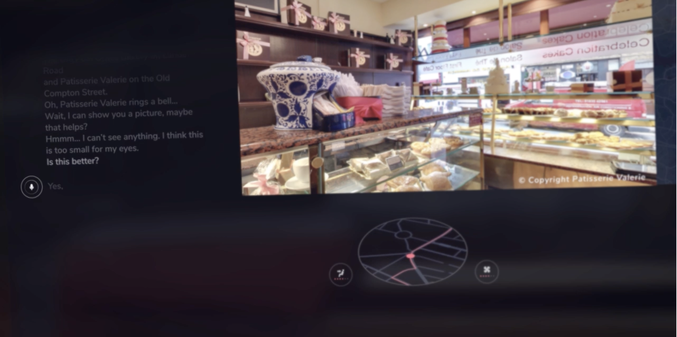
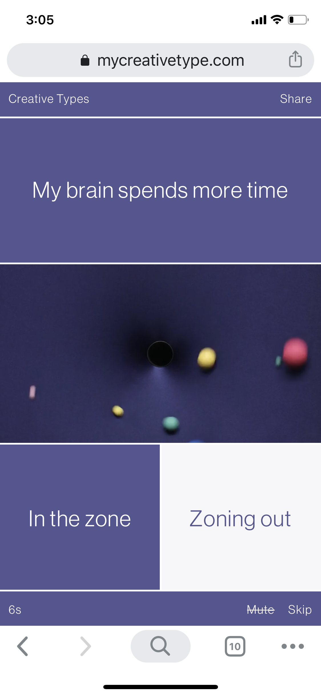
The app’s design development proceeded nicely even though I’d never before used Adobe’s XD software application. XD is pretty intuitive and flexible. If you’ve got InDesign and Illustrator experience, you will find yourself with a leg up in Adobe XD. After a few tutorials, I was implementing the design, the UX/UI and beta testing the app on my iPhone.

The feedback I was given was largely positive. There were some UX concerns with legibility and therefore increased the size of the font overall. The colors, transitions, and overall design was very positively received, especially among the target audience.

Design development of the GottaBe imposter syndrome app.

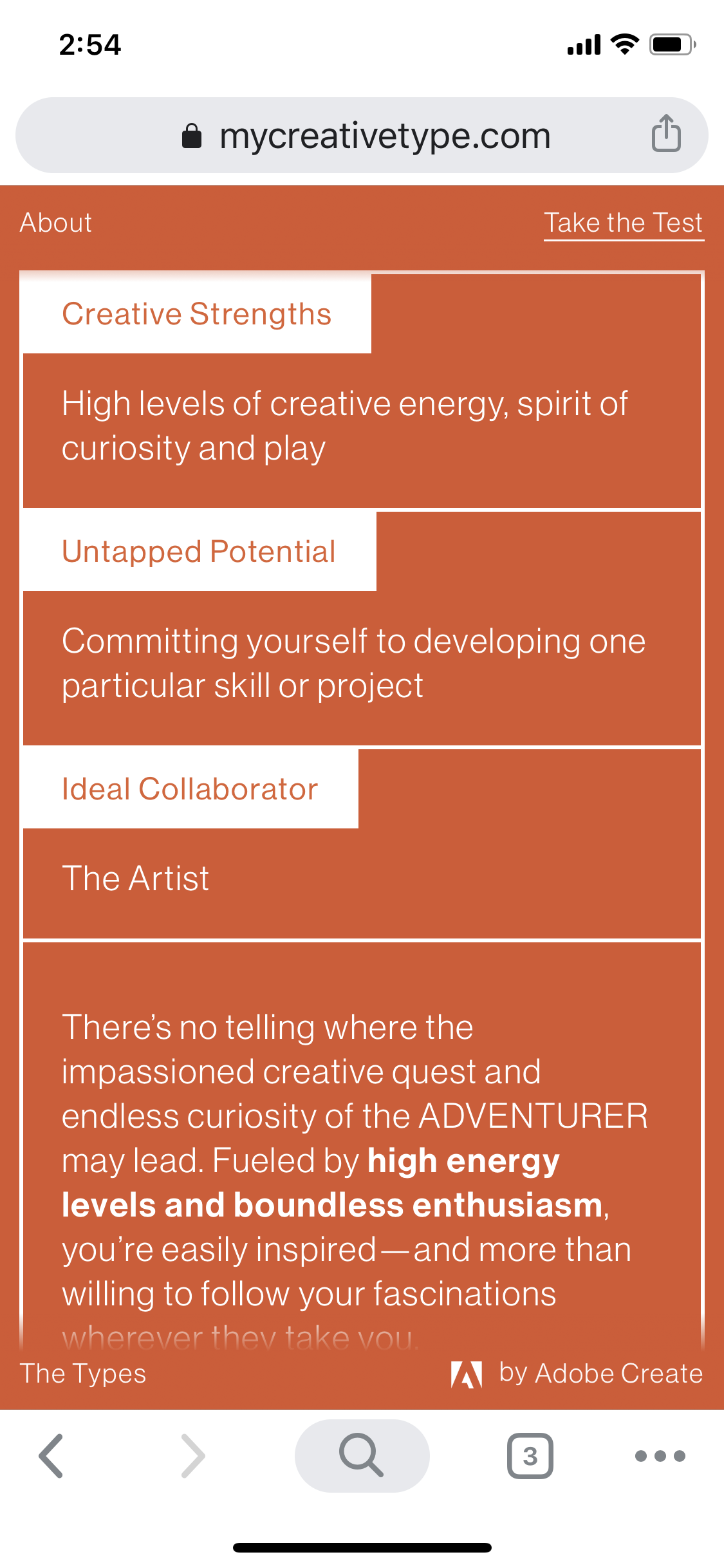
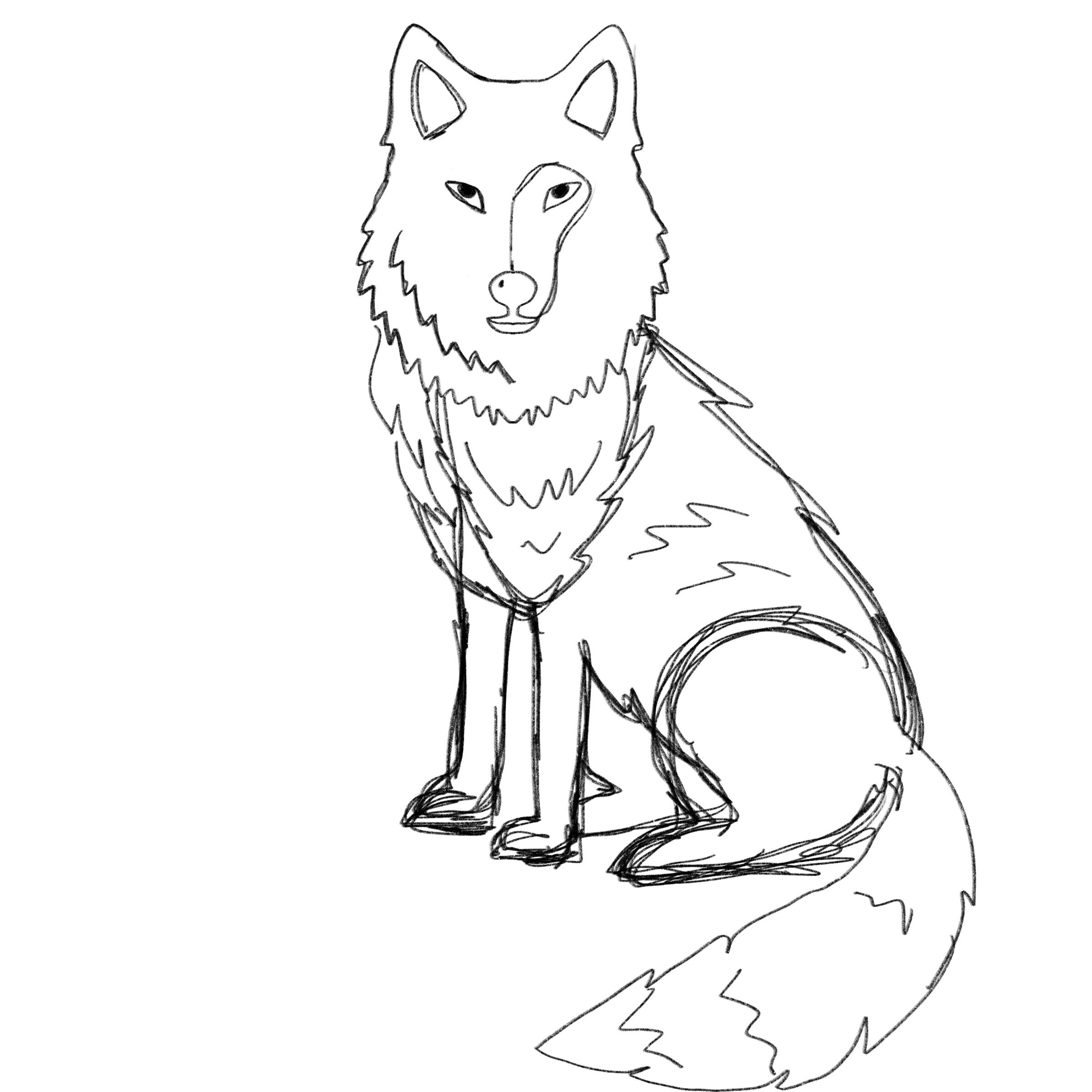
CHARACTER DEVELOPMENT AND FINAL DESIGNS

While the feedback for the app design overall was very positive the original approach to character development was to create something more approachable for my target audience and to use animals that represent the different behavioral traits associated with each persona. Shown below is the final character development.

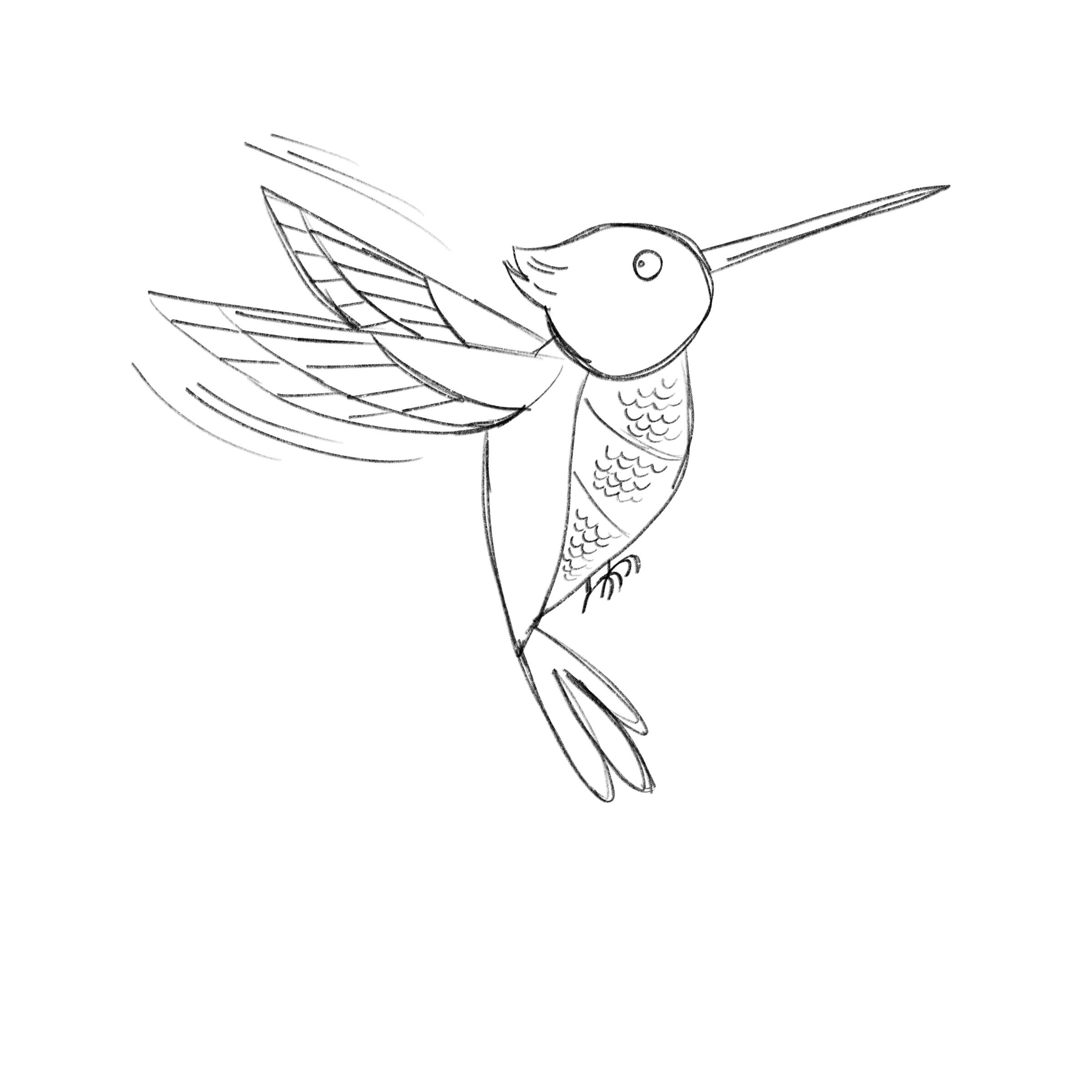
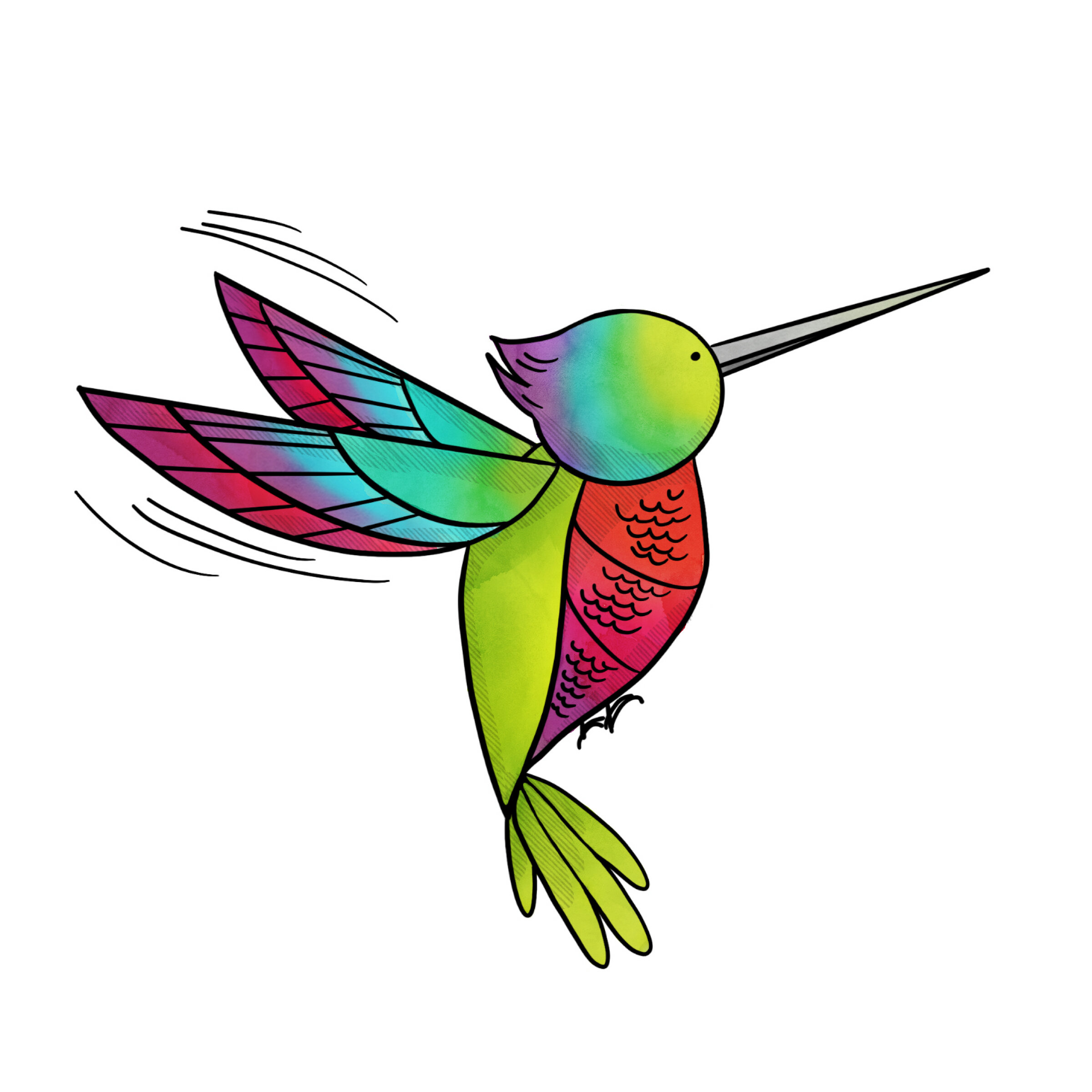
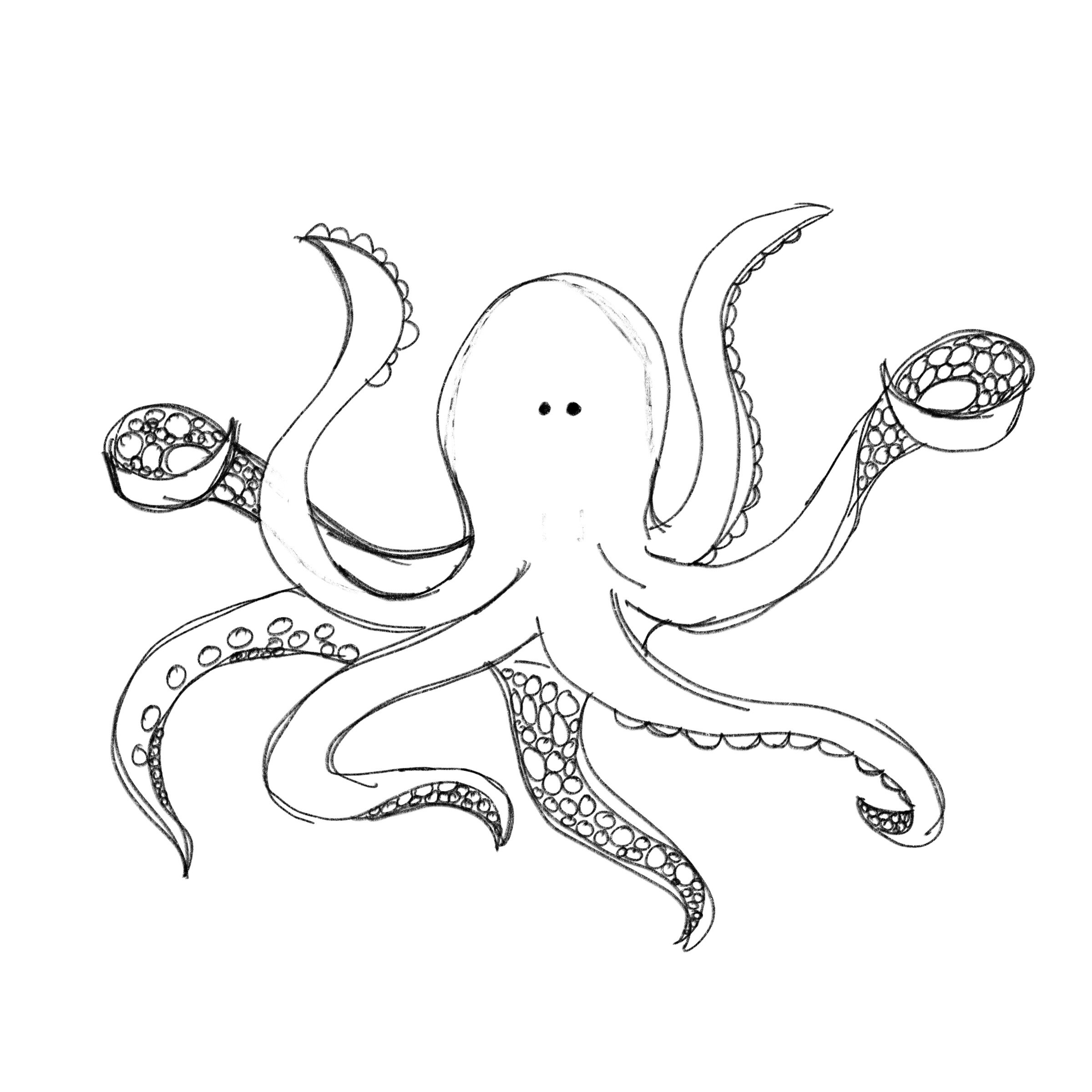
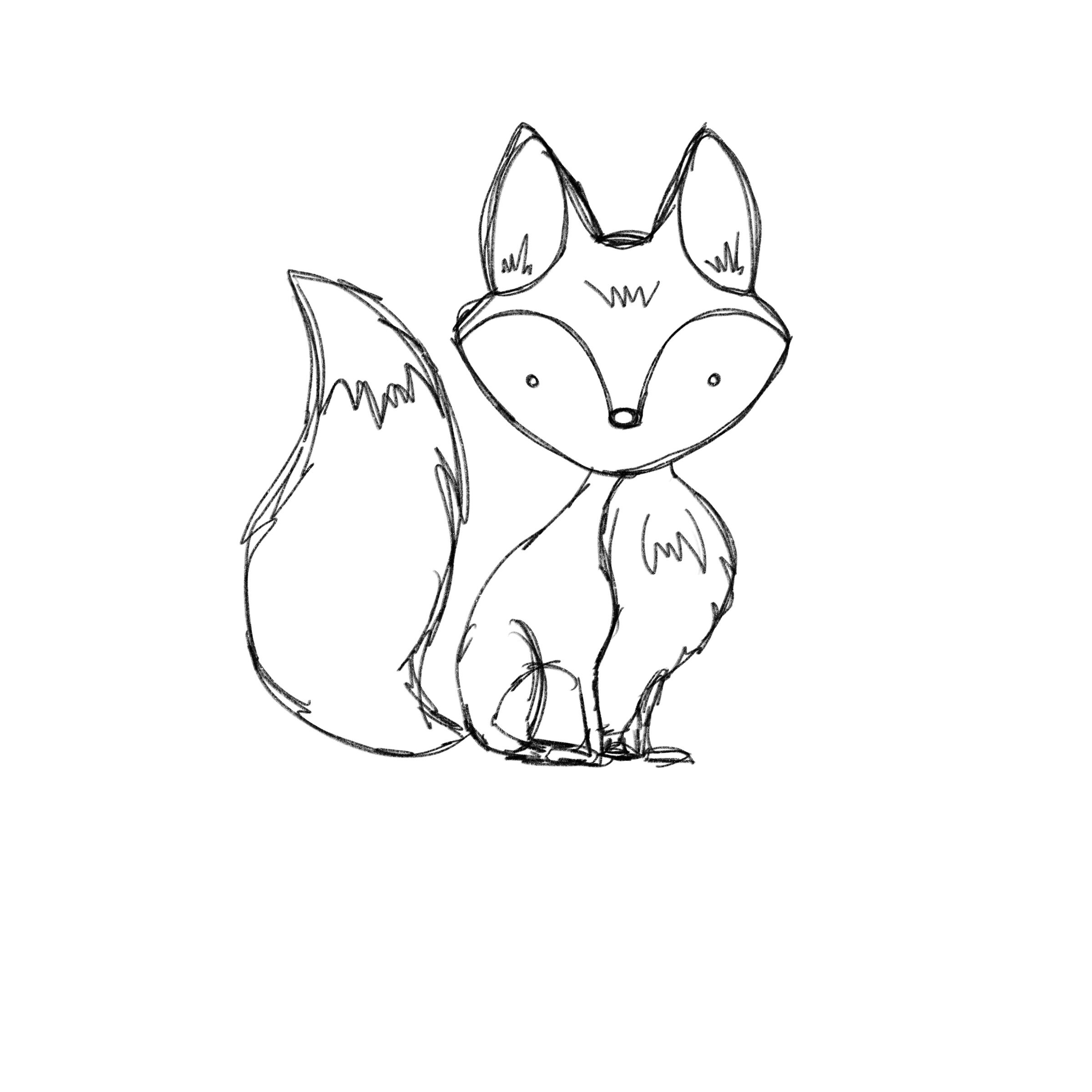
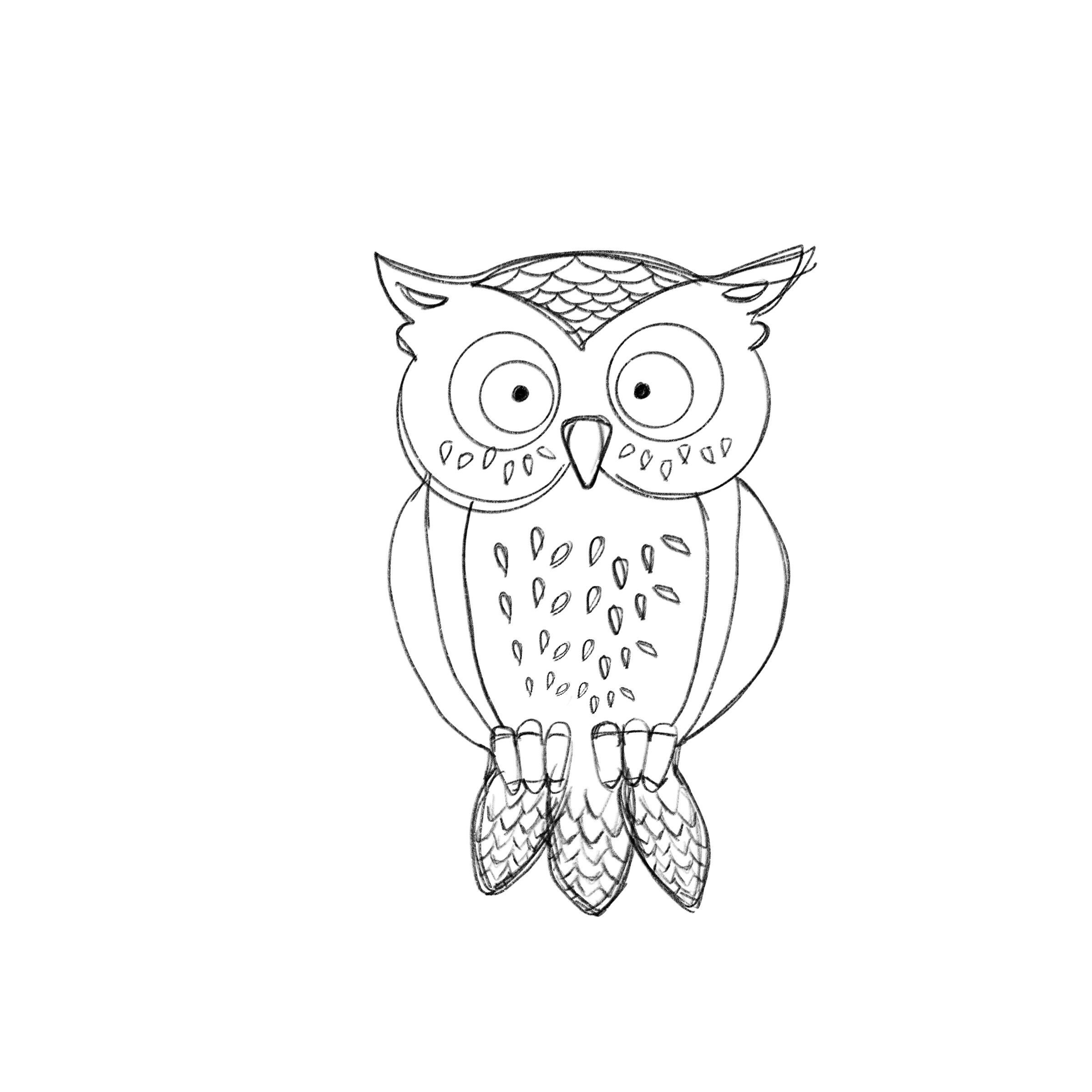
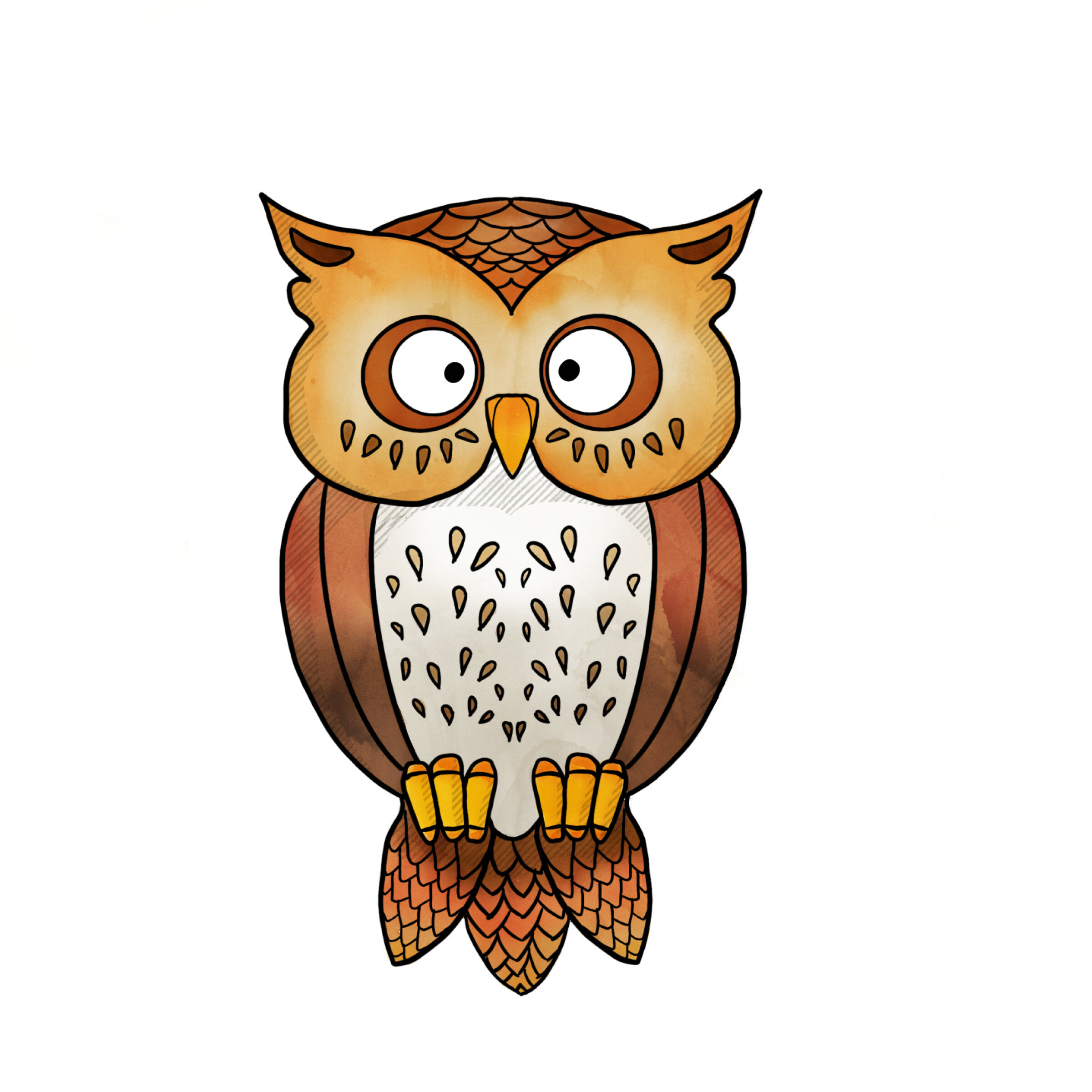
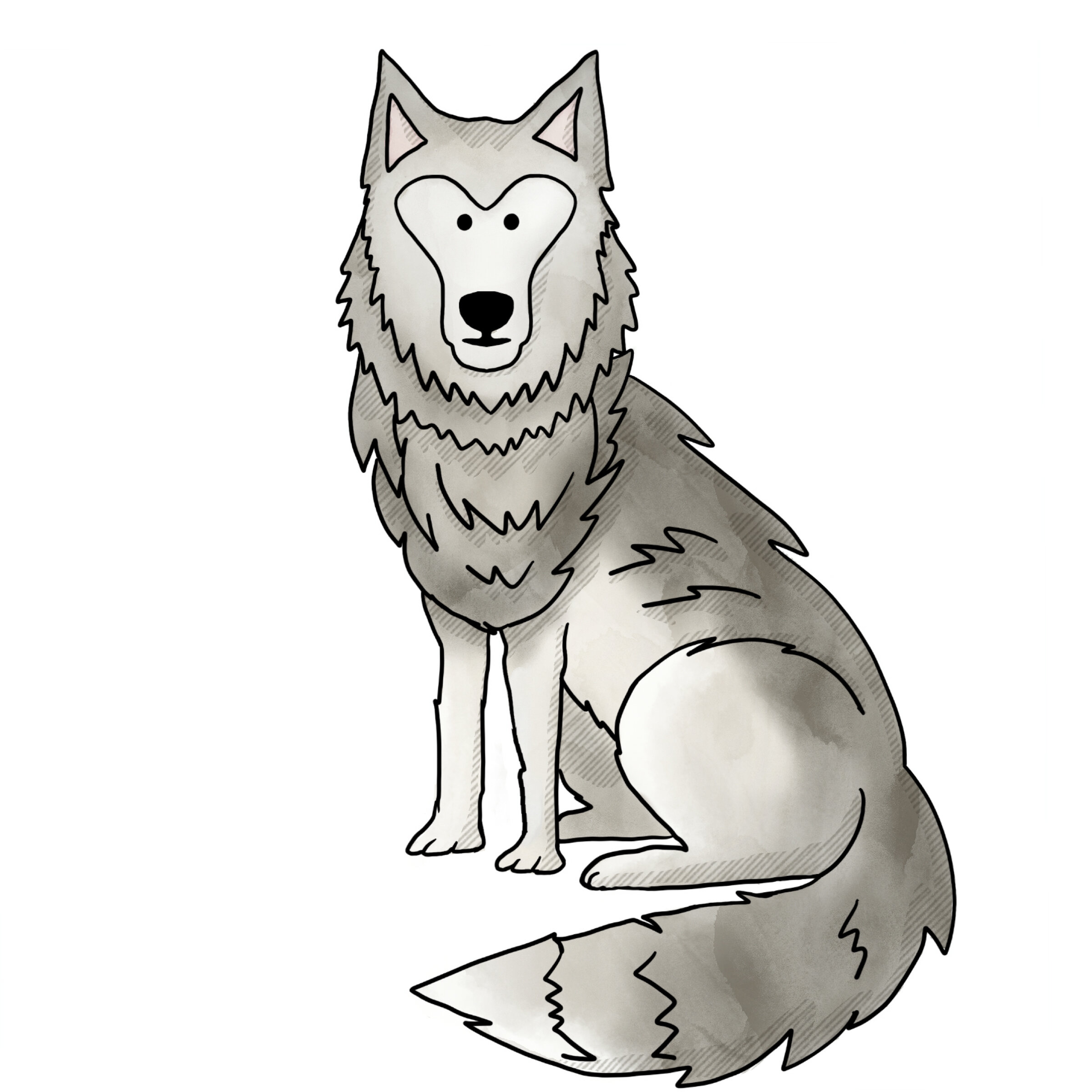
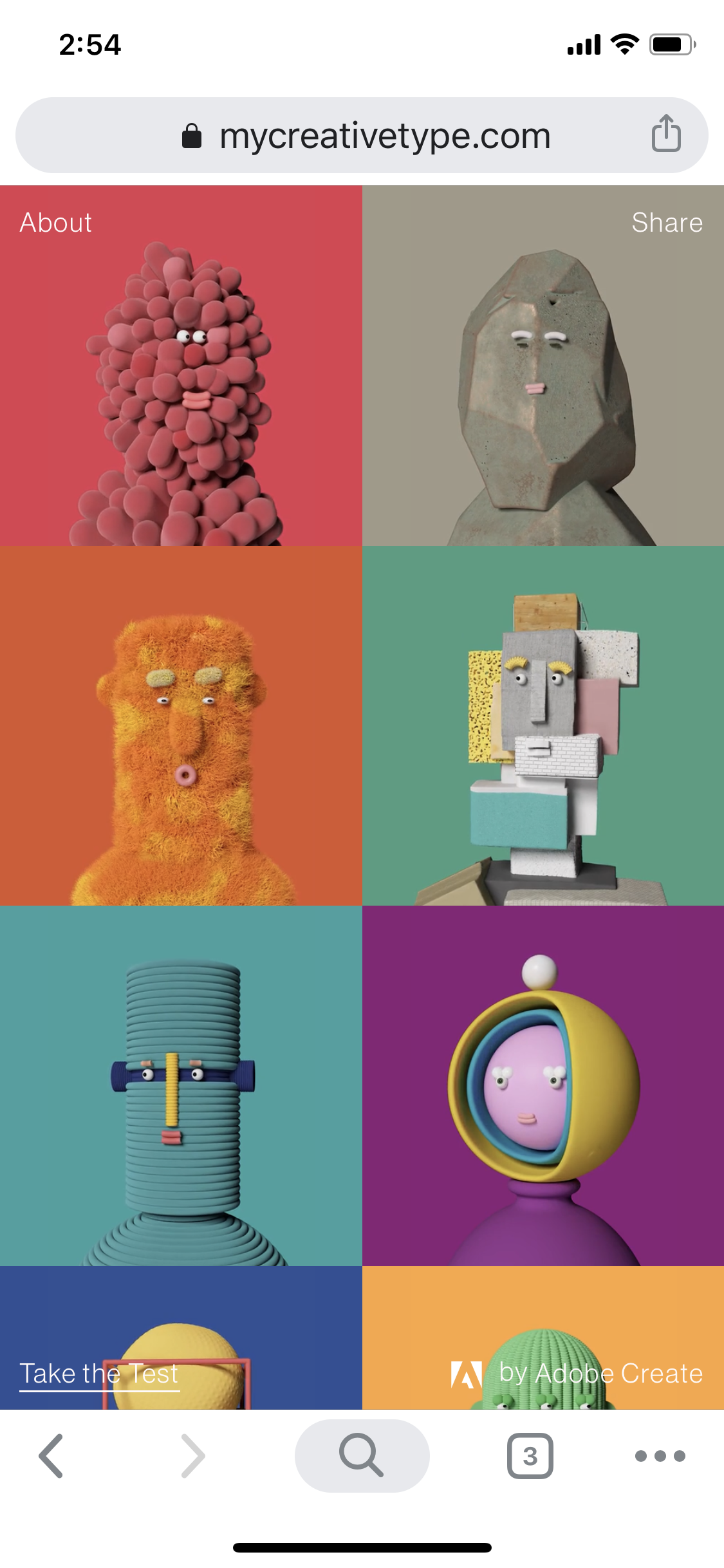
ADDITIONAL CHARACTER FEEDBACK

Given the target audience, Gen Z creative students, I did receive some last minute feedback that the characters needed an edge. I included sunglasses for the initial application thumbnails to coincide with the "imposter” aspect of the app context. Further, I applied a comic book grit/halftone to the characters to give them a bit more edginess and to better align with other aspects of the app design from a pattern perspective.

REFERENCE:

Skillshare (2018) Adobe XD Masterclass: Design a Mobile App & Website Wireframe. Retrieved from https://www.skillshare.com/classes/Adobe-Xd-Masterclass-Design-a-Mobile-App-Website-Wireframe/1543837313/lessons.

Beirut, M. (2015) How to use graphic design to sell things, explain things, make things look better, make people laugh, make people cry, and (every once in a while) change the world, London, Thames & Hudson.

AWWWARDS, (2018) Redefining Reality with Geoffrey Lillemon, Creative Director of W+K's Department of New Realities. Retrieved from: https://youtu.be/AUuTjsbNvpk

99U, (2019) Joel Beckerman: Designing With Sound. Retrieved from: https://vimeo.com/343057666

Glug, (2019) Marcello Google Creative Labs. Retrieved from: https://youtu.be/LdCBnqbCtm8

Skillshare, (2013) Design as Idea with Bob Gill. Retrieved from: https://youtu.be/_-nuzlpiKag


PreviousNext


GDE740 W10 | Workshop Challenge

THE CHALLENGE

  • Design your selected project concept and engage with key stakeholders to prototype and user test your developments.

  • Collaborate with key stakeholders to gather feedback; evaluate this feedback to ensure your project is in line with the original brief, strategy and target audience.

  • Make prototypes and user test your design developments.

DESIGN DEVELOPMENT

Using Adobe XD, I have created formal wireframes for my imposter syndrome web app for mobile. It is comprised of a welcome screen, twenty survey questions, a character landing page, five character (or persona) pages, a resources page, an about page and potentially a sign-in/up page. I am not sure about the sign-up/in page as I worry about it deterring folks from participating in the survey or engaging with the app.

WIREFRAME

APP NAME AND URL

I’ve decided to name the app GottaBe. The name is friendly, affirming, and has several opportunities for connection. For example: “Gotta be me,” I gotta B - and that’s okay because I don’t need to be perfect, “Gotta be real,” “Gotta be honest,” “Gotta be loving myself,” etc. I’ve registered the domain: www.gottabe.me.

COLOR PALETTE

A number of studies on the relationship between color and branding reveal that up to 90% of snap judgments made about products can be based on color alone, that colors influence how consumers view the ‘personality’ of the brand in question, and that the relationship between brands and color hinges on the perceived appropriateness of the color being the right ‘fit’ for the particular brand.

Therefore, I want to develop a palette that is friendly, approachable, and light-hearted. Here the the palattes I am exploring so far:

CHARACTER DEVELOPMENT

I’ll be looking at creating characters for each persona. I like the ambiguous characters from the mycreativetypes.com app, but will not be able to develop animated 3D characters within the timeline for this project. Adding some unique aspects of each persona to the characters might help make them more palatable and relatable for the audience.

I’ve identified four different approaches to illustrative styles — ranging from figurative to whimsical to abstract to animalistic — for this project and are shown below:

SURVEY QUESTIONS

The survey will consist of four questions persona for a total of 20 questions. The way the question are answered will deduce which persona the participant is assigned. More on this in the next week.

REFERENCE:

Skillshare (2018) Adobe XD Masterclass: Design a Mobile App & Website Wireframe. Retrieved from https://www.skillshare.com/classes/Adobe-Xd-Masterclass-Design-a-Mobile-App-Website-Wireframe/1543837313/lessons.

Beirut, M. (2015) How to use graphic design to sell things, explain things, make things look better, make people laugh, make people cry, and (every once in a while) change the world, London, Thames & Hudson.

AWWWARDS, (2018) Redefining Reality with Geoffrey Lillemon, Creative Director of W+K's Department of New Realities. Retrieved from: https://youtu.be/AUuTjsbNvpk

99U, (2019) Joel Beckerman: Designing With Sound. Retrieved from: https://vimeo.com/343057666

Glug, (2019) Marcello Google Creative Labs. Retrieved from: https://youtu.be/LdCBnqbCtm8

Skillshare, (2013) Design as Idea with Bob Gill. Retrieved from: https://youtu.be/_-nuzlpiKag


PreviousNext


GDE740 W10 | Lecture Review

DESIGN DEVELOPMENT

This week we learn from four new agencies who answer the question:

  • Please identify and explain a development process/activity where you had to evolve a more revolutionary approach to solve a project.

FELD

FELD was approached by Volkswagen’s design team to collaborate on a project. The interesting aspect of this project was there was no brief and no expectation. They wanted to collaborate with FELD and left it to them to come up with the project. They decided that they would focus on the idea of how one communicates with a machine — in this case a car. They set up a research site where subjects were encouraged to engage and communicate with the machine providing loads of input to FELD and Volkswagen on what ways do humans speak to machines. They then set up response mechanisms actually produced by humans acting as machines in varying degrees of diplomacy which further impacted the way in which the human subjects responded and communicated with the machines.

The takeaway for me here is that you don’t always have a straight, direct, line to a solution. Moreover, a direct route may be the most efficient way to the destination, but you may be missing out on unbeatable scenery — and ultimately experience.

Screen Shot 2019-11-30 at 7.21.51 PM.png

ACCEPT & PROCEED

Accept & Proceed collaborated with Canary Wharf, the secondary central business district of London, on an upcoming residence project. Along with the City of London, it is one of the main financial centers of the United Kingdom — yet certainly not known as a place to reside. They struggled on the project to arrive and align on a single tagline. Accept & Proceed decided to use data and an algorithm to help solve the problem. They fed thirty years worth of headlines into a computer, derived an algorithm and design conceit yielding a limitless arrangement of unpredictive, three-word taglines to be used across all platforms. The end result is progressive and contemporary, but also uses its authentic, historic reference — the words of the community to help tell its unique story.

The takeaway for me here is to be willing to experiments and look to unconventional ways to solve creative problems. You may be really pleased with the results.

STUDIO DUMBAR

Studio Dumbar created a new visual identity for Amsterdam Sinfionetta. They merged tyopgraphy, form, and color with sound: the music of the sinfionetta. The end result was an interactive experience that leveraged the messaging of Amsterdam Sinfionetta and the beautiful music it creates.

EDENSPIEKERMANN

EdenSpiekermann’s answer here was pretty shallow from a context perspective, yet I am sure it meant a lot to their client and to their teams. Their innovative approach was to use two different project timelines in parallel with a project to track short- and long-term project progress milestones.

The big takeaway for me from ES is that you shouldn’t be shortsighted or focused solely on your sprints. You need to keep the big picture in mind and continually reflect on how the small picture and big picture inform one another.

REFERENCE

Falmouth University (2018). Design Development | Interviews. Application and Interactions GDE740 19/20 Part-Time Study Block S1 (Falmouth, UK: Falmouth University)

GDE740 W9 | Workshop Challenge

THE CHALLENGE

  • Select one of your design concepts, which you think will successfully answer your chosen project brief.

  • Research innovative design thinking, format, media and production methods to gain a fresh insight into your project direction.

    • In what areas can I improve my concept? How can I develop an innovative, experimental and brave approach to elevate my selected concept?

CONCEPT DEVELOPMENT

As mentioned in Week 8, I’ve decided to focus my project on a web-based app versus a native app. Further, I am aiming to use a survey approach to help the audience explore and ultimately self-identify with one of the five personas of imposter syndrome.

I’ve found two web-based apps that do this well: http://mycreativetype.com/ and https://www.16personalities.com.

MY CREATIVE TYPE

The landing page for mycreativetype.com is inviting and welcoming. The motion-based typography creates a unique dynamism and interest.

Mycreativetype.com uses a either/or approach to it’s survey questions. There is one question per page and nine pages with an unique, interactive interstitial page for each of the nine questions. This approach lends itself to continued interest for the survey taker as it maintains visual interest, while keeping the questions simple and straightforward.

The results of the survey assign the taker a persona. My survey revealed that I am “The Adventurer.” Each persona has detailed attributes and comes with a unique character. Further, you can download a kit that provides a detailed PDF of your persona along with social media assets for you to engage in a conversation with other “creative types.”

You can also learn about the seven other personas. As you can see each character is unique and dynamic.

The mobile experience is exactly as the desktop experience except that it functions perfectly within the confines of the smaller screen space. The design is very responsive. The only downside on mobile is that the interstitials take up only a section of the screen leaving them a bit too diminutive for my taste. I imagine this was a design decision on the side of best UX.

What makes mycreativetype.com effective is its clean, friendly appearance, and easily navigated application. It encourages sharing and conversation.

16 PERSONALITIES

16Personalities.com as a great bit more information on their site. The test is as easy to approach, but has more questions and is designed on a scale vs. either/or.

The interface is clean and easy to follow. It uses symbology and shape to show the levels between “strongly agree” and “strongly disagree.” 16personalities.com has six questions per page across nine pages yielding 48 questions in total. Given that there are 16 personalities, it makes sense that there would be more questions. The depth of answers (to what degree you agree or disagree) plays into the results.

There are four main categories and four unique personalities within each main category. The main categories have unique broad traits shared across the personalities. The depth of those traits give way to the unique personality. This test is built upon research and uses the well-known acronyms from the Myers-Briggs Type Indicator® (MBTI®). 16personalities.com has evolved the MBTI further to achieve high test accuracy while also retaining the ability to define and describe distinct personality types.

The sight has a robust offering of resources and ways to engage and learn more about your personality type as well as the type of others. This can lead to open discussions in the workplace, at the dining table, and in the classroom about the importance of inclusivity and diversity. The site design has a whimsical flair and a sense of humor backed up by research and science.

The mobile experience for 16personalities.com, like mycreativetype.com, is one that is responsive, dynamic, and easy-to-navigate.

A HYBRID APPROACH

I’ve decided to pull aspects from each of these sites that would work best for my project. These are the attributes I aim to explore:

  • A welcoming/app start page landing experience

  • Using either/or survey question to keep the audience engaged and not overwhelmed

  • Four questions per persona for a total of 20 questions.

  • I like the idea of interesting motion-based interstitials, but believe that 19 may be too many and become fatiguing.

  • Creating characters for each persona that emulate aspects of the persona characteristic, but in a way that is friendly and relatable.

  • Creating a bio for each persona with more detailed information, ways to engage in a conversation, share their results and link to additional resources or support.

ROUGH WIREFRAME

Below is an initial wireframe sketch showing the inventory of pages. The next steps will be to create a formal site hierarchy and begin to flesh out with content, character development, and then final design.

wireframe.jpg


REFERENCE:

Calaby, L. (2018, August 14). The five different types of imposter syndrome. Retrieved from https://humanresults.co.uk/the-five-different-types-of-imposter-syndrome/.

Francis, T., & Hoefel, F. (2018, November). 'True Gen': Generation Z and its implications for companies. Retrieved from https://www.mckinsey.com/industries/consumer-packaged-goods/our-insights/true-gen-generation-z-and-its-implications-for-companies.

Gen Z: A look inside its mobile-first mindset -- Think With Google. (n.d.). Retrieved from https://www.thinkwithgoogle.com/interactive-report/gen-z-a-look-inside-its-mobile-first-mindset/.

Ilyin, M. (2019, August 23). M-commerce vs e-commerce. Retrieved from https://wiredelta.com/m-commerce-vs-e-commerce/.

Lebowitz, S. (2016, January 12). Men are suffering from a psychological phenomenon that can undermine their success, but they're too ashamed to talk about it. Retrieved from https://www.businessinsider.com/men-suffer-from-impostor-syndrome-2016-1?r=US&IR=T.

Mindtools Content Team. (n.d.). Impostor Syndrome: Facing Fears of Inadequacy and Self-Doubt. Retrieved from https://www.mindtools.com/pages/article/overcoming-impostor-syndrome.htm.

Scacca, S. (2019, March 29). Rundown Of Gen Z: What Does This Mean For Mobile Designers? Retrieved from https://www.smashingmagazine.com/2019/03/mobile-designers-generation-gen-z/.

Young, V., & Young, V. (2019, September 26). The 5 Types of Impostors: Retrieved from https://impostorsyndrome.com/5-types-of-impostors/.

GDE740 W9 | Lecture Review

CONCEPT DEVELOPMENT

This week we learn from four new agencies who answer the question:

  • Please describe a case study when innovative design thinking and fresh insight enables a surprising project outcome.

FELD

FELD worked on a project for Reebok at their new international headquarters in the harbor area of Boston. The project was to create a compelling reception area. Initially, FELD and Reebok senior designers conceived of a kinetic installation that took the Reebok logo apart and put back together using a motion installation. This was admittedly designed in an echo chamber and one that fell flat when presented to Reebok’s CEO. He stated almost immediately that it looked like the logo was being torn apart, something they could never do.

This meant scrapping that approach, accepting failure but using it to learn a way forward, and to begin a new, this time keeping the stakeholders close enough to the project to develop a piece everyone could be proud of: a LED light installation that used small movements to emulate the unique reflections of the brand.

ACCEPT & PROCEED

Accept & Proceed worked with Rapha a cutting-edge cycling brand on their Pro Team Collection, Data Print project using the “data in the ride” from Peter Kennaugh Tour de France race. They turned this data into a visualization pattern that was emblazoned on their jerseys, helmets, shorts, gear for the pro team, but also all of their consumer products. The unique approach to this project was the research into the consumer and their desire for data. Also, Accept & Proceed encouraged the subtle approach to sharing the backstory. They accomplished this by stitching a label with a tease to the story on the jerseys. This allowed enthusiast consumers find their own way into the brand campaign story. The end result fit the clean aesthetic for Rapha, but compelled a new way to visualize their brand to their consumers. Brilliant.

STUDIO DUMBAR

Studio Dumbar was tasked with developing a new identity for University of Twente in the Netherlands. Their unique approach to this project yielded an identity for a higher education institution unlike any I’ve ever seen in nearly ten years of serving as a creative in this market. Their research revealed that this schools distinctive was that it had a campus and one that teamed with interesting “elements” of the education available to its students. They created a universe of visual complements to their campus and unique educational offerings and paired it with a clean wordmark allowing for the campus expression be the forward visual element of the brand. This also allowed for interesting build outs for each of the subunits at the school. This is a contemporary, dynamic, innovative approach to identity — especially for higher education. Well done.

EDENSPIEKERMANN

EdenSpiekermann reflected on three projects that they found to be innovative:

  1. Changing the conversation with the consumer for a contact lens brand platform

  2. Using the brand value for a transit client yielding a project on “parking with empathy”

  3. Helping Dutch Railways to change negative consumer impression of riding the rails with Dutch

    • While the client came to ES wanting an app, the studio’s research proved that to be an ineffective solution

    • They studied the problem in situ and interviewed real passengers. This yielded a direction into interactive signage that notified passengers which cars were the most empty, where to load, and where to take your bike or find accessible seating.

The big takeaway for ES is that you aren’t charged with giving clients what they want. You are charged with giving them what consumers need. And knowing the difference and to use research to prove your case.


TEDX: DESIGN & DISCOVERY

The big takeaway for me from this 2003 production with David Carson is to trust your intuition, to lean on and embrace your unique experiences, your point of view, and your ideas to aid in expressing yourself as a creative (although this aspect will come with varying results depending on the project) and lastly, perhaps most importantly: Have fun. Experiment.

DESIGN INABA: MORAG MYERSCOUGH

I found Morag’s creative curiosity and playfulness contagious and imagine many who are lucky enough to collaborate with her at any level feel the same. The big takeaway from this piece was that we are the maker’s of our present and future: we can be whatever we want to be. Embracing the unknown can be liberating and exciting. Have fun. Make magic.

REFERENCE


Falmouth University (2018). Concept Development | Interviews. Application and Interactions GDE740 19/20 Part-Time Study Block S1 (Falmouth, UK: Falmouth University)